Implement an App Store Header in React Native With Sticky Parallax Library

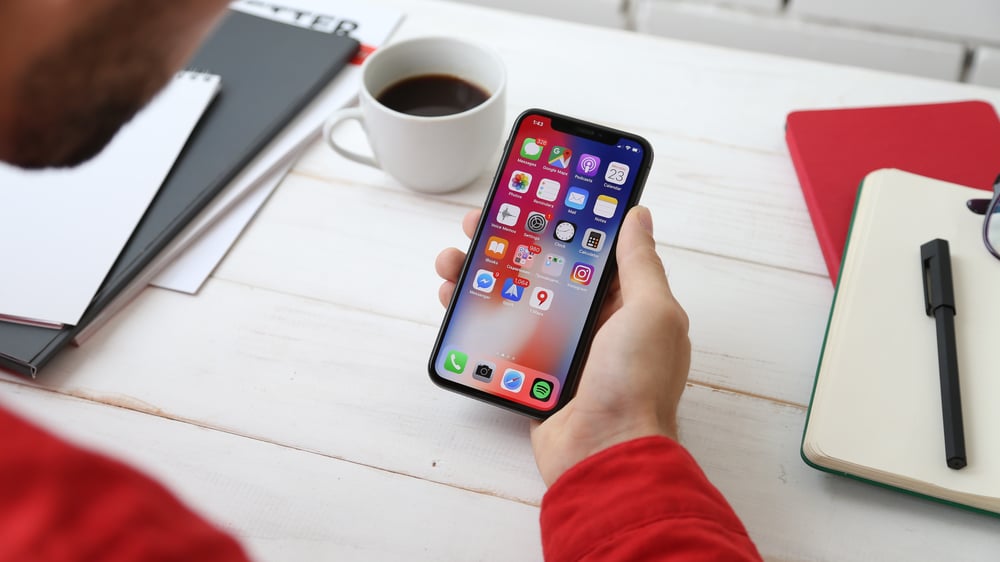
When scrolling, this header hides the back button to make the header with blurred background appear. After scrolling through product details, a call to action button is displayed on the right side of the header with the product’s logo in the middle.
To quickly implement a similar header layout with animations we can use the react-native-sticky-parallax-header library. It will allow us to focus on implementing a design which resembles the original App Store header, without writing unnecessary logic.
You can choose from three variants of predefined header components: Tab Bar header with scrollable tabs and two animated headers - Avatar Header and Details Header. Apart from that you can use the StickyParallaxHeader component and create a fully custom header.
In our case we can use the Avatar Header with slightly modified logic.
Let’s import “StickyParallaxHeader” and use “AvatarHeader” as “headerType”. Apart from that we can set “hasBorderRadius” to false to turn off the rounded border. We can set “backgroundColor” to be black and “parallaxHeight” to be 430, as this would be the height of the whole parallax. The prop “transparentHeader” should be true, as we want our header to be fully custom, and it should be invisible and appear after scrolling.
We also need to set up a “scrollEvent” like in the example below.
<StickyParallaxHeader
 headerType="AvatarHeader"
 hasBorderRadius={false}
 backgroundColor="black"
 scrollEvent={event(
   [{ nativeEvent: { contentOffset: { y: scrollY.y } } }],
   { useNativeDriver: false }
 )}
 parallaxHeight={430}
 transparentHeader={true}
/>
Then we should import “Animated” from “react-native” and create a “scrollY” variable. It will be necessary to prepare custom animations.
const { event, ValueXY } = Animated
const scrollY = new ValueXY()
Create the foreground component
To make it easier to track code changes we make, check the full source code of the header. I’ll explain different parts of the code in this blog post.
Now we need to create a foreground component which has a background image at the top and a view with details, consisting of the product logo on the left, a title, a subtitle, a call to action button “Get” and a share icon.
Here is the whole component code - make sure to pass it to the foreground prop of StickyParallaxHeader like this: “foreground={renderForeground}”.
const styles = StyleSheet.create({
 foregroundImage: {
   width: '110%',
   height: 250,
   marginLeft: -25
 },
 foregroundContainer: {
   flexDirection: 'row',
   marginBottom: 100,
   marginTop: 27,
   marginLeft: 27
 },
 foregroundLogo: {
   width: 128,
   height: 128,
   borderRadius: 32
 },
 foregroundDetails: {
   marginLeft: 15
 },
 foregroundDetailsHeader: {
   color: 'white',
   fontSize: 22,
   fontWeight: 'bold'
 },
 foregroundDetailsDesc: {
   color: 'gray',
   fontSize: 20
 },
 foregroundActionsContainer: {
   flexDirection: 'row',
   marginTop: 40,
   alignItems: 'center'
 },
 foregroundActionsButton: {
   backgroundColor: '#3479F6',
   width: 80,
   height: 33,
   borderRadius: 18,
   alignItems: 'center',
   justifyContent: 'center'
 },
 foregroundActionsButtonTitle: {
   marginLeft: 10,
   color:'gray',
   fontSize: 10
 },
 foregroundActionsShare: {
   width: 20,
   height: 20,
   marginLeft: 30
 }
})

const renderForeground = () => (
 <View>
   <Image source= style={styles.foregroundImage} />
   <View style={styles.foregroundContainer}>
     <Image source= style={styles.foregroundLogo} />
     <View style={styles.foregroundDetails}>
       <Text style={styles.foregroundDetailsHeader}>The Sims™ Mobile</Text>
       <Text style={styles.foregroundDetailsDesc}>Play with life.</Text>
       <View style={styles.foregroundActionsContainer}>
         <TouchableOpacity style={styles.foregroundActionsButton}>
           <Text style={styles.headerDetailsButtonTitle}>GET</Text>
         </TouchableOpacity>
         <Text style={styles.foregroundActionsButtonTitle}>{`In-App\nPurchases`}</Text>
         <Image source= style={styles.foregroundActionsShare} resizeMode="contain"/>
       </View>
     </View>
   </View>
 </View>
)
Create the header component
At the beginning of the blog post we set “transparentHeader” to true, so right now no header is displayed, but when we use the renderHeader prop with our custom header component it will be fully visible. We can manipulate its background opacity to make It invisible at the start and make It appear after scrolling a little bit.
Notice that the header background is a blurred view - we can use the @react-native-community/blur library to do that.
Header background
In our header component we can create an Animated View to apply animated opacity and inside we can use BlurView from “@react-native-community/blur” with the “ChromeMaterialDark” blur type.
const styles = StyleSheet.create({
 headerContainer: {
   width: '100%',
   height: 97
 },
 headerBlurView: {
   position: "absolute",
   top: 0,
   left: 0,
   bottom: 0,
   right: 0
 }
})

<Animated.View
 style={[styles.headerContainer, { opacity }]}>
 <BlurView
   style={styles.headerBlurView}
   blurType="chromeMaterialDark"
   blurAmount={15}
   reducedTransparencyFallbackColor="black"
 />
</Animated.View>
You can notice that Animated.View has opacity passed to styles. This is an animated property with simple interpolation on the “scrollY” value we created. It means that after scrolling to a place where our scrollY is 110, opacity will be increased to 150, making the background fully visible.
const opacity = scrollY.y.interpolate({
 inputRange: [0, 110, 150],
 outputRange: [0, 0, 1],
 extrapolate: 'clamp',
})
Header white back button
While the header is invisible, on the left side we can see a white back button. It has two animated properties. It’s moved to the left after scrolling and it’s completely invisible when the header background is shown.
In this case we are positioning the button absolutely over the header background and then passing the “left” property to the button container, which is a React Native clickable element “TouchableOpacity”. This value is interpolated, so after scrolling “scrollY” to a value of 110, the button is moved to the left, up to value of “left: -40”, where the button is completely outside of view.
On top of that we are also passing opacity with the value “arrowOpacity”. It changes the opacity from 1 to 0, so after scrolling to a “scrollY” value of 140, the button is invisible.
const styles = StyleSheet.create({
 headerImage: {
   width: 18,
   height: 18,
 },
 headerButtonContainer: {
   position: 'absolute',
   top: 50,
   zIndex: 4
 },
 headerButton: {
   backgroundColor: 'white',
   height: 36,
   width: 36,
   borderRadius: 18,
   alignItems: 'center',
   justifyContent: 'center'
 }
})

const left = scrollY.y.interpolate({
 inputRange: [0, 110, 160],
 outputRange: [24, 24, -40],
 extrapolate: 'clamp',
})

const arrowOpacity = scrollY.y.interpolate({
 inputRange: [0, 110, 140],
 outputRange: [1, 1, 0],
 extrapolate: 'clamp',
})

<TouchableOpacity style={[ styles.headerButtonContainer, { left }]}>
 <Animated.View style={[styles.headerButton, { opacity: arrowOpacity }]}>
   <Image
     style={styles.headerImage}
     resizeMode="contain"
     source=
   />
 </Animated.View>
</TouchableOpacity>
Header search button
The first thing we can see after white button disappears is the blurred header background and the search button with the left arrow icon. The header background should be already prepared in the first step; now we need to implement a search button and make it appear on scroll.
In this example “View” with “headerWrapper” is positioned absolutely with a “top” value of 55, which is implemented for iPhones with a notch, so iPhone X and newer. For Android and older iPhone devices you should change this value by creating a helper function to compute this value. You can take a look at the “example” directory in the react-native-sticky-parallax-header repository and check how it's implemented there.
After implementing the Image component with the back arrow icon and Text component with the “Search” value, we can wrap it with Animated.View and pass the same opacity which we used with the header background. The search button should be visible at the same moment as the background.
const styles = StyleSheet.create({
 headerWrapper: {
   position: 'absolute',
   left: 0,
   top: 55,
   width: '100%',
   flexDirection: 'row',
   justifyContent: 'space-between',
   alignItems: 'center'
 },
 headerSearchContainer: {
   flexDirection: 'row',
   alignItems: 'center',
   paddingLeft: 5,
   paddingRight: 60
 },
 headerSearchArrow: {
   width: 25,
   height: 25,
 },
 headerSearchText: {
   color: '#2488FF',
   fontSize: 20
 }
})

<View style={styles.headerWrapper}>
 <Animated.View style={[styles.headerSearchContainer, { opacity }]}>
   <Image
     style={styles.headerSearchArrow}
     resizeMode="contain"
     source=
   />
   <Text
     style={styles.headerSearchText}>
     Search
   </Text>
 </Animated.View>
</View>
Header icon and call to action button
The last thing to appear on scroll are product details such as an React Native app icon and a “Get” button with info about “in app purchases”. This part of the header should be visible right before the user scrolls out of the parallax header which is our “renderForeground” component.
After displaying the “Search” button on the left side of the header it should be wrapped with a View with headerWrapper styles, under the Animated.View which we just implemented. This time we need an interpolation to display header details as the last animation. It will be opacity again, but with different values. Up to a “scrollY” value of 250, details will be invisible, but from 250 to 350, opacity will be increased to full visibility.
const styles = StyleSheet.create({
 headerDetailsImage: {
   width: 30,
   height: 30,
   borderRadius: 7.5
 },
 headerDetailsContainer: {
   flexDirection: 'row',
   alignItems: 'flex-end'
 },
 headerDetailsText: {
   marginLeft: 10,
   color:'gray',
   fontSize: 10,
   textAlign: 'right',
   paddingBottom: 3
 },
 headerDetailsButton: {
   backgroundColor: '#3479F6',
   width: 80,
   height: 33,
   borderRadius: 18,
   alignItems: 'center',
   justifyContent: 'center',
   marginHorizontal: 8
 },
 headerDetailsButtonTitle: {
   color: 'white',
   fontWeight: 'bold',
   fontSize: 20
 }
})

const detailsOpacity = scrollY.y.interpolate({
 inputRange: [0, 250, 350],
 outputRange: [0, 0, 1],
 extrapolate: 'clamp',
})

<Animated.View style=>
 <Image source= style={styles.headerDetailsImage} />
</Animated.View>
<Animated.View style={[ styles.headerDetailsContainer, { opacity: detailsOpacity }]}>
 <Text style={styles.headerDetailsText}>{`In-App\nPurchases`}</Text>
 <TouchableOpacity style={styles.headerDetailsButton}>
   <Text style={styles.headerDetailsButtonTitle}>GET</Text>
 </TouchableOpacity>
</Animated.View>
Snap threshold and snap value
Now when we have a “renderForeground” function and a “renderHeader” function, we can pass it to the “foreground” and “header” functions of StickyParallaxHeader.
Previously we set headerType, hasBorderRadius, backgroundColor, scrollEvent, parallaxHeight and transparentHeader. Now we need to customise the value of “scrollY” to which the header sticks. The whole header + parallax foreground height is 430, so the sticking point placed between the foreground image and the second part of the header with details is 167. You can pass it to the “snapValue” prop. Then you can pass a value of 50 to “snapStartTreshold”. After scrolling past the “scrollY” of 50, the header scrolls automatically to 167. The user then has to scroll past the title in the details part of the header to open It. The value of “snapStopThreshold” should be 250 to achieve that.
Bear in mind that to make this code easier, our header has a “top” value of 55, which is set for iPhones with a notch. To make this header responsive we need to compute this value both for the snap props and parallaxHeight. You can find some solutions in example components in the
react-native-sticky-parallax-header repository.
const AppStoreHeader = () => (
 <StickyParallaxHeader
   headerType="AvatarHeader"
   hasBorderRadius={false}
   backgroundColor="black"
   scrollEvent={event(
     [{ nativeEvent: { contentOffset: { y: scrollY.y } } }],
     { useNativeDriver: false }
   )}
   parallaxHeight={430}
   transparentHeader={true}
   foreground={renderForeground}
   header={renderHeader}
   snapStartThreshold={50}
   snapStopThreshold={250}
   snapValue={167}
 />
)

export default AppStoreHeader
Summary
You can find the whole App Store header source code in the additional examples directory of the library repository. Using react-native-sticky-parallax-header we managed to quickly implement an App Store header and add custom animations on scroll. It was easy to add a few different types of animations running after each other when scrolling. The simplified example from the blogpost can be improved by implementing some responsiveness to the header and its animations. You can also implement the body of the screen containing ratings, a scroll view with videos and the rest of the product description and then pass it through the “renderBody” property.


