The Missing Collection View in SwiftUI


Long story short, it’s a declarative framework that can massively reduce the time needed for creating and refactoring views in our apps. This blogpost is meant for people who already have a basic understanding of SwiftUI. Otherwise, a good primer on the subject is the WWDC 2019 session number 204 – read this first and then come back here!
The missing part of SwiftUI
After the announcement, developers from all over the world started digging into the possibilities of SwiftUI and were mostly amazed. However, while the excitement was building, some of them quickly noticed that a piece that we all love is unfortunately missing. There is no direct equivalent of our beloved UICollectionView! For me personally, it was quite strange since this control is being used a lot in apps all over the App Store. Luckily, some of us got to ask at the source how to approach it. Here is what they said.

The Apple approach
According to a post at Avery Vine’s blog, the approach suggested by Apple is to integrate Collection View – made using our old friend UIKit – into SwiftUI apps. The whole topic of integration between those two frameworks was covered in WWDC 2019 talk no. 231 as well as in the blog post mentioned above (briefly, for this specific case). Basically, what we need to do is:
- Create a struct implementing UIViewRepresentable protocol that wraps UICollectionView into a representable form in SwiftUI.
- In the makeUIView(context:) method of this struct, create a Collection View in an imperative way.
- Create a Coordinator object which will feed our collection with data through Context object.
This seemed like a lot of work to me, and it definitely lacked the feeling of SwiftUI adventure.

The obvious thing to do – play with SwiftUI
Since I wasn’t satisfied with the Apple approach, I did what every other developer would do (after going through StackOverflow) – I started playing with what is out there. The default component for representing datasets in SwiftUI is a List, which is basically an equivalent of UITableView – so no horizontal scrolling and no custom layouts. And I really wanted that!
Stacking & scrolling
Before moving to implement the collection in SwiftUI, I would love to recommend a solution that is already out there. Created by Karol Kulesza, QGrid is a reusable collection view that might be useful for you!
Note: in the following code samples, I will be using some classes (i.e., Pokemon) that were not declared before – you can refer to this Github repository for their declarations :)
Achieving an object that is horizontally scrollable was quite quick and intuitive. Fortunately, SwiftUI offers an object called ScrollView, which combined with HStack and some more SwiftUI magic, gives us what we might want. Here is how:
- Firstly we need data. To work with what is coming in the next steps, the objects we want to display need to implement the Identifiable protocol. It’s a requirement by ForEach loop to properly identify objects from the given collection.
struct PokemonImage: Identifiable {
  var id: Int {
    pokemon.id
  }
  var pokemon: Pokemon
  var image: UIImage
}
- After we know what we want to display, we need to tell SwiftUI how to do it. So we need a cell object.
struct PokemonCell: View {
  let pokemon: PokemonImage
  var body: some View {
    VStack {
      Image(uiImage: pokemon.image)
        .resizable()
        .frame(maxWidth: 100, maxHeight: 100)
      Text(pokemon.pokemon.pokeName)
        .fontWeight(.semibold)
        .padding([.leading, .trailing, .bottom], 5)
    }
  }
}
- Finally, we can work on the collection view itself. What we need is horizontal ScrollView with embedded HStack and ForEach loop. Just like this:
struct CollectionView: View {
  @State var pokemons = [PokemonImage]() /// Don't forget to fill it with data!

  var body: some View {
    ScrollView(.horizontal) {
	  HStack {
		ForEach(pokemons) {
			PokemonCell(pokemon: $0)
            	.background(Color.yellow)
                .cornerRadius(5)
                .padding(10)
		}
	  }
    }
  }
}
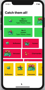
The final effect might look like this:
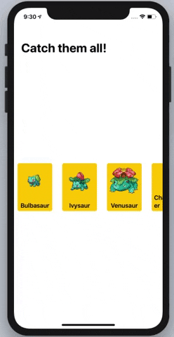
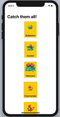
That was easy, huh? SwiftUI magic! 🤩🧙♂️ The same thing can be done vertically, of course, but then you get a List basically.
Although it looked nice, it still lacked some of the features I really wanted – the possibility of customizing the layout of cells and lazy loading of new views (as in List or in similar controls in UIKit). On top of that, I wanted to land with something generic! And that wasn’t it yet.
In my pursuit of having a collection view in SwiftUI, it clearly wasn’t enough, but if you are looking for a quick and easy solutions – that might be your shot!
Generic collection view – my research
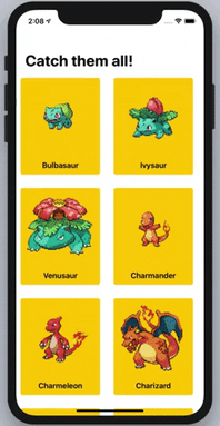
In order to achieve all of the things mentioned above, I started from scratch. The final effect is pretty satisfying; take a look below:
Ingredients
In order to implement collection view like this I needed 6 key ingredients, some more crucial for the whole implementation and some just adding a final polished layer. But in the end - all 6 were necessary for success.
Managing sizes with the help of GeometryReader
In general, SwiftUI lays out views starting from the top (parent) to bottom (children). Level by level, the children are being told what size they should have. But as we all know, some children might not want to listen to their parents. SwiftUI helps them to do it with GeometryReader. It’s basically another view, but with a secret stash containing size properties inside. Those properties (size, frame, etc.) can be used by child views to decide their own size based on what their parents decided for them. We can use GeometryReader by wrapping it around the view we want to display, then reading the size proposed by the parent, and finally tweaking it. In our case, we would use it to get the actual size and pass the collection view to calculate the sizes of subviews.
typealias CollectionViewElementSize<Elements> = [Elements.Element.ID: CGSize] where
Elements: RandomAccessCollection,
Elements.Element: Identifiable

enum CollectionViewLayout {
  case flow

  /// For other examples: single line and multline refer to Github repository linked above!

	func layout<Elements>(for elements: Elements, containerSize: CGSize, sizes: CollectionViewElementSize<Elements>) -> CollectionViewElementSize<Elements> {
        switch self {
        case .flow:
            return flowLayout(for: elements, containerSize: containerSize, sizes: sizes) /// will be declared later
        }
    }
}

struct SwiftUICollectionView<Elements, Content>: View where
	Elements: RandomAccessCollection, /// crucial: RandomAccessCollection required by for each
	Content: View,
	Elements.Element: Identifiable /// required by for each
{

	private var layout: CollectionViewLayout
	@State private var sizes: CollectionViewElementSize<Elements> = [:] // here we store sizes of elements

	var body: some View {
		GeometryReader { proxy in /// container size
			self.bodyFor(self.layout,
						containerSize: proxy.size,
						offsets: self.layout.layout(
                        	for: self.pagedCollection.dataDisplayed, /// will be declared later
							containerSize: proxy.size,
                            sizes: self.sizes
                        )
			)
		}
	}

    private func bodyFor(
      _ layout: CollectionViewLayout,
      containerSize: CGSize,
      offsets: CollectionViewElementSize<Elements>
    ) -> some View {
    	switch layout {
        	case .flow:
				return AnyView(flowLayoutBody(containerSize: containerSize, offsets: offsets)) /// will be added in next step
    	}
   	}
}
Communicating characteristics up the hierarchy with PreferenceKey
We already know that some child views might want to have a different size than the parent told them to. Actually, in this case, all views are like this! So in order to make them live together on the screen, we need to somehow communicate their characteristics up the view hierarchy. SwiftUI has a tool for that called PreferenceKey. In our case, it will store pairs of values – the ID of the object and its size. In order to propagate the value of a child to a parent, we need to use its view wrapper to send the value of the key so that the parent view can react to the changes. Be careful here! You don’t want to end up in a recursive loop. In our case, we should save propagated sizes to a property called sizes, which will then be passed to an object calculating the layout positions of collection cells.
private func flowLayoutBody(
	containerSize: CGSize,
	offsets: CollectionViewElementSize
) -> some View {

	/// properties important for ScrollView body - will be added later on

  	return ScrollView(.horizontal) {
      	/// will be added later on
  	}
  	.onPreferenceChange(CollectionViewSizeKey.self) {
  		self.sizes = $0
  	}
}

private struct PropagateSize<V: View, ID: Hashable>: View {
	var content: V
	var id: ID
	var body: some View {
		content.background(
			GeometryReader { proxy in
				Color.clear
					.preference(key: CollectionViewSizeKey.self, value: [self.id: proxy.size])
			}
		)
	}
}

private struct CollectionViewSizeKey<ID: Hashable>: PreferenceKey {
	typealias Value = [ID: CGSize]
	static var defaultValue: [ID: CGSize] { [:] }
	static func reduce(value: inout [ID: CGSize], nextValue: () -> [ID: CGSize]) {
		value.merge(nextValue(), uniquingKeysWith: { $1 })
	}
}
Laying out the collection using ZStack
In order to lay out the views in SwiftUI, we need to use stacks: HStack, VStack, and ZStack. HStack and VStack allow us to layout the views on one axis (horizontal and vertical, respectively). Only the ZStack allows us to specify view positions on both axes. Since we want to lay out our views without axis constraints, we will use ZStack. By default, ZStack will try to use as little of the screen as possible, but we want it to use all of the available space! In order to achieve that, we need to use a little hack. By putting a Color.clear object in the stack together with our collection, we will force it to take the whole possible space.
ZStack doesn’t have a spacing property because it doesn’t make sense (since it operates on the Z-axis). Instead, we should use the offset() modifier in which we will provide the desired position of the collection cell.
Of course, to allow scrolling, ZStack needs to be put in ScrollView because stacks don't offer this functionality by default.
/// Add this to SwiftUICollectionView properties

private var contentView: (Elements.Element) -> Content // cell for row at index Path from

/// Add this to flowLayoutBody() method declared above

ZStack(alignment: .topLeading) {
	ForEach(pagedCollection.dataDisplayed) {
		PropagateSize(content: self.contentView($0).embededInNavigationLink, id: $0.id)
			.offset(offsets[$0.id] ?? CGSize.zero)
			.animation(Animation.spring())
			.onFrameChange {
				/// view modifier body - will be added later
			}
    }
	Color.clear.frame(width: containerSize.width, height: containerSize.height)
}
Calculating cells offset independently from the UI framework
The last thing regarding layout is calculating the offsets of the collection cells. This can be done independently from the UI framework. It’s explained quite nicely in one of the Swift Talk episodes. Depending on layout type and preferences, you can calculate it differently. When it comes to implementing the flow layout, I decided to follow the approach shown in the Swift Talk episode, which you can have a look at below:
/// Add this to CollectionViewLayout enum

private func flowLayout<Elements> (
	for elements: Elements,
	containerSize: CGSize,
	sizes: CollectionViewElementSize<Elements>
) -> CollectionViewElementSize<Elements> {

	var state = FlowLayout(containerSize: containerSize)
	var result: CollectionViewElementSize<Elements> = [:]
	for element in elements {
		let rect = state.add(element: sizes[element.id] ?? .zero)
		result[element.id] = CGSize(width: rect.origin.x, height: rect.origin.y)
	}
	return result
}

private struct FlowLayout {
	let spacing: UIOffset
	let containerSize: CGSize
	var current = CGPoint.zero
	var lineHeight = CGFloat.zero

	init(containerSize: CGSize, spacing: UIOffset = UIOffset(horizontal: 10, vertical: 10)) {
		self.spacing = spacing
        self.containerSize = containerSize
	}

	mutating func add(element size: CGSize) -> CGRect {
		if current.x + size.width > containerSize.width {
			current.x = 0
			current.y += lineHeight + spacing.vertical
			lineHeight = 0
		}

		defer {
			lineHeight = max(lineHeight, size.height)
			current.x += size.width + spacing.horizontal
		}

        return CGRect(origin: current, size: size)
	}
}
Feeding the collection view with data – piece by piece
/// WrappedInt and PagedCollectionParameters are helper classes,
/// refer to the Github repository linked above for their implementation

/// Add this class to the project


final class PagedRandomAccessCollection<Elements>: ObservableObject
	where Elements: RandomAccessCollection
{
	private var collection: Elements {
        willSet {
            if newValue.count < collection.count {
                observablePage.value = newValue.count / pageSize - 1
            }
        }
    }
    private var currentPage: Int = 0
	private var observablePage: WrappedInt // Helper class, see repo above.
	private var pageSize: Int
	private var pages: [Elements.SubSequence] {
		return collection.split(size: pageSize)
	}
     private var hasNextPage: Bool {
        return collection.count / pageSize - 1 > currentPage
    }
    var canGetNextPage = true

    @Published var dataDisplayed: [Elements.Element] = []

	// For methods implementation refer to the Github repository linked above :)

}
/// Add this wrapper view to the project

struct LazySwiftUICollectionView<Elements, Content>: View where
	Elements: RandomAccessCollection,
	Content: View,
	Elements.Element: Identifiable
{

	private var pagedCollection: PagedRandomAccessCollection<Elements>
	private var layout: CollectionViewLayout
	private var contentView: (Elements.Element) -> Content

	init(
      data: PagedRandomAccessCollection<Elements>,
      layout: CollectionViewLayout,
      contentView: @escaping (Elements.Element) -> Content
    ) {
        self.pagedCollection = data
        self.layout = layout
        self.contentView = contentView
    }

	var body: some View {
		LazySwiftUIPagedCollectionViewProvider<Elements, Content>(layout: layout, contentView: contentView)
			.environmentObject(pagedCollection)
	}

	private struct LazySwiftUIPagedCollectionViewProvider<Elements, Content>: View where
    	Elements: RandomAccessCollection,
        Content: View,
        Elements.Element: Identifiable
     {

		@EnvironmentObject private var pagedCollection: PagedRandomAccessCollection

		var body: some View {
			SwiftUICollectionView(
				pagedData: pagedCollection,
				layout: layout
			) {
				self.contentView($0)
			}
		}
	}
}
Catching the scroll view reaching its end
In order to use paged collections properly, we need to ask the data piece at the right moment. In UIKit, we would just observe for scroll view events, but SwiftUI doesn’t provide such an API. So we need to somehow create it on our own by observing the frame change of cells. Here you have a handy extension for View struct that implements a modifier to do just that.
/// Add this extension wherever suits you
extension View {
	func onFrameChange(frameHandler: @escaping (CGRect) -> ()) -> some View {
		return AnyView(self.background(
        	GeometryReader { geometry in
				Color.clear
            		.beforeReturn {
						frameHandler(geometry.frame(in: .global))
					}
			}
		))
	}

  	private func beforeReturn(_ onBeforeReturn: () -> ()) -> Self {
      	onBeforeReturn()
      	return self
  	}
}
Based on the calculated maximum offset, we are able to tell when we reach the end of the rendered cells and add some more data to display the dataset.
/// Add this to SwiftUICollectionView's flowLayoutBody method body (before return):

	let maxOffset = offsets.map { $0.value.height }.max()
	let padding = maxOffset == nil ? CGFloat.zero : maxOffset! - 3 * containerSize.height / 4
	self.pagedCollection.canGetNextPage = true

/// Fill the onFrameChange view modifier in this method:

  .onFrameChange { frame in
    if -frame.origin.y > padding && self.pagedCollection.canGetNextPage {
    	self.pagedCollection.nextPage()
    }
  }
One thing is also worth mentioning here: ZStack embedded in ScrollView will only show us things that will fit the screen. In order to scroll "beyond" screen border, we need to add proper padding, calculated as the maximum value of cell offsets.
/// Add padding view modificator to ScrollView being returned in SwiftUICollectionView's flowLayoutBody method

	.padding(EdgeInsets(top: 0, leading: 0, bottom: padding, trailing: 0))
Conclusions
And that’s it! It’s not particularly simple or intuitive to get a fully functional collection view in SwiftUI, but it’s possible. If you want to be puristic with SwiftUI usage, you can do it as I described. On the other hand, if you want something quick and simple, you can just go with combining Stack and ScrollView. Finally, if you need to be pixel-perfect and be sure you covered all the possible cases – go for the Apple approach.
If you want to recap everything you learned here, you can check out my Github repository with all the code – enjoy!
Photo by Karen Vardazaryan on Unsplash


