Frontend Quick Tips #12 SVG Masks and How to Wear Them


Contents
No one likes those big articles - that’s why we’re creating Quick Tips - short tips to change your developer's life from the moment you read them.
Those may be some patterns explained in JS code on real-life examples or some techniques for better code.
Problem
Let’s suppose you are in need of color-changing icons or some fancy-shaped photo container, but you really don’t like this messy SVG markup in your code. Say no more!
Solution
What if I told you both of these things could be done with CSS only, without embedding your SVG code in HTML? CSS Mask - the hero we need and deserve.
How does that work?
Basically, we still need to store this SVG image somewhere. What we don’t need is looking inside or doing anything with its code. We simply use it as a mask like that:
mask-image: url("./assets/unicorn.svg");

-webkit-mask-image: url("./assets/unicorn.svg");
- Ok, that’s cool, but I don’t see any changes…
Hell yeah, you don’t. We still need to apply a background color to our div/pseudo element or fill it with an image, so that our mask actually masks something. Let’s try it in a real life example.
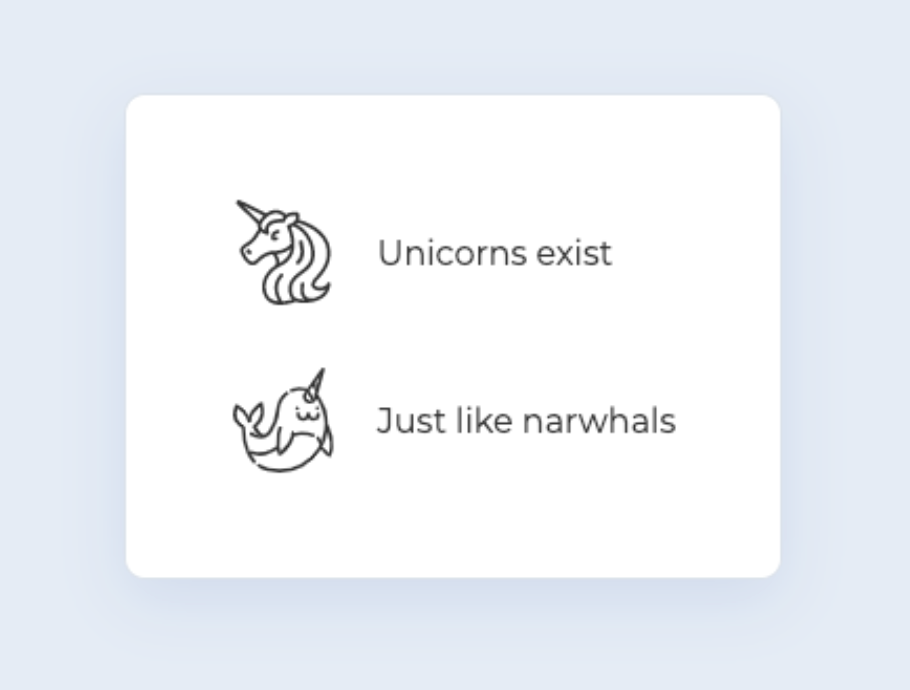
First things first - HTML and some basic styling:
<ul class="list">

    <li class="list__item">

        <div class="icon icon--unicorn"></div>

        <div class="list__txt">Unicorns exist</div>

    </li>


    <li class="list__item">

        <div class="icon icon--narwhal"></div>

        <div class="list__txt">Just like narwhals</div>

    </li>

</ul>

.list {

  padding: 50px;

  margin: 0;

  list-style: none;

  background-color: #fff;

  border: 1px solid #dce2eb;

  border-radius: 10px;

  box-shadow: 0 10px 30px 0 rgba(161, 172, 217, 0.3);


  &__item {

    display: flex;

    align-items: center;

    margin-bottom: 30px;


    &:last-child {

      margin-bottom: 0;

    }

  }


  &__txt {

    margin-left: 20px;

  }

}
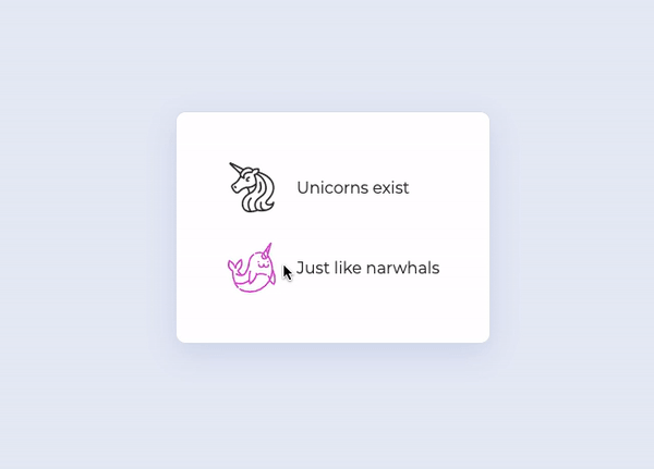
Now let’s handle our icon and mask.
.icon {

  content: '';

  width: 50px;

  height: 50px;

  background-color: #323232;

  mask-size: contain;

  -webkit-mask-size: contain;

  transition: background-color 0.2s ease-out;


  &--unicorn {

    mask-image: url("./assets/unicorn.svg");

    -webkit-mask-image: url("./assets/unicorn.svg");

  }


  &--narwhal {

    mask-image: url("./assets/narwhal.svg");

    -webkit-mask-image: url("./assets/narwhal.svg");

  }

}
Almost there... Now you should see something like this.
…and since our icon’s color is determined outside of the SVG file by CSS background-color, we can simply use a transition on hover to change it, so it works like this:
And that’s it!
No need to mess with SVG fills, strokes, adding classes or anything. Just our old HTML and CSS.


