


Design System Services

Design system services for digital products: UI audits, design tokens, component libraries in design and code, documentation and governance. Rated 4.9 out of 5 by our clients.

Trusted by

Estimate your project

Design system services, from audit to governance

Six service lines. Take one, or let us build the full system with your teams.

Design audit

We inventory the UI across your products, flag duplicate patterns, and check contrast against WCAG 2.2. The design audit shows where a design system saves the most effort.

Design tokens and Figma Variables

We define palette, type, spacing, and radius as design tokens in Figma Variables, then export them to code so a brand change reaches every product.

Figma component library

Components with variants, states, and auto layout, built on your tokens, so designers assemble screens from approved parts without detaching styles.

Coded component library in Storybook

React components with accessibility checks and tested states, documented as Storybook stories and published as a versioned package your front-end teams install.

Documentation and handoff

Usage guidelines, do and don't examples, and design-to-dev handoff notes sit beside each component, so developers stop asking designers for specs.

Governance and adoption support

Ownership, a contribution workflow, and a release rhythm, plus pairing with your teams during the first rollouts. This keeps the system in use after we leave.

Design systems backed by real delivery

17+

Years in the market

Building web, mobile and AI products since 2008.

3,500+

Projects delivered

From MVPs to enterprise platforms.

900+

Clients worldwide

Product teams in 50+ countries.

4.9/5

Average client rating

How our clients rate their work with Netguru.

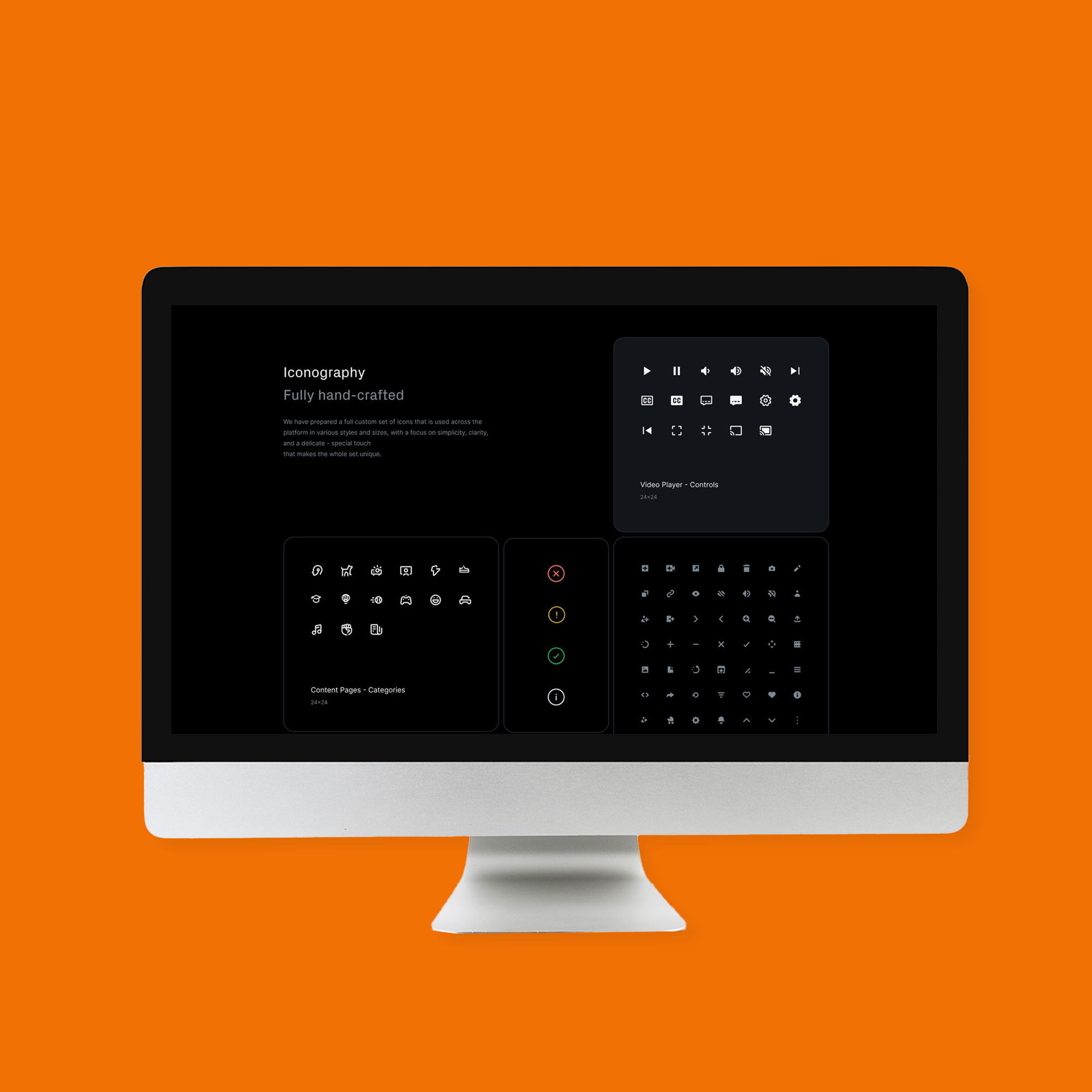
Joystream: a design system with 190+ components and 175 design tokens

Joystream, a blockchain video platform for creators, needed a customisable design system that other operators could extend without it drifting.

Netguru's design team redesigned the interface first, then built the Atlas design system: 190+ global components, 175 design tokens and 100+ pages of documentation.

  • 190+

    Global components

  • 175

    Design tokens

  • 100+

    Pages of documentation

Getting to work with the amazing talent in the Netguru roster has turned out to be one of the most material positive impacts on how we build products at Joystream.

Bedeho Mender

Founder and CEO at Joystream

Read case study
Joystream orange square preview

How a design system engagement runs

A design system lead works with designers and front-end engineers, and your own product designers and developers join from the first phase. Duration depends on product count and scope, and discovery turns that into a plan.

  1. Design audit

    We catalogue UI patterns across your products and rank them by reuse and risk. You receive a design audit report and a prioritised component backlog.
  2. Foundations and design tokens

    Designers set palette, type scale, and spacing in Figma Variables while engineers wire the token pipeline. You receive documented design tokens for web and any other platform you support.
  3. Figma component library

    We build components with variants and states from your tokens. You receive a Figma component library with usage notes, ready for your product designers.
  4. Coded components

    Engineers build each component in React, with accessibility checks and a Storybook story. You receive a versioned coded component library (React) your teams can install.
  5. Documentation and handoff

    We write usage guidelines and code examples, and agree how designers and developers work together. You receive documentation and a design-to-dev handoff process.
  6. Governance and rollout

    We agree owners, contribution rules, and release steps, then support the first product teams. You receive a design system governance model, a versioning and deprecation policy, and a rollout plan.

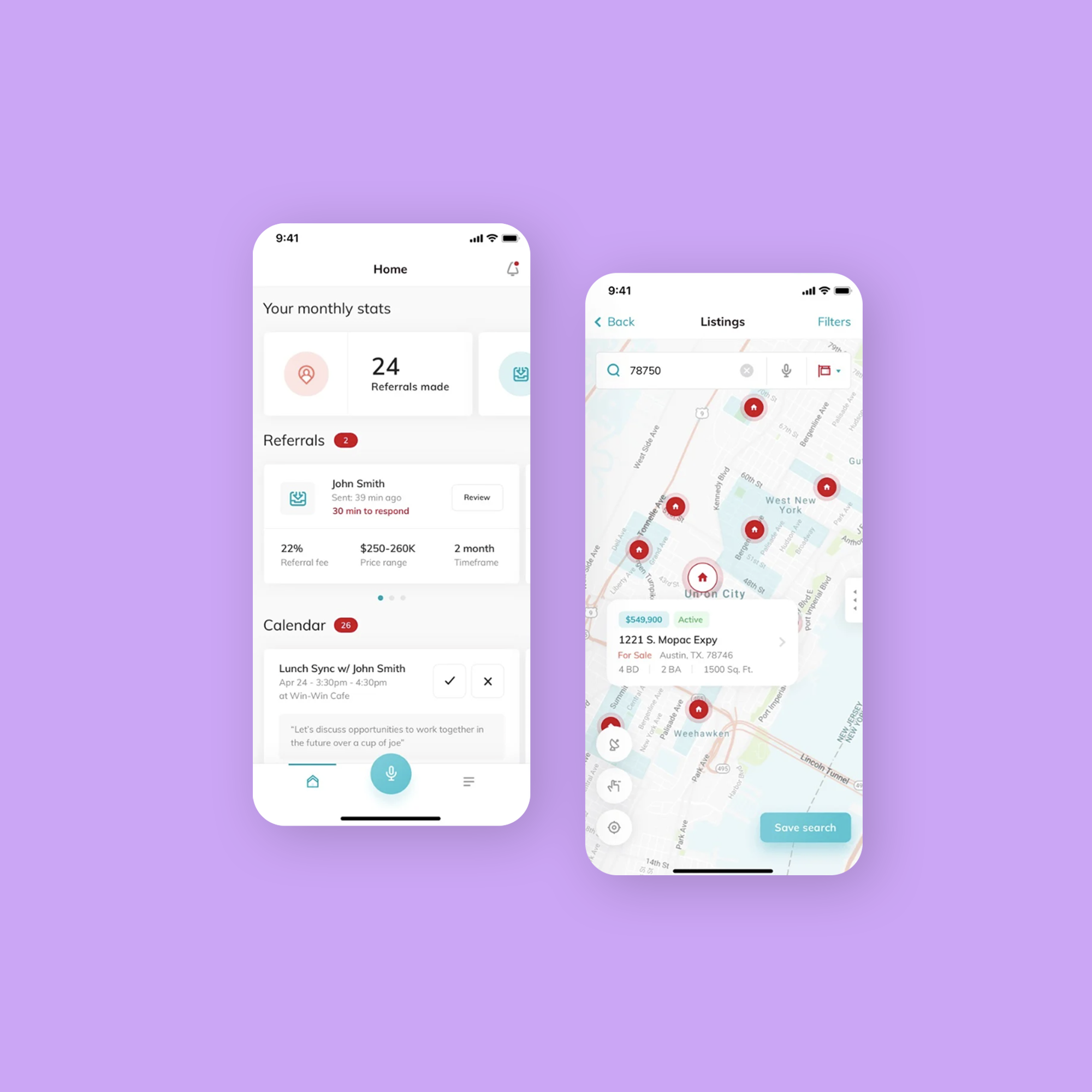
Keller Williams: a design system adopted across 100% of its products

Keller Williams, the largest US real estate franchise by agent count, was rebuilding its products and needed one interface language across them.

Netguru built a new design system from scratch with KW's designers, from visual assets to UI components developers reuse. Every product it was built for adopted it.

  • #1

    Real estate franchise in the US

  • 100%

    Adoption of the design system

  • 0

    Legacy UI left behind

Netguru has been the best agency we've worked with so far.

Adi Pavlovic

Director of Innovation at KW

Read case study
Keller Williams lavender square preview

Engineering and design standards behind the work

Figma Variables and token pipeline

Tokens live in Figma Variables and flow to code through an automated pipeline, so design and production share one source of truth.

Storybook-driven components

Every React component ships with Storybook stories that cover states, props, and interaction tests, so teams review behaviour before it reaches a product.

Accessibility to WCAG 2.2

Contrast, focus order, and keyboard support are checked per component. Our team includes WCAG expertise and an IAAP certified specialist.

Performance

We keep components lean and importable one at a time, so adopting the library does not weigh down your existing pages.

Versioning and deprecation governance

Semantic versioning, changelogs, and a clear deprecation path let product teams upgrade on their own schedule.

AI-assisted workflows

Where they fit, we use AI tools to draft component docs and test cases. Engineers review every output before it enters the library.

What our clients say

Rated 4.9 out of 5 by our clients.

Netguru has been the best agency we've worked with so far. They are able to design new skills, features, and interactions within our model, with a great focus on speed to market.

Adi Pavlovic

Director of Innovation, Keller Williams

Netguru has really great design resources. I'm very thrilled to be working with them.

Mette Kjærnet Udø

VP of Product, Aspit AS

Netguru's expertise and collaborative approach were key in transforming our website into a dynamic and intuitive platform that truly reflects our vision.

Laura Mattiucci

Director Marketing & Communications, Cardano Foundation

How you can work with us

Three ways to start. Each one comes with the same delivery standards and a named delivery lead.

Fixed-scope project

A design system audit or a first component set with a fixed scope, timeline and budget. It suits a single product or a pilot.

Dedicated team

A cross-functional team of product designers, front-end developers and a design lead that owns a roadmap with you sprint by sprint, under time and materials.

Team extension

Senior product designers and front-end developers who join your in-house team, follow your process and tools, and are matched to the skills your roadmap needs.

Design system services: your questions answered

What does a design system include?

A design system joins design tokens, a Figma component library, a coded component library (React) with Storybook, documentation, and design system governance. Together they give designers and developers one shared set of parts and rules.

Design system vs UI kit vs component library vs style guide: what is the difference?

A UI kit is a set of static Figma assets. A style guide documents brand rules, and a component library is reusable code. A design system combines all three with tokens, usage guidelines, and an owner who maintains them.

What drives the cost of a design system?

Cost depends on the number of products and user roles, how many components you need, design depth, integrations, accessibility and security requirements, and team shape. A discovery phase turns these drivers into an estimate.

Which engagement model do you recommend?

We usually recommend a co-build with your team once the first components exist, because your people then own the system. A fixed-scope project suits a clear brief, and a dedicated team suits a long roadmap with several products.

How long does a design system take?

Duration depends on how many products share the system, how many components you need, and how fast your teams can review. We build the foundations and highest-use components first, so product teams start using them while the rest is built.

What signs show we need a design system?

Typical signs: the same button exists in several versions, designers and developers argue over specs, and new screens take longer each quarter. We recommend a design audit once two or more teams or products ship UI under one brand.

How do we choose a design system agency?

Check for relevant case studies, a security certification such as ISO 27001, code ownership and IP assignment, a clear statement of work, and defined support terms. Red flags: Figma-only delivery with no coded components, and no plan for governance.

How does design system governance keep the system alive?

Governance names an owner, sets a contribution workflow, and defines a versioning and deprecation policy. Teams know how to propose a component, how releases ship, and how old patterns retire. See our DesignOps guide.

Which tools and stack do you build with?

We build with Figma Variables, a token pipeline into code, React components, and Storybook as documentation and review space. Our default is Storybook because designers, developers, and testers all work from the same live components, which also supports design-to-dev handoff.

Design system projects across industries

Case studies from fintech, retail, healthcare and more.

Talk to our design systems expert

Tell us about your product, and we will talk through scope, the right team and the engagement model.

Barbara Rybicka

Commercial Director

Click for the details