Frontend Quick Tips #9 Level up Animations With Custom Cubic-Bezier


No one likes those big articles - that’s why we’re creating Quick Tips - short tips to change your developer's life from the moment you read them.
Those may be some patterns explained in JS code on real-life examples or some techniques for better code.
Problem
Your animations are dull and repetitive? All timing functions that you know are built-in CSS ones (linear, ease-in, ease-out)? Or maybe you got a design but no guidelines on how the animations/transitions should look and you want to make them really smooth and neat.
Solution
Custom cubic-bezier to the rescue!
First, let’s answer the question: What really is a timing function used in the transition/animation property?
A Timing function describes how an animation will progress, allowing it to change speed during its course.
So this is how it looks on a graph:
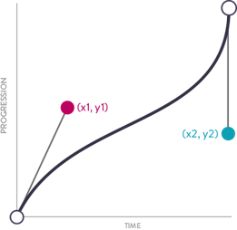
And this is how it looks in a CSS animation-timing-function: cubic-bezier(x1, x2, y1, y2). Every built-in timing function can be written as custom-bezier. Example: linear - cubic-bezier(0.0, 0.0, 1.0, 1.0).
Good news: you don’t have to calculate the values for cubic-bezier by yourself. In our beautiful world we have many tools that can do it for us.
If you want to have fun on your own, you can check out this one. By pulling points on the graph you can define your own cubic-bezier and compare it to the standard used in CSS.
If you are a really lazy person and would like to have everything handed to you, you can check the great easings website - you will find there many cool timing functions ready to use!
You can also play around with your animation directly in Chrome devtools - just click the icon next to the timing function.

Does it really make a difference? Could you show me some examples?
Let’s imagine we are building a game and we need to implement a star rating. You did a great job and managed to get 3 stars!
Let’s try to use a classical linear at first. Well, it looks rather boring.


Let’s try a custom one – add some more dynamics to the line. It’s obviously better but…


…let’s play even more. This is my favourite hack! You can stretch the line above the graph field to emulate overscaling stuff. Now it looks neat, right?


But where can I use it in a real-life project? Well, everywhere, good choices would be: modals, buttons, drawers. One last GIF with a navigation drawer for you! For sliding-in I used easeOutQuart and for sliding-out - easeInQuint.