Accessibility Is So Much More Than Contrast


Contents
Various business contexts encourage us to recognize and celebrate other cultures and populations.
This also makes us more aware of people with disabilities and problems they may encounter while accessing the web or using digital products.
At Netguru, we care about accessibility and its role — we aim to create products that are usable and accessible for everyone. Very often, it means making sure that digital products are available for people who otherwise might not be able to use them at all. Sometimes these are just minor changes — like using the right contrast. However, accessibility is much more than that.
It can improve the product’s usability for everyone: for those using their mobile phones in the bright sun — with the right contrast; for those in public spaces — with captions; for those on poor internet connection — with alternative text, etc.
What is accessibility?
In general, accessibility in the digital world means ensuring that people with disabilities are able to use the digital solutions. This includes auditory, visual, speech, physical and cognitive, learning, and neurological disabilities.
Making the digital world accessible is a decent, human thing to do — and that alone should be enough to do it.
But often it’s not, so let’s see some other reasons why accessibility should be our concern:
- 15% of the world population (over 1 billion people!) live with some form of disability. Creating inaccessible solutions means you’re excluding them from using your product. And yes, disabled people are in your target group and use (or try to use) your products. Not all disabilities are visible and certain disabilities can’t be observed in Google Analytics stats.
- Research shows that people with disabilities are very loyal customers. Once they find a solution that takes their needs into consideration, they are not really willing to change it or experiment with new ones.
- All of us become temporarily or situationally disabled sometimes due to an accident or circumstances like bright sunlight, a loud environment, etc. Roughly 20% of internet users will have or will develop a form of disability throughout their lifetime. It has been beautifully captured by Inclusive: A Microsoft Design Toolkit.
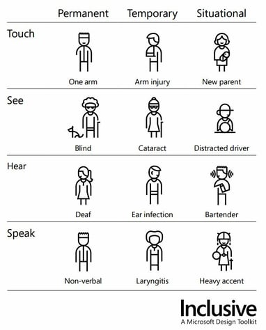
Microsoft’s approach to disabilities from Inclusive: A Microsoft Design Toolkit.
- We design for our future selves. If we’re not treating accessibility seriously, no one will create accessible software for us when we’re older.
- We hate this reason, but sometimes it’s the only one that works: In some countries accessibility of digital products is forced by the law and even though the law is sometimes not very clear, huge fines are not unusual. Currently, it’s most often observed in the USA and Canada, but EU countries are going in the same direction.
Okay, let’s look at the role of the contrast then
Keeping the right contrast is one of the WCAG guidelines. In case you don’t know what the WCAG guidelines are — they’re a set of standards that software creators should follow to make sure their products are accessible to everyone. Minimum contrast ratio of the elements (mainly text to background) is one of the guidelines and often it’s perceived as the only one.
Contrast definitely is crucial for ensuring readability of the app or website and it’s also fairly easy to implement. Color pickers like Pika and contrast checkers like... well… Contrast Checker, are your friends here and, honestly, there is no reason not to select appropriate color combinations.
For AA (middle) level WCAG conformance, the text to background contrast should be 4.5:1 (for large fonts it can be smaller, 3:1). It’s not very hard to achieve in a beautiful way — take a look at the palette done by The Zebra below. Another option for creating an accessible color palette is to use the Color Safe tool.
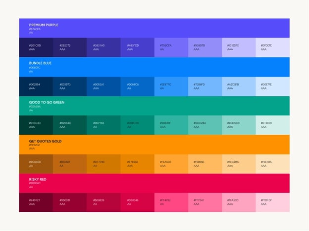
This is an example of beautiful and accessible color palettes created by The Zebra..
Yet, accessible websites are so often ugly! It’s not because of WCAG, though — as you will see in this article, a lot of the accessibility features are invisible. Keeping the contrast won’t magically make the website ugly — consider the example below from an amazing article on The Aesthetic-Accessibility Paradox.
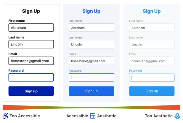
Form in the middle is an example of accessible and aesthetically pleasing design.
The contrast is an easy fix and a good starting point. To start your journey with accessibility and ensure the digital product at least basically takes into account the needs of ALL users, you need a bit more of an effort.
Read on to see how to start implementing accessibility in a meaningful way and often without it even being visible on your website!
Making your digital product more accessible
Alt text for images
Alt text allows screen readers and other assistive technologies to read a description of the image or skip it (if the image is purely decorative). Otherwise, the screen reader will read the source path of the image, which, as you might imagine, is usually not very useful for the users.
Alternative text is invisible on the website. It is set in the code, but usually needs to be delivered to developers either by designers, editors, or business owners.
Depending on the context, the same image could be described differently — mainly because we do not want the alt text to duplicate info that is already being said on the website or in the article.
Alt text is not only useful for people using screen readers, but also for those who have a poor internet connection but would still like to understand the content of the website.
Well-written alt text can help us understand what is in the image, even when we can’t see it.
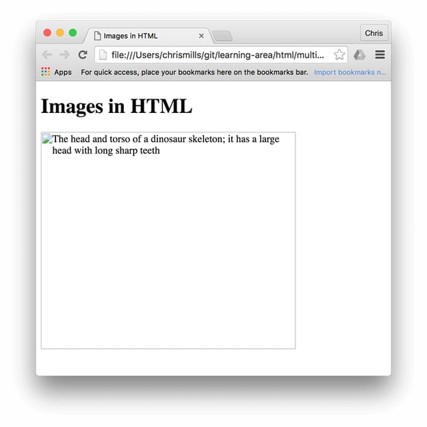
Source: MDN Web Docs
No alt text makes it impossible to comprehend what is in the picture.
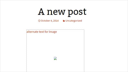
Source: Creative Blend
Lingo
Each industry has its own jargon that might not be understandable for people outside of it. Keeping it to a minimum, so that no one is (or feels) excluded, improves content readability, makes it understandable for more people, and therefore brings them more value.
Other good practices in this area include: keeping the navigation and content structure simple; adding images, videos, or interactive content to explain complex topics; and expanding acronyms and abbreviations the first time they appear in the text. These serve not only people with cognitive impairments, but also those who read in a foreign language, are in a hurry, or experience the cognitive overload that many of us struggle with these days.

Source: Accessibility is Usability presentation
Language
Speaking of language — screen readers can read text in many languages, but to do it correctly, they need to know what language a site is in. This is set by the "lang" attribute in the website’s code (and again, this attribute is invisible for the visitors). Steve Faulkner’s video below shows how a screen reader’s pronunciation is affected by setting the wrong language attribute — the text is in English, but the attribute is set to Spanish, French, and German. This way, the text might not be understandable for the visitors — listen for yourself!
Captions
Captions allow deaf and hard-of-hearing people to have access to audio or video content that is available on the website. Though they are not the only ones who benefit from this solution. According to this survey, 80% of people using captions don't have any hearing impairment. Anyone who is in a loud, crowded environment can use captions instead of listening to the voice or sounds in a video. 69% of those surveyed watch video without the sound in public and, surprisingly, 25% of them also watch videos without sound in private.
The other angle is, e.g., watching a movie in a foreign language with subtitles, because not everything that actors say is understandable. It certainly happens for me, thanks Netflix! Oh, and actually, Netflix was sued for not having closed captions in their movies.

Screenshot from the Netflix series “Disenchantment”.

Screenshot from the Netflix series “Squid Game”.
Audio descriptions
This is a similar issue to the one above. Any video content or visual information should be provided with an audio description for blind and hard-of-seeing people. This makes even more sense if you think of how many of us have deteriorating eyesight due to long hours spent in front of our computers. Also, audio descriptions are useful for people who can’t look at the screens, like drivers.
Headings
Headings allow people to decide if they want to read the page or not. For sighted people, they are usually easy to spot — prominent, big, bold font, etc. For those of us who use assistive technologies, the styles of the headings will probably not be that obvious. Heading tags (<h1>, <h2>, etc.) allow assistive technologies to understand that this element is a heading (and its level) and communicate it to the user. Heading tags are yet another invisible element that is crucial for users.
Just look at this Heading (H1) of Apple’s accessibility website.
%20of%20Apple%E2%80%99s%20accessibility%20website.jpg?width=587&name=Heading%20(H1)%20of%20Apple%E2%80%99s%20accessibility%20website.jpg)
Keyboard access
Using a mouse requires hand-eye coordination, so it’s not adequate for people with low vision, tremors, or problems with coordination. A lot of assistive technologies rely on keyboard access and create keystrokes as their output, for example, speech input software or sip-and-puff software.
This makes the keyboard the most operable and flexible way for people with disabilities and everyone else who is just purely frustrated by using a mouse or a trackpad. Hence, all functionality in a website or an app should be achievable using the keyboard. It’s also important to give a clear visual indicator of the keyboard’s focus (ie., show users where their keyboard is focused at the moment).
<Label> tags for form fields
<Label> tags are a kind of alternative text for form fields. Thanks to the labels, screen readers know what kind of input is requested from the user and can support them in entering the proper values.
Visible labels near form fields are a standard in today's internet. They make sure sighted users know what information should be entered into which field. <Label> tags are set in the code and invisible for the person visiting the website, but serve the same purpose for those who use screen readers.
Two versions of visible labels in a form published on UX Planet. <Label> tag in the code plays the same role for screen readers.
Accessibility should be your new must
Everyone can at some point be disabled (even situationally), so your solution should always meet the needs of such users. What’s more, making digital products accessible is really not that hard. Not to mention that accessibility is tightly connected to usability and improving it will bring benefits to all the people visiting your website or using your software. Results? Your product will gain loyal, longtime customers who will be happily recommending it.
I hope this article serves as a useful intro to some of the aspects of creating accessible software. And more importantly, that it allows you to see that accessibility is more than just color contrast. What we went through in this article is a mere glimpse into accessibility and the WCAG guidelines. If you wish to learn more about accessible products, start by checking out the WCAG guidelines or reach out to us here at Netguru. Together we can make your digital solution more accessible.


