10 UX Best Practices to Optimize Your Digital Product


Contents
How do you make a fully optimized product that solves problems and grows to meet evolving users' needs?
There are at least 10 great UX best practices that you can follow to ensure you know how to work with UX designers to optimize your digital product and gain a competitive advantage.
So, what is user experience (UX) design? And what steps can you take to optimize it and enhance your overall product?
UX design covers any design process that is focussed on creating a system that provides a great experience to its users. Whether it's a minimum viable product or a finished product, there are a variety of UX best practices you can follow to ensure you build a UX that supports both your product and company’s goals.
The below tips can be used to enhance the quality and longevity of digital products such as websites, mobile apps or some other digital user interface. Taking heed of these UX design best practices will make it easier to create a product that is coherent, effective and enduring. What should you pay attention to right from the start?

Make your product accessible
To begin, it is important to make products as accessible as possible for the biggest group of users. A report by the United Nations from 2011 estimated there were 1-1.3 billion people with disabilities in the world. In fact, people with disabilities are the largest minority in the world and it is important during your UX design process to consider how accessible your product is to everyone that may encounter it.
To ensure a high accessibility level for all users irrespective of their situation, abilities or context, it is important to implement a few basic design elements.
Here are a few examples:
- Consider people who are color-blind. Color blindness affects approximately 1 in 12 men (8%) and 1 in 200 women in the world (according to colorblindawareness.org). Check your designs on a contrast checker website to see if they show enough contrast. Also, don’t specify important information by color alone. Use a combination of text, color or graphical objects.
- Ensure your product is responsive. Conduct usability testing on multiple devices, so that the product is properly scalable for the visually impaired.
- Use ‘alt’ texts for images in case the image does not load.
- Be inclusive by having options in terms of gender.
For more information about accessibility in digital design, take a look at the WCAG (Web Content Accessibility Guidelines).

Source: webaim.org
Mobile design for one handed use
Inclusivity also plays a role in the placement of the elements and. Even though nowadays it’s more or less a standard practice, it’s still important to place navigation menus at the bottom of a mobile screen if you want to create great UX design.
Back when we had smaller screens, people used to be able to reach the top of their screens with their thumb with only one hand. But the way in which human-computer interaction is processed has changed.
Now, due to much bigger screens, users are not able to reach the top of their screen that easily anymore. Therefore, one of the UX best practices is to place the navigation on the bottom, so that the user can reach the navigation items with one hand. This simple design element allows you to avoid users’ frustration.
In addition, it is important to place other crucial elements at the bottom of the screen, like when you need to create a new message on a messaging app. Don't be afraid to conduct user testing and usability tests to find the design elements that suit your users best.

Example: Facebook app with the bottom navigation bar
Site scannability
Scannability is about the ease with which a body of text can be read and understood. Much like reading a newspaper, users skim your content to find what they are looking for rather than read it word for word. Therefore, you need to adjust your UX design standards to reflect this reality.
It will benefit you to keep your content lined up with two basic rules of UX writing: make it straightforward and easy to understand. If you confuse users with poor scannability they can get frustrated and will quickly abandon your product.
Here are some tips to make your content more clear and concise:
- Use bullet points.
- Keep paragraphs short. Preferably, aim for them to be under 5 sentences.
- Remove filler words to ensure sentences are short and to the point.
- Use subheaders to organize content.
- Choose colors and typography wisely. Too much variety can make the design cluttered and difficult to decipher.
- Use white space around content and double spacing between paragraphs for easy reading.
- Double check your spelling and grammar. Mistakes make your brand seem unprofessional.

Keep essential content above the fold
'Above the fold' refers to the section of your site that first greets users when they land on a page. One of the key UX best practices is to ensure that all of your beneficial information and content is kept above the fold and easily accessible.
This means that a user only has to scroll a certain amount, as ‘below the fold’ is the common point where people bounce from the page. A high bounce rate could be the sign of a badly designed landing section.
This UX design best practice is especially important for mobile users who are more likely to bounce off the page compared to desktop users.

Example: Hubspot
Use storytelling
Most people process information when it is delivered in the form of a story. Stories evoke empathy, emotion and attachment. It is UX best practice to use these emotional reactions to improve engagement with your product. Stories have the potential to make your digital product interesting and can help users develop a deep understanding of your brand.
Better yet, in addition to just telling a story—include a video of it. Presenting information through audio and/or video is an especially powerful way to help people understand the message and relate to the product.
When using a video in your design process, ensure that you are conveying authentic emotions and simple concepts. Why? People are more likely to trust and like other people when they believe they see genuine emotions rather than fake or contrived ones. Storytelling should be on any list of UX best practices because it actively engages your user and creates memorable interactions.

Example: Highline
Cookies
Turn off all non-essential cookies by default. If your website doesn’t collect or track any personal data from users, or if it only collects anonymous data, you may not need a cookie notice in the first place. Turning off non-essential cookies is one of the easiest UX best practices to follow.
In addition, present call-to-action buttons with clear copy. For notices that only use simple notifications like, “By using our website, you agree to our use of cookies,” you have to ensure the user is still presented with the option to acknowledge. Instead of using only a close button try using an “Accept and continue”. The intent of this prompt is clearer.
Furthermore, it is important to be transparent about what the cookies are used for. Give users the option to choose their own preferences. This simple UX design tip will empower the user and give them a sense of control.
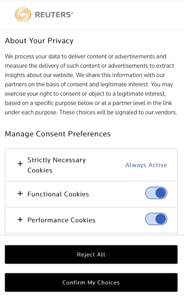
Example: Reuters
Have a logical information architecture
Another key UX best practice is to ensure that you have a logical information architecture. This is especially vital for larger products with a high number of pages and a substantial amount of content. Ask yourself, how easy is it to navigate this website?
One way to ensure a logical information architecture is through the card sorting method. Card sorting is a UX research method in which participants group individual labels written on post-its according to criteria that make sense to them. This method reveals how the target audience’s domain knowledge is structured, and it helps to create an information architecture that matches users’ expectations.
To make sure you are following UX best practices, make a list of the topics and/or features you would like to include in your product. Write down all those topics on post it notes and invite at least ten people (individually) from your target audience to group those post it notes into different categories (ten people being the minimum to indicate user patterns).
Once you have the results of the card sorting sessions, you can draw some conclusions and make a sitemap. A sitemap is a hierarchical list of things you want to include in your product. For example, you will need a settings page. On that settings page you will need functionalities like changing the password, changing the email, deleting the account, and so on.
All of this user research will ensure that the structure of your product makes sense and that your users will easily be able to find the information they need.

An example of a website which needs a well-thought out information architecture. An e-commerce website from the Netherlands: Cool-blue
Less is more
Anything that stands in the way of the user’s goal is an unnecessary distraction and should be removed. Ask yourself, are there any unnecessary elements in this design? How will each element of the design impact customer behavior? Is the user interface cluttered?
Every UX design element in your product should contribute to achieving the primary goal. Users expect simplicity and this is mostly easily achieved through minimalist and consistent design. Some of the characteristics of minimalist design include simplicity, clarity of thought, individual functionality of every element, elimination of non-functional elements, and meaningful expression.
‘Less is more’ is one of the best UX design practices because it is about sticking to the essential elements and delivering an uncluttered and consistent experience. To achieve this you must think carefully about your visual style, the design trends you want to incorporate and how you can meet user needs as efficiently as possible.

A good example of an app which only focuses on the core functionality: Shazam
Be consistent
Consistency is one of the key things to focus on if you are really committed to creating the best user experience.
Everytime a user interacts with your product the process should be easy and familiar. If a user has to find a new way to resolve a problem every time they navigate through a product, they will become frustrated and create a negative relationship with your product.
In addition to the obvious usability benefits, having a consistent product creates a sense of professionalism and evokes trust. Like many of the other UX design best practices, this tip is quite easy to implement but can make a huge difference to your end product.

Example: www.apotheek.nl
Use animations
Visual feedback is vital in UX design. In real life, buttons and other controls respond to our interactions. This is how we expect things to work. Thus, users also expect this kind of flow in digital products.
One of the UX best practices is to use animations and transitions to give the user more context and a better understanding of how the product works.
Animated objects attract a lot of the user’s attention and help guide the user to the next step of an interaction. For instance, minimizing a window on MacOS will activate a motion in which the window is minimized to the navigation bar on the bottom. This ensures that the user knows where to find the window when it needs to be opened again. This simple design pattern influences user behavior and ensures a reliable user experience.
In addition, animations and transitions can make the product experience feel seamless and create a more positive relationship between the user and the product.
When elements move between states, the movement should be fast enough so users don’t have to wait, yet slow enough so users can understand the transition. A general rule of thumb is to keep the animations at a duration of 300ms or under.
Continuous UX Improvement
All of these tips are focussed on making sure your UX design decisions keep users informed and address their needs and align with your overall business goals. Hopefully you can follow some of these UX best practices to create user-centric digital products and kickstart innovation within your product team.


