4 Steps to Great User Onboarding


We’ve put together a list of dos and don’ts you can follow when trying to ensure that your onboarding process offers the best UX possible.

Conversions vs onboarding
Gaining users is tough enough on its own – but it’s only half the battle.
Conversions, conversions, conversions. Sometimes we can be so lost in ensuring we acquire as many new users as possible, that we can often lose sight of the fact that once the conversion is made, we’ve then got to make sure that those new users are having an excellent first-time experience of our product in order that they are sure to come back again and again (and again and again). Indeed, we cannot settle for simply acquiring new users, we must turn them into active ones.
Yes, conversions are one thing, but onboarding users is another discipline entirely.
The problem often comes in the form of user expectations. It wouldn’t be an unfair assumption to say that the majority of people are, generally speaking, pretty internet-savvy these days. When we start using a new website or application, if the developers have been smart, then we can normally find our way around the basic features and functions pretty intuitively. We know where to look, for instance, for the navigation menus, the shopping cart, the blog.
But there might be some functions on your product pages that may require a little more explanation for use – or so you think. As Nate Munger points out in a blog post for Inside Intercom:
“Some new users expect you to welcome them and show them around the place, while others prefer you to get out of their way as soon as possible and let them figure things out for themselves.”
Getting the balance just right is the name of the game, but, needless to say it’s not always a very easy task. Thankfully, however, there are some very helpful dos and don’ts that you can follow when trying to ensure that the onboarding process offers the best UX possible, and we’ve put together a list of them as part of a walkthrough of the process to help you.
The Key Elements Of The Onboarding Process
1. Introducing The Product
When users encounter your product for the first time, for successful onboarding, it’s imperative that the product is explained to the user cleanly, clearly and enticingly. So…
Do:
Focus on the value of your product – this needs to be communicated very early on. If your product is developed in such a way that the true value of it doesn’t become clear to the user until, say, the third or fourth time they’ve used it, then this will often be too late for many of them, and you will have lost some potentially active users. So, communicate the value of the product in no uncertain terms in your introductory pages.
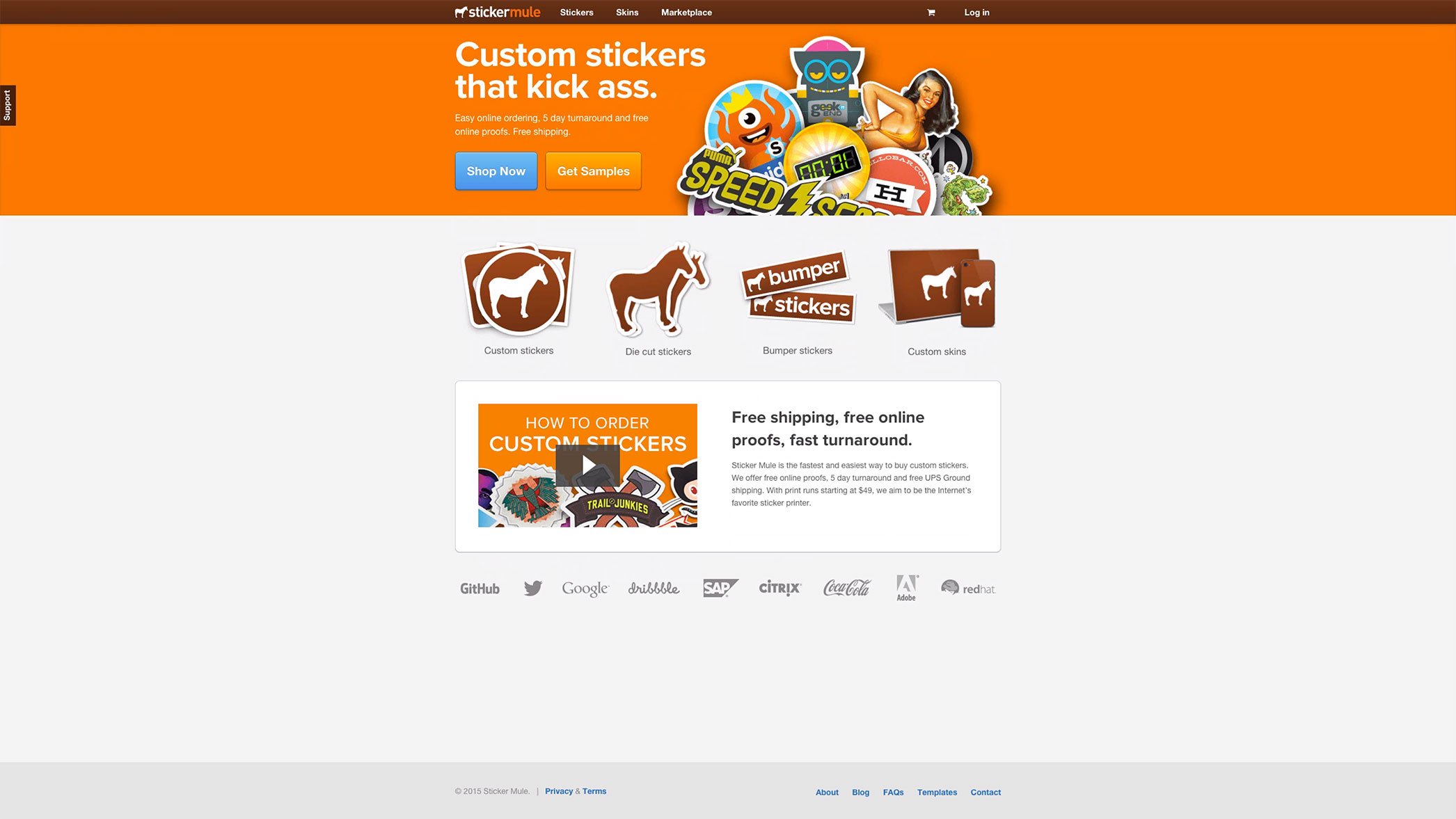
Photo by Useronboard.com.
Sticker Mule’s landing page ticks nearly all the boxes – decent value prop, great examples of stickers, clear CTAs. Good stuff.
Don’t:
Count on your product’s interface to explain the value of your product. This point is made abundantly clear on a post by helpscout.net:
“Getting users to figure out your product’s value by learning its interface is like getting people to follow a recipe when they don't have the slightest idea what they’re cooking. You don’t start with instructions to knead dough and simmer sauce and hope it turns into a pizza—accomplishing anything of significance requires setting the proper context beforehand. In this case, that context is how much their lives will be improved with your product in it.”
Don’t use too many slides and cram these pages with too much information, as in the example below:
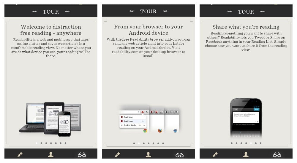
Photo by smashingmagazine.com.
Point taken, Readability - reading is a way of life. But why stop potential customers from getting straight to the point by making them digest so much information in the first place?
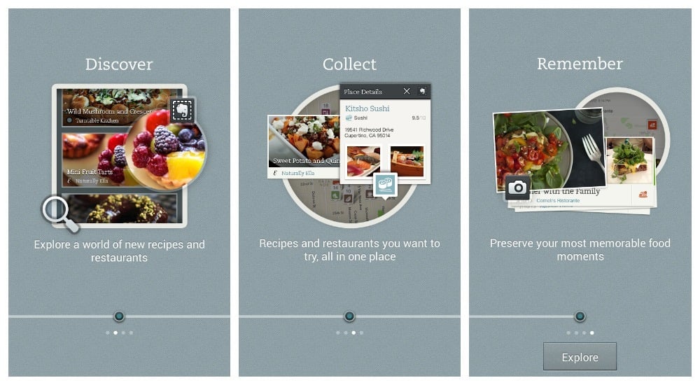
Photo by smashingmagazine.com.
Evernote Food onboarding process. Well done!
Here, Evernote Food use a nice introductory page sequence explaining the value very clearly to the user before he or she gets stuck into the app. The user knows what to expect from the app by seeing these pages first, and that’s a good thing.
2. Signing Up
You can’t hope to onboard anyone unless you make the conversion process as quick and pain-free as possible. With this in mind:
Do:
Offer social logins, as these will offer users a one-click sign up. There will be no need to get your users to set up a brand new profile, as it will use an already existing one from, for example, Facebook, Twitter or Google. Social login is proven to be trusted and popular, and what’s more, it’s very handy. In a 2013 Blue Research report commissioned by Janrain, it was found that 92% of people have stopped using a site because they’ve forgotten their password. Also, as Web Hosting Buzz says in their infographic, 86% of users are bothered by the need to create an account for a website. Social logins solve this problem almost entirely.
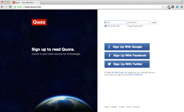
Photo by Blog.intercom.io.
Sign-up process by Quora, quick and simple.
Don’t:
Ask for too much information from the user when signing up. If your new users don’t want to sign in with an existing social account, then they shouldn’t have to – but that doesn’t mean you need to know absolutely everything about them when they fill out your registration form. Some products require users to not only fill in their name and email address (which, frankly, should be all you really need), but their date of birth, their occupation, marital status and what they had for breakfast that morning. Put simply, if you have too many required fields to fill out in your form, then people will either think that you’re being too invasive, or otherwise just get the sense that the process is going to take too long, and either way they abandon ship before it sets sail.
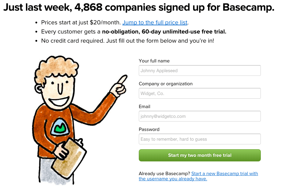
Photo by Basecamp.com/start.
Here, Basecamp get the sign up form pretty much spot on. Only 4 fields to fill in, and there’s even a friendly cartoon of a man literally pointing the user in the right direction. Very subtle, very clever.
3. Encouraging Use Of The Product
Your users understand the value of your product and how it’s going to enrich their lives, you’ve guided them thoughtfully through a very simple sign up process – and now you want them to start using and enjoying the experience of what you have created.
Do:
Find a means of encouraging them through your product in a way that helps them to complete meaningful tasks with a clear end goal in mind. If necessary, provide a tutorial of how to use your product’s essential functions – but don’t let it be too intrusive. Users should be able to turn off the tutorial if they want (and of course quickly refer to it again in the future should they ever become stuck). If you’re using video tutorials, then they should be short, clear, friendly and fun.

Photo by Slack.com.
This storytelling-type video by Slack gives you the idea of how their product works and what benefits it brings to a company - all in just two minutes. Also, it combines a customer recommendation and a case study. A real example to follow!
Don’t:
Let this stage be anything less than exciting for the user. You will need to make sure that very clear ‘success’ messages are displayed to the user as they progress, that the value and benefits of the product are reiterated throughout, and that there are no ambiguous calls to action.
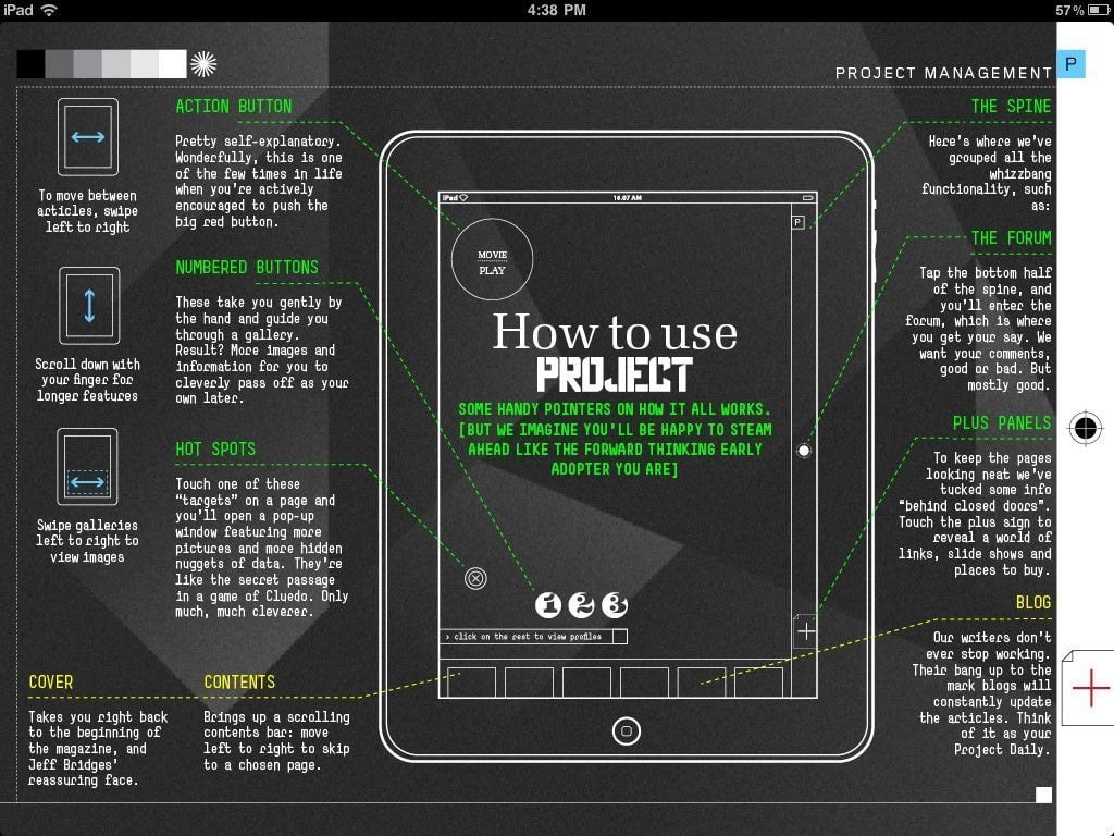
Photo by Elezea.com.
This tutorial screen from the magazine app Project is just too much. Too many tips are being shown at once and it’s all rather overwhelming. It’s asking too much of the user, and makes the product seem overly complicated.
4. Generating Leads
The ultimate aim of the onboarding game is of course to guide your new active users along the path to purchase.
Do:
It may be that you want your new users to upgrade from freemium to premium, and during the onboarding process is a great opportunity to do this, as new users are motivated users. Your freemium version is full of value – that’s already been communicated – but now you’ve really got to focus on how great your new users’ lives would be if they chose to upgrade. You’ve got them hooked, now seal the deal.
Below is a good example of the right way to do it from Nimble. It’s a gentle reminder to the signed up user who has yet to become active. Importantly, the value of becoming active is nicely reiterated here, and instructions are given as to how to proceed. Furthermore, a free download is offered as part of the bundle (a true Jedi move).
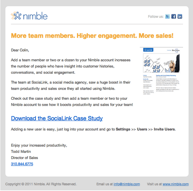
Photo by Customer.io/blog.
Don’t:
Abandon your new active users if they don’t upgrade on their first visit. It’s important to follow up all first time visits with an email, encouraging them to come back and use the site again. If it’s a free trial model that you are using in your onboarding process, then you need to send out reminder emails regularly when the trial period is coming to a close – though remember to focus on the value of your product, instead of just sending out a string of commanding messages, which will do nothing but irritate your users and put them off your product for good.
How do you feel about your user onboarding process now? Would you like to make some changes, or you think it works well just the way it is? Share your tips and tricks with our readers - we're looking forward to see your comments!
Now that you've found out how to encourage your users to get accustomed with the app's features, make sure you haven't crammed too many. Read why more features won't save your mobile app.


