Landing Page Design: 8 Best Practices


Contents
Poor conversion numbers almost always mean that your design, message, and target audience are not aligned. Learn how to make sure your LPs are converting with these simple landing page design best practices.
A landing page (LP) is a place where users “land” after they interact with content from various traffic sources like an ad, a social media post, or an answer in a search engine. It is a step in a user journey and one of the key channels of communication with your audience. Its main purpose is to represent your business, encourage customers to learn more about your offer, and, hopefully, use your services.
A great landing page design is essential to attracting the audience, keeping users on the site, and converting them into customers.
If you’re curious about the ways you can perfect it to support your business, discover some of our best practices for creating an effective landing page design for your company
Types of landing pags
Landing pages (LPs) are usually designed with a single purpose in mind.
There are a dozen different types of them, but, depending on the business goal behind the page, we can distinguish between the two most common categories: clickthrough landing pages and lead generation landing pages.
Click-through landing pages
Click-through landing pages act as a “middleman” between an ad and the final destination page. They direct the user straight toward an offer or a product with the hope of shortening the transaction process. They usually present a piece of brief information about the product or service and a simple call-to-action that guides the user to a product page or checkout. This way, click-through LPs allow you for a much swifter transaction completion.
This type of landing pages is often used by SaaS and e-commerce businesses.
Lead generation landing pages
Another common landing page category is the lead generation LP.
The purpose of so-called “lead gen” or “lead capture” landing pages is to collect users’ data and contact information in order to i.e. encourage users to join a subscription or engage the customers in a high-ticket sale. Oftentimes, these LPs come with an additional motivation factor for leaving your contact info, such as free access to an e-book, a webinar invitation, or a shopping discount.
Lead generation pages are a frequent part of B2B sales and lead gen strategies, but you can also see them used in B2C by e-commerce companies.
The difference between click-through and lead gen landing pages
Although lead capture and click-through pages might sound a bit alike, their roles are very different. Click-through LPs' goal is to speed up the sales process, while lead gen is more about gaining information about the users and building a bond with them before selling a given product.
The roles of a landing page
There are a number of reasons your business should take an interest in creating a top landing page design. Creating hype, increasing conversion rates, driving word-of-mouth – the right landing page design can help you reach your goals.
Let’s discuss some of the most common roles of landing pages:
- Lead capture – The main role of most landing pages is to collect users’ data through a user-friendly contact form. In order to make the most out of lead capturing, you need to present crucial information about your offer and a clear CTA.
- Click-through – Another important purpose of landing pages is the click-through, which is a go-between the ad and the destination page. In most cases, its purpose is to supply the user with key information to shorten the customer journey. Sometimes, click-through pages can also provide customers with an additional incentive, such as a free trial or a coupon.
- Splash page – Splash pages are LPs that appear right before the user reaches a destination page. Their goal is to obtain some information about the user before presenting more. In most cases, they require minimal action from the user. They can ask the user to fill out their date of birth or an e-mail address, among others.
- Squeeze page – The main role of a so-called “squeeze landing page” (or an “opt-in” page) is to drive transactions. These pages are short and contain minimal info and visuals. They’re pretty similar to lead gen sites, but they offer well-defined action point, such as ordering a copy of an e-book or making an appointment with a serviceman.
- Coming soon – The coming soon pages are the best way to tease or hype up your audience before you introduce your offer. They can act as a sneak peak into your business. These sites can hold some basic information on the company, contain a countdown, or include space for leaving contact info to get to know the offer as soon as it goes live.
- Referral pages – If word-of-mouth is an important aspect of your business, referral pages are a must for you. The role of these landing pages is to drive positive word-of-mouth and achieve a wider reach by offering your customers additional benefits, such as discounts or gifts.
The difference between a landing page and a home page
What’s the difference between a landing page and a home page?
A home page allows your customers to learn everything they need to know about your business, explore your products, and read about your values. It’s like a book that tells the whole story of your company. Home pages usually contain an elaborate navigation system and lots of links. They often encourage a lot of scrolling and click-throughs.
The landing page, on the other hand, is much simpler. It’s more like a digitized leaflet with key information and, ideally, one link or form only. Its goal is to encourage one simple action.
Landing page design best practices
Having learned the basic principles behind landing pages, let’s talk about creating one that’s as effective as the page can get. Discover these 8 best practices for a successful landing page design.
Simplicity is key
When designing a landing page, focus on your goal and get rid of everything that could clutter the site, making it harder for users to reach their destination. Here, less is truly more.
Make sure that you create a hierarchy and stick to it, building a flow that your users will want to follow. Focus on the things that matter and remember not to distract your audience with unnecessary information.
Many times, it may be better to minimize the number of images and videos. By using proper whitespaces and the right balance between visuals and typography, you can highlight the most important actions and make your CTA prominent, raising the conversion level.
Make your call-to-action literally call to action
CTAs are one of the fundamental elements of every landing page design.
If you want your call-to-action to stand out and drive conversions, make sure that it’s easy to find and clearly visible to the users. You can do that by using bright colors and applying the right contrast ratio.
Another important aspect is the copy – it needs to be as specific as possible so that the users know what to do and what happens after they click on the button with the CTA.
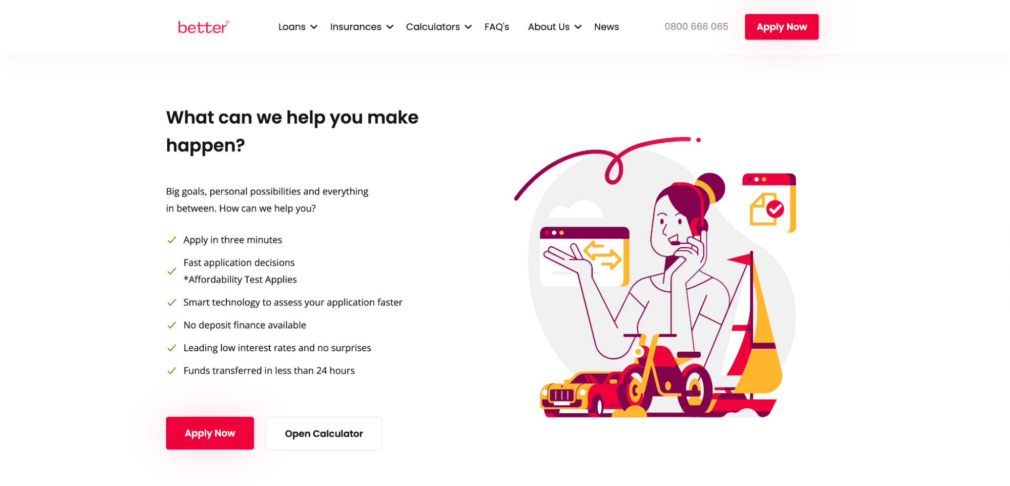
Take a look at the example below. In our project for Better, we used a bright red color for the CTA in order to catch the user's eye. There is the same, simple, and direct copy applied on all key call-to-actions within the page, so the user knows what to expect. We also made sure to keep the right balance and don’t overuse the CTA, as it might overwhelm the visitors.
Remember that without a clear CTA, your landing page cannot fulfill its purpose.
Create engaging content above and beyond the fold
Want your audience to feel excited about your offer? Make sure you tell an interesting and relevant story behind it. The best way to do it is to apply these few rules like ClickUp:
-
Benefit-oriented title
Short, simple, and extremely to the point. The audience gets a clear indication of the real benefit that comes with using the product.
-
Value-driven subtitle
Another excellent example of a bold copy that shows the value behind the product in a very straightforward way.
-
Adequate and high-quality visuals
ClickUp uses some of the app’s screens to provide the audience with a sneak peek of what using their product might actually look like.
-
Strong social proof
To enhance the value they bring to the table, the company presents social proof with the number of positive reviews of their product and some powerful brand names of organizations that already used their solution. -
Simple CTA
Last but not least, the page provides users with a short CTA. In addition, the call-to-action is complemented with a piece of information stating that users can try the product for free and without credit card info. Putting this benefit right along the CTA makes it convincing and increases conversion rates.

Highlight the benefits in your headlines
Headlines are one of the first things your audience notices when entering your page. Make sure that you highlight the benefits of your offer right there to decrease a bounce-off and make your way toward a successful conversion.
Remember that people don’t necessarily read each word of every section of the site, so make your headlines engaging and concise.
A great example of highlighting the benefits in headlines is Linktree. The company provides persuasive, bold, and clear copy that conveys the benefits of using the product.


Pay attention to the visuals
Visuals are a part of your story, and choosing the right ones is what makes a great landing page design. Ensure that every photo, video, and graphic that you use on your page contributes to your goal and guides the user toward the conversion.
Be consistent, use materials that are in line with your branding, and add images that best illustrate your offer.
One example of strong and highly characteristic visual communication is Netguru’s “Hidden Heroes” project where we tell the stories and celebrate the people behind various tech breakthroughs. The site has been awarded The Drum Awards 2022 – a global program that recognizes the best businesses and people from the marketing and communications industry.
To make it unique, we invited several artists to help us with creating illustrations that depict our “hidden heroes” in the artist’s individual style yet are still in line with brand communication.

Add social proof
Social proof can be a very valuable asset when it comes to the top landing page design.
According to Statista, in 2022 in the U.S. customer reviews were a source of new product shopping inspiration for as much as 27% of the surveyed consumers. Yet, in order for social proof to be believable, it needs to be authentic. If you want your audience to trust your reviews, include the name, surname, or company name of the customers reviewing the product. Don’t ever use stock photos – these can be easily spotted, discrediting even the best solution.
There are different types of social proof. These may include:
- Written reviews
- Testimonials
- Number of users
- Number of reviews
One of our favorite examples of well-implemented social proof is the one used by Miro. The company uses three different types of social proof above the fold:
- A big number of active product users
- General information about the number of reviews and stars
- Corporate logos of companies that use their solution

Another way Miro uses social proof is by creating a separate section and an additional page. The company decided to use the section to present written testimonials from their customers. After clicking on the CTA button above the reviews, the users are redirected to a “case study page” where they can read more stories from Miro’s users.
 Provide a relevant offer
Gather and highlight your product’s most important values that could help your customers convert. Write a clear, benefit-oriented copy that includes your USP and addresses the needs of your audience.
If you offer a product or a service to a number of different target groups, think about designing more than one landing page. The more personalized the offer, the more your audience is likely to convert.
Remember about responsiveness
Lastly, don’t forget about user experience and increasing conversion for mobile users. Having a wonderful web UX is not enough anymore. Know your audience and their preferred devices and make sure you’re addressing all of them.
According to Statista, in the second quarter of 2022, mobile devices (tablets excluded) generated more than half of global website traffic, and, thanks to Gen Z, this number will most likely continue growing in the following years.
Top-notch landing page design examples
How do these tips work in practice? Let’s take a look at some examples of an excellent landing page design.
Maze landing page
Maze’s landing page consists of bold, amazingly animated 3D visuals that catch the user’s eye. They provide a very straightforward CTA, encouraging visitors to try their service for free. They’ve added a social proof with the number of customers and reinforced the most important values and features of their offer.
What’s also a good practice is that they included a clear description of their target group right on top of the page and created the design in a way that’s appealing to the specific personas.

Shopify landing page
Shopify knows how to keep it simple. Their trial page is very minimalistic with highlighted benefits and the price of their service.
The interface of their LP is super clean and consists of simple value-oriented headlines, crafted images, and short paragraphs. The call-to-action is at the center, and the form is one-field only, which makes it very easy for users to convert.

Open phone landing page
Another great example of a well-thought-out landing page design is the Open phone’s site.
The company opted for high-quality visuals and a trendy UI style. Their CTA is very clear and provides users with straightforward information stating they can try the product for free. The offer’s features are highlighted and described as user-oriented benefits.
The company uses social proof with brand names and offers the possibility to learn more about their customer success stories in the linked case studies.
Last but not least, the landing page presents the real components of the product, making it easier to imagine what using it would be like.

Flodesk landing page
Flodesk landing page has a very inspirational design with a unique layout, bold colors, and interesting UI, encouraging the visitors to scroll. The visuals used on top are also examples of what the customer can achieve by using their service.
The company presents all the features of its product in a listed, concise way.
This modern, extraordinary design perfectly suits the company’s target group – 18-34-year-olds.

Netflix landing page
With well over 200 million subscribers, Netflix truly knows how to make the best of its landing pages.
The company’s LP is a simple one. It uses a few, high-quality images that present its most buzz-worthy shows. The texts are benefit-oriented and kept short, and the CTA clearly stands out from the site thanks to the bright red color and a straightforward copy.

Common landing page mistakes
Too much clutter or an overly complex page layout
Landing pages were meant to be simple. Most of them have the same goal: shortening the conversion process. A cluttered design with an overwhelming amount of information can be confusing and discouraging for the users.
If your audience feels lost and won’t be able to find the information they need right away, it’s likely that they’ll leave your page without converting.
Lack of focus and clarity
Before you start working on your landing page, ask yourself about its goal and then design the page with it in mind. Whenever you feel like the page is lacking something, think about whether this element will help your goal or whether it could become a distractor for your audience. Multiple CTAs and unclear communication are actively cluttering your user’s mind.
Remember that balance is the key. If you add too much „important information” to your page, in the end, nothing will seem important.
Low quality or no images
From the user’s perspective, the quality of your visuals says a lot about the quality of your service. To impress your audience, be sure that your images are top-flight and are painting the right picture for your business.
Stock-like, generic, or pixelated photos can bring you more harm than good or even make your page seem fake and unsafe to use.
No social proof
Reviews, testimonials, and ratings – they all build trust in your business. The lack of them may lead your visitors to question the credibility of your page, making them less likely to use your services.
No clear and compelling value proposition
Why should the user choose your offer over any other competitor? Answer this question and keep it in mind while creating all the content for your landing page.
Many times it’s better to have one, strong benefit than a number of generic ones that distract the user.
Slow loading time
A 2019 survey by Unbounce found that nearly 70% of consumers say that page speed impacts their willingness to buy from an online retailer. What's more, half of the surveyed people said they’d be willing to give up video and animations for a faster loading time.
Slow load time can turn your potential customers away, that’s why it’s important to optimize the page speed.

Lack of responsiveness
Whether we like it or not, the number of mobile users is rapidly growing. Not addressing their needs could be a big mistake that takes your landing page’s conversions down with it.
Top landing page design: a quick sum-up
Landing pages are an important part of your communication with the audience. Yet, nowadays users are usually impatient and tend to scan the content instead of carefully reading it.
According to Gartner, on average as much as 48% of website visitors leave the primary landing page without engaging deeper with any marketing collateral. This is why businesses need to design their pages in a way that provides their users with the most important information up front.
If you present your offer’s benefits and the value it brings to the table in the right form, you have a chance to significantly increase the conversion.
Introducing just several best practices of landing page design optimization can greatly influence the way your audience sees your business.
A top landing page design can help you communicate better with your audience, build stronger relations with your customers, generate more leads, and, in the end, sell more products.
This blogpost was created in collaboration with Agnieszka Jucha Kasperczyk (Senior Product Designer) and Bogdan Onofrei (UI Designer).


