How to Improve Website Navigation Using These 12 Tips

Contents
Website navigation is the most important feature of the overall user experience and can make or break your chances of conversion. Having a solid site navigation system is critical to maintaining high user retention rates and low bounce rates.
Nonetheless, many website owners focus on website design and multimedia, ignoring the fact that even well-designed sites can lose up to 55% of visitors due to poor navigation. Users don’t like to dwell on to find information they need when they can just switch to another resource.
Outstanding web designs leverage good navigation to support business goals and, at the same time, offer users a streamlined experience, both on desktop and mobile. If you want to stop pushing visitors away, start improving your website and app navigation with our 12 tips right now.
Key Takeaways
-
Effective website navigation is crucial for user experience and includes various components like menus, breadcrumbs, and links. It’s necessary to have a clear and organized structure for ease of content location, which affects site engagement, SEO, and business outcomes.
-
There are several types of website navigation menus — horizontal, vertical, dropdown, and footer — each suitable for different website structures. The choice depends on the content needs and user pathways, with considerations for both desktop and mobile layouts.
-
Designing user-friendly navigation involves best practices such as maintaining simplicity, ensuring consistency across pages, and creating responsive layouts. Utilizing analytics and A/B testing for optimization and avoiding common mistakes like menu overload and inconsistency are also key.
Understanding Website Navigation

Imagine a website as a multi-story building. The navigation system serves as the elevator panel, guiding visitors to their desired floor or information. This includes components such as menus, breadcrumbs, and links that direct visitors towards content and features, significantly affecting user experience.
This roadmap indicates the intricate information architecture beneath, including important pages. The navigation menu, acting as the main gateway to other webpages, must be clear and simple to support the user’s journey. It highlights the necessity for a well-organized navigation structure, ensuring clarity for visitors.
What is Website Navigation?
Website navigation serves as the interface giving visitors access to various areas of a website. This collection of user interface tools, including the website navigation menu, guides users through a website, aiding them in efficiently locating content and features. The website navigation structure, consisting of components such as menus, breadcrumbs, and internal links, plays a crucial role in ensuring a smooth and intuitive user journey.
Importance of Good Navigation
Good website navigation serves as a guide to help users find what they’re looking for quickly and easily. It encourages them to stay on the site longer, enabling them to fully explore all that the site has to offer. A whopping 38% of consumers focus on navigational links and layout upon their first visit to a site.
Therefore, good navigation greatly augments user experience by simplifying information location. It holds a significant impact on website success as it enhances SEO, fosters trust and credibility, and ultimately boosts conversions and business revenue.
1. Tie navigation with business priorities
Aligning the website design with business objectives will not only help you clearly communicate the purpose of your business, but also help you funnel the visitors to the most important features for conversion and sales. Be aware where you want your users to end up and offer a short, clear and intuitive path(s) that gets them there. The next 11 tips will also help you to tie navigation with business priorities.
2. Incorporate Calls-To-Action
CTAs are indispensable to directing users to where you want them to end up. The right CTA can also improve your click-through rate and help you turn more leads into customers. These buttons are also ideal for when you want a potential customer to fill out a form, share your content online, or even sign up for an event you're promoting. Precise and catchy phrases will perform much better than the usual “click here” button.
3. Limit the number of menu options
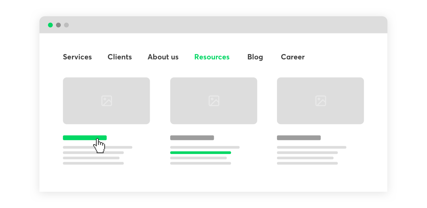
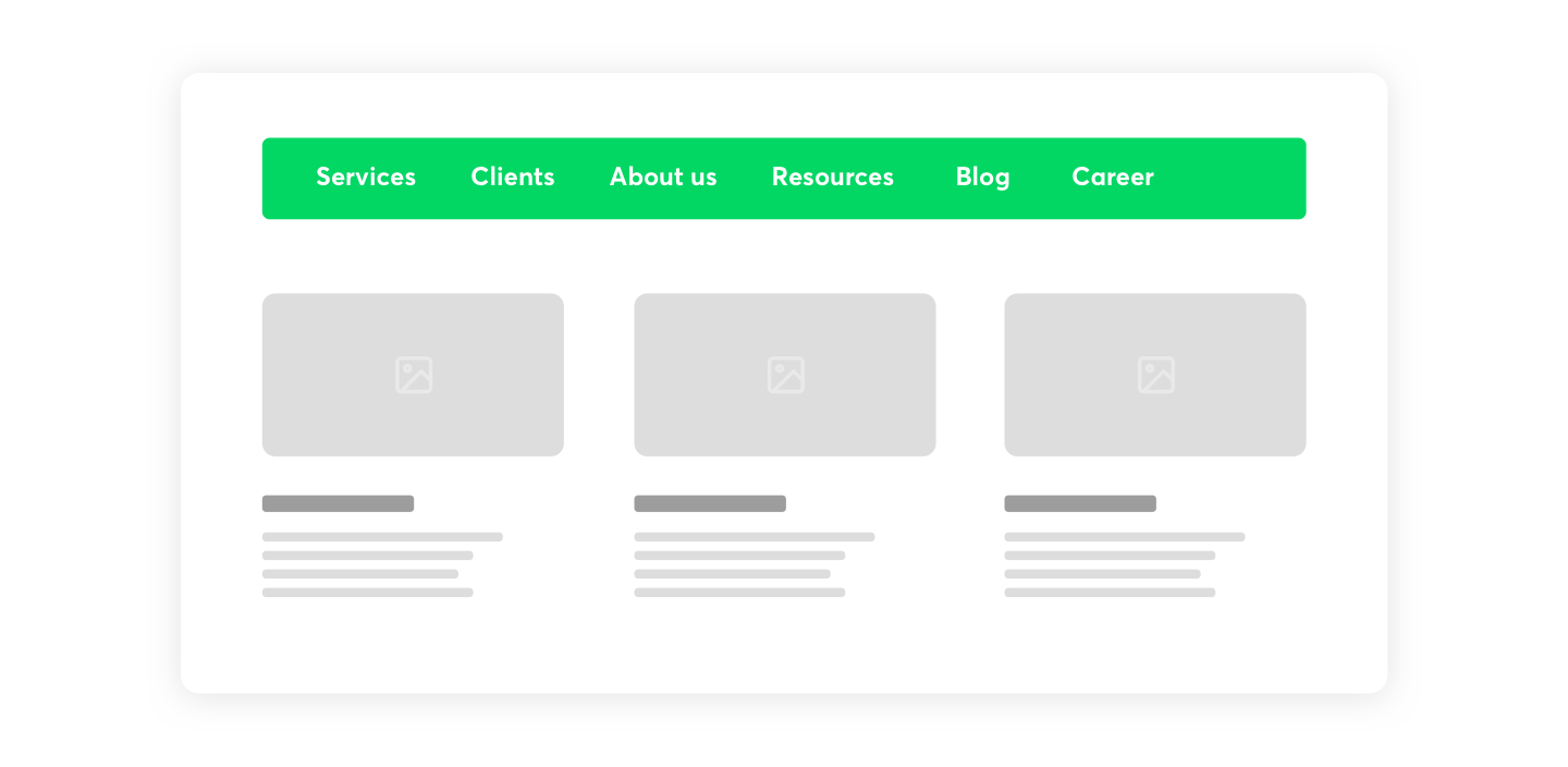
Users don’t usually have a lot of time to digest the structure of your website, so the simpler the menu, the better. Seven or eight categories to choose from is plenty, so don’t go above that number. More options may confuse the audience and cause them to abandon your website - they won’t spend their precious time trying to figure your website out! Concise menus also index better in search engines, which assigns more authority to interior pages, driving more traffic to your website.
4. Split categories
Your website’s navigation system probably has several categories, sections, and subsections. These should have good, SEO-friendly titles, but that's not enough. Your categories should also be clearly presented on the site and visibly separated from sub-categories. This is important for keeping the user informed at all times as to their location. Visual cues that can help users navigate include contrasting colours or banners stretched across the full width of the website5. Remove misleading navigation titles and text
Look out for inaccurate navigation titles and links that could confuse the visitor or annoy them. This is a popular reason for site abandonment. Visitors should have true information about what they will find if they click on a navigational link and misleading them is never good for user experience. Ensure that all language is an accurate portrayal of the page it corresponds to, which also applies to images.
The intent may not be malicious — being vague or unclear could be enough for a user to frustrate out of the process.
5. Create a sticky navigation bar or a back to top button
If you’re creating a long page, add a sticky navbar that will be visible to users as they keep on scrolling down. You can also include a back to top button that will help users quickly return to the key content included at the beginning. The point is to make the website quick to navigate for time-poor online users and ensure that all the pages are easily and quickly accessible.
6. Don’t underestimate the footer navigation bar
The bottom navigation bar is excellent for displaying your sub-categories! Think about it - users that browse through your website all the way to the bottom may be thirsty for more information. The footer is a good place to include all that extra information or more options, but don’t forget to also include links that belong to primary navigation bar categories.
7. Add a search bar
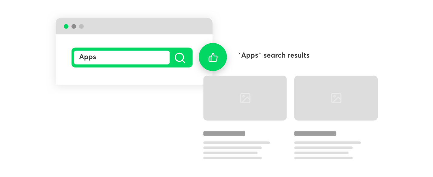
Users looking for specific information may prefer to use the search option instead of scrolling and looking for something manually, so make sure you add this feature to your website. The ideal place for it is right at the top of the sidebar or in the header area, but aside from making it easy to find, it actually needs to work. A search bar that yields no results harms your business! The search bar should always yield quality results, accommodate typos, and show related products and items. Google offers a programmable search engine to add custom search to your site.
8. Make it easy to move from one page to another
Users should be able to go from one page to another without friction, so aside from including links to other pages on your website, it’s also good to make all pages accessible from the navigation bar. When designing the menu bar, think about the flow of the information architecture. Opt for a navigation map that provides clean and intuitive paths. Navigation icons are a quick and straightforward way for the user to find what they need.
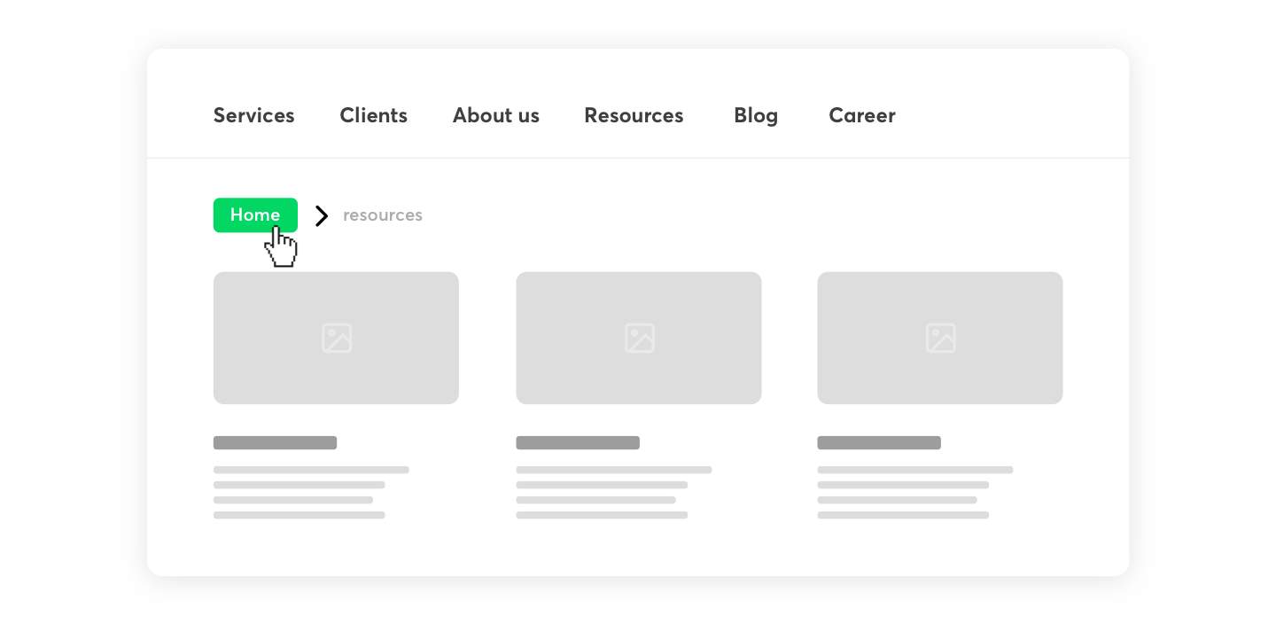
9. Include links to the homepage
Visitors may want to return to the homepage after checking other pages, so make sure this option is always available. Never force visitors to use the 'back' button in their browser to go to your home page. The homepage acts as a base camp for the user journey, so that’s where they usually return having explored other sections of your site. Embedding this link in your company’s logo is a good and intuitive way to drive users back to the homepage.
10. Make good use of colors
Application of different colors can add visual navigation cues and positively impact usability. Creating contrast and using eye-catching colors can help users identify important elements faster and should be used to drive attention to the navigation bar. Make sure you visually differentiate it from the rest of your content. You can explore color theory for this purpose.
11. Prioritize mobile navigation
Did you know that Google indexes and ranks websites on the basis of what’s on their mobile versions? That’s certainly the most important, but not the only reason why you should thoroughly consider how to best use the mobile device display space in terms of content distribution. Here are a couple of statistics:
- As of January 2021, almost 60% of the global population use the internet, according to Statista (that’s 4,66 bn active users!).
- In March this year, almost 55% of those users browsed on their mobiles.
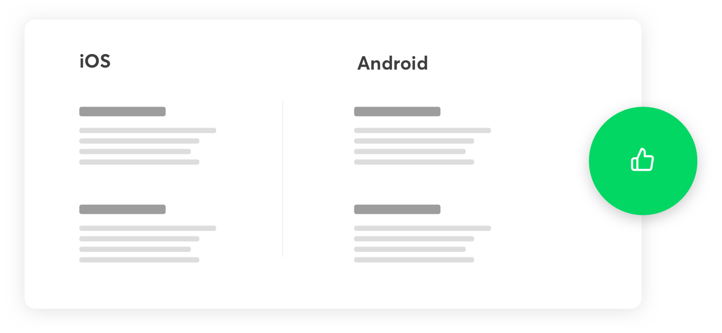
Many users won’t even see your website on a desktop, so you simply cannot afford to ignore having a responsive design for your new website - it’s vital to achieving your business goals. From the users’ perspective, offering a seamless user experience across desktop and mobile apps is a must.
12. Use short and concise names
Good navigation will leverage short and accurate words. Long and complicated names are not only likely to confuse and thus won’t navigate well, but also harder to recognize for search engines. In the case of navigation names, it won’t pay off to be original. Choose names that are straightforward and relevant: Standard expressions like “contact,” “search,” “subscribe,” and “sign in” will do the job.
Best Practices for Designing Website Navigation
Creating user-friendly website navigation integrates both art and science. It requires a delicate equilibrium of:
-
Simplicity
-
Clarity
-
Consistency
-
Responsiveness
Prioritizing user experience and business objectives.
Let’s explore these practices further.
Keep It Simple
Particularly in website navigation, simplicity is the pinnacle of sophistication. To prevent cognitive overload and facilitate easy recall and navigation of options, a well-organized horizontal navigation bar should limit to 7±2 top-level items.
The minimalist design approach, with clean lines and ample white space around navigation elements, significantly reduces clutter and enhances user experience.
Prioritize User Experience
In designing website navigation, user experience takes precedence. It demands the creation of separate navigation layouts for mobile and desktop devices, the use of clear labels, and assured accessibility.
Descriptive navigation labels are better for both search engines and visitors, as they clearly communicate the content, aligning with SEO and user expectations.
Consistency Across Pages
In website navigation, consistency is vital. It imparts a sense of stability to users, a crucial aspect throughout the entire website experience across all devices and screen sizes. Incorporating visual indicators such as breadcrumbs and location indicators in the navigation design helps users understand their current position within the site’s structure.
Enhancing Website Navigation with Tools and Techniques
The digital age presents us with a plethora of tools to improve website navigation. Some of these tools include:
-
Google Analytics, which helps understand user behavior
-
Google Optimize, which allows you to experiment with changes using A/B tests
-
Google’s Keywords tool, which helps identify popular terms
Utilizing these tools can greatly enhance your website navigation.
Using Analytics to Optimize Navigation
Google Analytics serves as a valuable ally to your navigation. It enables you to:
-
Observe visitor interactions with website navigation
-
Pinpoint areas for improvement
-
Fine-tune navigation, placing important links and CTAs more prominently to streamline the user journey
With insights from analytics, website owners can optimize their navigation and improve the overall user experience.
A/B Testing for Navigation Elements
A/B testing represents another potent tool for navigation enhancement. It allows designers to compare a variation against the current design to analyze which performs better in user engagement and conversion rates.
Implementing Search Functionality
Search functionality, provided through a search bar, acts akin to a personal assistant for your website visitors. It significantly improves user experience by providing a direct path to the information or products users are looking for, leading to a faster and more efficient navigation experience. Moreover, search engine optimization plays a crucial role in making your website more visible and accessible to potential visitors.

Real-Life Examples of Effective Website Navigation
Learning by example is always enlightening. Let’s explore some navigation examples by analyzing how two tech giants, Apple and Amazon, have nailed their website navigation, providing seamless user experiences.
Example 1: Apple
Apple, a trailblazer in design, incorporates its minimalist ethos into its website navigation. The streamlined horizontal navigation bar, with distinct product and service categories, offers users an intuitive browsing experience.
Example 2: Amazon
Amazon, a titan in e-commerce, utilizes flyout navigation elements, permitting users to access over 150 content departments without feeling overwhelmed. It’s a perfect example of how to handle extensive content without compromising user experience.
Common Mistakes to Avoid in Website Navigation
Like any design process, there are pitfalls to sidestep in website navigation design. Overloading the menu, using unconventional navigation elements, and neglecting mobile optimization are common mistakes that can lead to a frustrating user experience.
Overloading the Menu
Minimalism reigns in menu design. Overloading the main menu with items can overwhelm users, complicating their decision-making process.
Inconsistency in Design
Consistency holds paramount importance in design, and navigation is no exception. Altering the style or position of the primary navigation bar across different pages can disorient users and create a sense of being lost.
Ignoring Mobile Optimization
In the smartphone era, overlooking mobile optimization can be costly. Swift loading times on mobile-optimized websites are imperative as mobile users generally have less patience, contributing to a more engaging user experience and minimizing bounce rates.
The importance of solid website navigation for excellent user experience
In the digital world, website navigation plays a pivotal role in shaping user experiences and business outcomes. A well-designed navigation structure acts as a roadmap, guiding visitors through a site’s content and features.
From simple horizontal navigation bars to complex dropdown menus, various navigation types cater to different site structures and content needs. Prioritizing user experience, maintaining consistency, and leveraging tools for optimization are key to creating effective website navigation.
As we’ve seen with examples from Apple and Amazon, a well-thought-out navigation strategy can significantly enhance user interaction and engagement. So, the next time you embark on designing or refining your website navigation, remember - it’s all about creating a smooth and intuitive journey for your users.
Easy website navigation is crucial for leading a visitor through the buyer journey, leading to conversion. Business owners should be conscious about their business goals and align the navigation strategy to support them. Overcomplicating the menus, making certain features difficult to find and using misleading words will confuse visitors and make them abandon your page in no time, costing you those precious conversions! The navigation UX has a direct impact on the time users spend on your website, their opinion about your company, and the decision to purchase or not, so follow the best practices to offer outstanding navigation experience.


