Maximizing Consistency Across Platforms with Design Systems


Contents
Design consistency is necessary to maintain brand identity. But the bigger the organization, or the more projects you tackle simultaneously, the harder it can get. Here’s where design systems come to the rescue.
These resources help product teams, both designers and developers, in their daily work. They define a visual language, which simplifies product development and helps them create new solutions more efficiently. What’s more, creating a design system is the only way to warrant a consistent interface across all platforms and provide all users with the same experience.
In this article, I’ll explain what multi-platform and responsive design systems are, and how using them contributes to a unified design across various user environments.
What are design systems?
A design system is a collection of reusable components and a set of standards that helps to effectively manage design. It acts as an oracle, which helps designers maintain visual consistency across all parts of the website or platform.
So, what exact components are design systems built of? I particularly like the categorization from Nielsen Norman, which put it into two key elements – the design repository itself and the team who use it in their work.
Element one: The design repository
- Style Guide: Offers detailed instructions and examples for visual elements, such as logos, typography, and brand colors. It also includes guidelines on tone of voice and language, helping designers understand the overall brand feel.
- Design Library: Also known as a component library, it houses reusable design elements with implementation instructions, often including code snippets for both frontend and backend development.
- Pattern Library: Contains reusable layouts and templates. While less detailed than the component library, it provides a broader view of design patterns for creating consistent user interfaces.
Element two: The people who manage it
A design system's success relies on the team that maintains it. Without proper management, the system can quickly become outdated and redundant. The team structure can vary, but should at least include:
- Interaction Designer: Develops and maintains guidelines for user interactions.
- Visual Designer: Ensures visual consistency by creating and updating visual examples.
- Developer: Provides code snippets and implements specifications for each component.
If budget allows, consider adding:
- Part-time Researcher: Conducts user research to keep the design system user-focused.
- Part-time Architect: Manages the overall structure and integration of the design system.
- Content Writer: Writes clear documentation and guidelines, ensuring effective communication within the team.
Challenges in multi-platform development
Less options for designing UI
Android and iOS have different components, rules, and best practices, which means that app developers can face UI design challenges. Both user groups are used to a specific look and feel of each operational system. Ignoring these standards might reduce users’ familiarity and prolong the learning process.
Increased costs
Building one app is expensive, but if we want to create an app that runs on both platforms the cost rises even further. For native development you will need two separate teams for each version of the app, who’ll not only build but also maintain it.
Scalability and maintenance
In a survey Ben Callahan ran across product teams, scalability came up as a key pain point in maintaining consistency across diverse platforms and technologies.
The designers he spoke to told him the speed at which their organizations needed to adopt new components became a true challenge. One person said that the demand is higher “than our little team can adequately support”.
How to address these challenges with a design system
Design systems can make the work of product teams much easier by:
Streamlining development: The team can use reusable components to significantly speed up their work. Also, they don’t need to worry that the components won’t work well with the remaining ones.
Ensuring consistency: Creating a standard for how UI elements should look and function improves visual consistency, which reduces cognitive overload. The user can navigate your app or site easily, without learning how each element works.
Improving collaboration: Your design system acts as the single source of truth for developers and designers. All the documentation and guidelines are there, so it’s easier for them to collaborate and communicate.
What is a multi-platform design system?
A multi-platform design system is an approach to design, which allows to create a consistent user experience irrespective of the platform used. This is achieved by tailoring UI elements to meet platform-specific standards. Let’s now take a look at two design systems examples, starting with Booking.com.
Booking.com
Booking.com, one of the largest travel marketplaces, wanted their users to have a great experience on all types of devices. They knew that building a multiplatform design system was the only way to achieve this goal. The project involved coordinating the work of 200+ designers and 800+ developers across four platforms.
The design system team came up with a comprehensive foundation – the Design Language, which included design tokens for color, typography, and other elements. To be able to store and convert these tokens for various platforms, build plugins, streamline updates, and stay visually cohesive, the team created the Design API. Booking.com wanted to make sure that their icons are used in a unified way and guarantee consistency, so they created the Asset Service.
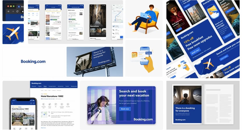
As you already know, having a design system in place is just part of success. To make sure that it’s used properly, the team created a structured maintenance process. It involved design and tech assessment, implementation, and reviews to validate if components are aligned and accessible.
Not only did a design system help the brand improve the designer-developer relationship. It also created a consistent user experience across platforms.
Keller Williams
Keller Williams (KW) is what I can boldly call a “design system success story”. Today, they’re the world's largest real estate franchise with over 170,000 agents. What helped them get there was a decision they made back in 2015, when they decided to become a tech company and undergo digital transformation.
Netguru initially helped KW on a ‘small’ design project, i.e., designing a feature for one of their projects. Ultimately, this grew into a long-term partnership, and one of the areas we supported them in was building a new design system.
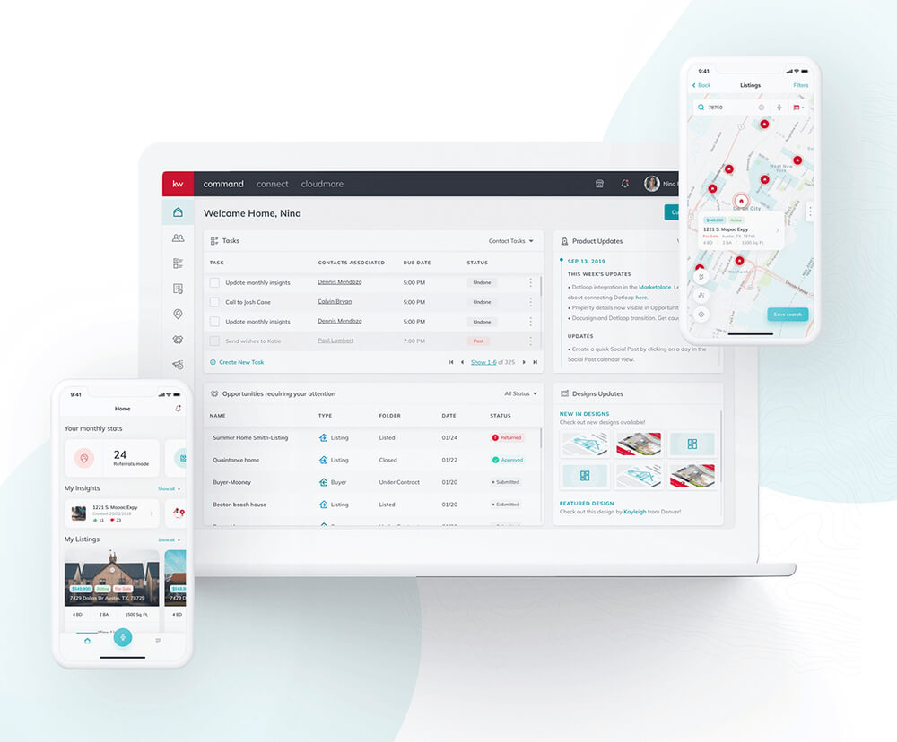
KW keeps rolling out new digital products for realtors, such as Command, their CRM for real estate agents, and Kelle, which they describe as “Siri for the real estate industry”. So, it goes without saying that they needed to maintain visual and functional consistency across all of them.
Together with the designers at Keller Williams, we created a design system to help make work on UI/UX future-proof. Our team created a comprehensive resource, with visual assets like fonts, colors, and reusable UI elements, along with detailed instructions.
This lets KW stay close to one of their core values, i.e., interconnectedness. As Neil Dholakia, the company’s CPO told us, what lets them stay ahead of competitors doesn’t come down ‘just’ to company size or the number of platforms they build. “It’s the interconnectedness of our system. We spent a lot of time connecting all of our systems – including our legacy systems – so that we would have all of the data.”
What is a responsive design system?
Responsive design system, is an approach to product design (not a separate technology), which enables content to be adjusted automatically to the screen size and device. This guarantees a consistent user experience, regardless of whether users view content on a tablet, phone, or watch.
Grid system: Is responsible for maintaining consistent spacing and alignment across various screen sizes. It defines the layout structure, including gutters, margins, and columns.
Fluid layouts: Enable elements to adjust proportionally to the screen size by using flexible containers and percentage-based widths.
Responsive typography: To ensure readability across all devices, font sizes, line heights, and spacing, it adjusts them automatically based on the size of the viewport.
Scalable images and media: Uses CSS techniques to make sure that the size of all media including images and videos adjusts to the screen.
Flexible components: Interface components adapt their layout, behavior, and size to work well on different screens. Think of elements like buttons, navigation menus, and other interactive parts of the interface.
Media queries: In responsive design, CSS rules outline how height, width, orientation, and resolution will look based on the specific device. This leaves room for different breakpoints and styling decisions.
Modular design: This design approach breaks down the interface into reusable modules and components. As a result, it’s easier to adapt specific elements per screen size.
Regular testing: Checking the designs on multiple devices and screen sizes helps check how the app works in different environments.
Joystream
Joystream is another company we helped create a design system for
– this time, a responsive one. They’re a blockchain-based, open-source platform for video creators.
They wanted to create a highly customizable design system for the Joystream platform, which would serve them as they scaled. Joystream needed clear design guidelines along with a structured, detailed documentation, which would let video app operators in their design work.
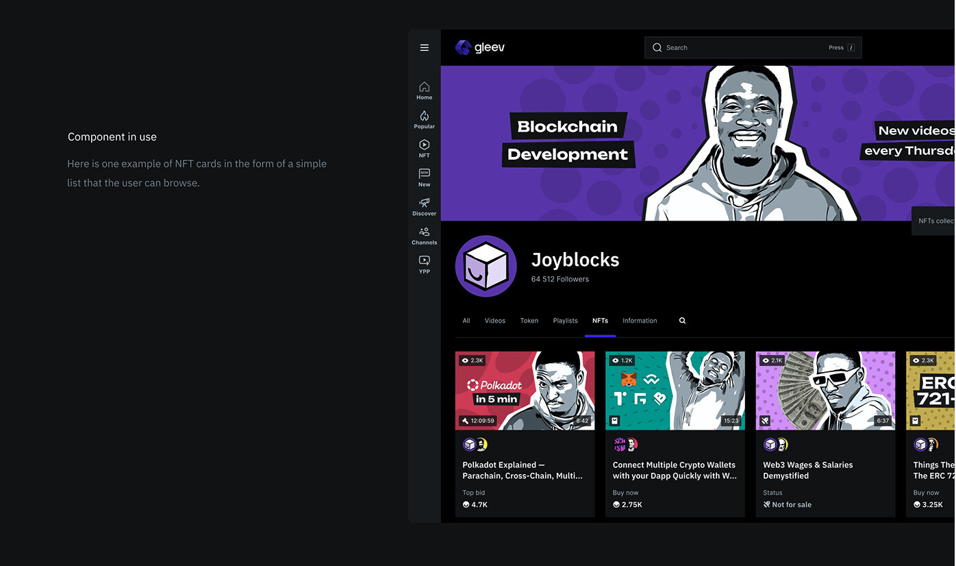
We created three sets of documents:
Design guidelines – We put in place rules to guide Joystream and its users in maintaining a unified format for all views and components. At the same time, ensuring multi-faceted consistency of each design component.
Implementation guidelines – We also wrote descriptions to help understand how multiple design elements can be used in different variations in the design and ensure interaction and animation consistency.
Model design system components – The design system, which Joystream called ‘Atlas’, reflects the W3C token methodology. It also features all the components needed to maintain design consistency.
The result is a flexible design system, which can be adapted and further developed by the DAO community.
Developing design systems
While each design system project will be different, depending on the size and whether you’re creating design system from scratch or already have some resources. Still, here are the steps I recommend taking if you want to be sure you’re building the best design system:
- Create a UI inventory: Put together all reusable patterns, elements, grids, icons, etc. This will help you understand your starting point. You’ll spot potential design discrepancies and see where you have design decision gaps. As a result, you’ll get a very rough roadmap for building your design system.
- Secure organizational buy-in: This is where you secure not only the budget but also support from the team and stakeholders. I recommend sharing your UI inventory findings and explaining why it’s important to fix any inconsistencies to guarantee good UX.
- Put together a multidisciplinary team: By ‘multidisciplinary’, I mean a team of both designers and front-end developers. These are two actors who will use the design system so you need both perspectives.
- Create design principles: and put them in writing: Define shared design principles, including technology choices and design system format.
Develop a color palette: Create a palette of your core brand colors. This is also the time to agree on naming conventions. - Create a typographic scale: Your information architecture must be consistent across all products, which is why you need to pick typefaces and create a typographic scale. Run some tests to be sure that it impacts the UI effectively.
- Implement an icon library: To reduce language barriers and influence users create an icon library. Just make sure to pick the right technology for implementation.
- Standardize style properties: Implement grid styles, white space, and other style properties to make sure the design stays consistent.
- Build initial design patterns: Use an iterative approach with your design patterns. Come up with the best architecture for your pattern library, and then make incremental changes.
- Conduct sprint retrospectives: Building a design system is a continuous process. Organize sprint retrospectives regularly to check progress, and implement changes if necessary.
Popular design systems examples
Here are a few design systems examples, including open-source tools and resources, to help you create your own design system:
Lingo
Lingo is a digital brand hub, where you can store all your assets and documentation. It’s like a visual home for your brand. It helps teams to organize, manage, and share their assets by acting as a single source of truth.
Figma
Figma is a leading collaborative design tool, which supports the creation of cutting-edge interfaces. You can develop reusable elements, which can be applied across designs. It enables users to convert files into pattern libraries and give different teams access to the same components, enhancing collaboration.
Bootstrap
Bootstrap is a free, open-source CSS framework used in responsive, front-e nd web development that prioritizes mobile. It includes HTML, CSS, and JavaScript-based design templates, covering multiple interface components like buttons, navigation, forms, and typography.
Material Design
Undoubtedly, Material is one of the most popular design systems – for good reason. Google published it to help digital product teams create experiences for web apps, Flutter, iOS, and Android. The components you’ll see here are interactive and come with built-in state instructions. These let you see how each component behaves when clicked, dragged, selected, or when it’s in a disabled state.
The best design systems match your company’s needs
Let me put it blatantly – the lack of a design system is often synonymous with team conflict and visual inconsistency. These resources act as a written code of conduct and help designers and frontend developers understand what their output should be like.
Putting a design system in place is especially important if you want to develop multiple apps, or create an adjustable design for various devices. Given just how fast new products are rolled out, having a way to accelerate work on designs and coding is the obvious way to go.


