Design System vs. Style Guide: A Practical Comparison


Contents
A comparison between a design system vs style guide shows how they affect your product's consistency and development efficiency.
Design systems boost productivity by 34% and make team collaboration better. This matters because users often assess a company's credibility through its design.
These tools help create cohesive digital products but serve different purposes. Design systems aim to maintain consistent design at scale and cut down duplicate design elements and patterns. Style guides take a narrower approach by focusing on visual and editorial standards. Teams need to understand these differences to pick the right approach that fits their project needs. The concept becomes clearer when you look at design system vs style guide vs component library and UI style guide vs design system.
This practical comparison breaks down the unique aspects of each tool and shows how they work together. Silk serves as a perfect example of a design system that showed a 50% reduction in setup and prototyping time for commerce and marketplace products. This piece helps you choose the right approach for your needs, whether you manage a large product ecosystem or maintain brand consistency for a single application.

What is a Design System?
A design system contains standards, components, and guidelines that help manage design at scale through reusable elements. It creates a shared language and visual consistency. Unlike standalone style guides, design systems work as complete ecosystems that enable teams to build products consistently and quickly.
Core Components: Tokens, Libraries, and Patterns
Design systems have three basic building blocks that work together:
Design tokens create the foundation of any robust design system. These named values store design decisions like colors, typography, and spacing as data instead of hard-coded values. Design tokens turn design attributes into variables that work across platforms to ensure consistency between design and code.
Component libraries contain reusable UI elements with specific implementation guidelines. Each component has its name, description, attributes, states, and code snippets. Teams can implement these ready-to-use elements without starting from scratch, which eliminates redundancy.
Pattern libraries have content structures, layouts, and templates that solve common design problems. Pattern libraries give frameworks to combine components into cohesive interfaces, though some consider them less detailed than component libraries.
Design System Examples: Material Design and Silk
Material Design by Google shows how a detailed design system can streamline processes between designers and developers. Its extensive documentation and component library have made it one of the most widely used systems worldwide.
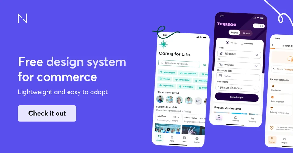
Silk, developed by Netguru, provides a commerce-ready design system built from real client projects. It gives foundations, components, and patterns specifically designed for commerce trips. Silk stands out by offering a practical middle ground—more structured than simple UI kits yet less complex than enterprise systems. Teams that use Silk report a 50% reduction in setup and prototyping time, saving 3-6 days during MVP sprints.
Why Teams Use Design Systems: Consistency at Scale
Design systems act as a single source of truth and promote collaboration between design and development teams. This collaborative environment reduces misunderstandings during handoffs and speeds up implementation.Standardized components save time on repetitive tasks. Teams can focus on solving complex problems and accepting new ideas instead of recreating common elements for each project.
Design systems' centralized nature makes product maintenance easier because fixes and improvements instantly spread to all products. This creates a ripple effect of efficiency throughout the organization.
Maintenance Requirements and Team Responsibilities
A design system needs dedicated resources and clear governance. Design system teams should have at least one interaction designer, one visual designer, and one developer. Larger organizations might also need researchers, architects, and content writers.
Good governance must handle several vital areas: bug reporting procedures, methods for new elements, quality assurance protocols, and documentation standards. Teams should regularly audit to find redundancies, missing components, and accessibility issues.
Program managers ensure the design system matches organizational goals. They help communication flow between design system teams, implementation teams, and end-users while increasing adoption across the organization.
What is a Style Guide?
Style guides document a brand's look, sound, and appearance across platforms and touchpoints. They differ from design systems that manage product ecosystems. These guides focus on creating consistent visual and verbal standards for brand communication.
Visual Style Guides: Colors, Typography, and Logos
Visual style guides create the foundation of brand appearance. They specify exact color values through HEX codes for web use, CMYK values, and Pantone colors for print materials. Typography guidelines detail the fonts needed for headlines, body text, and special purposes.
Each guideline includes size and spacing instructions. Logo rules outline proper usage on different backgrounds, required space, and approved variations. Research shows that 94% of first impressions relate to design, making these visual standards vital for brand perception.
Content Style Guides: Voice, Tone, and Grammar
Content style guides shape a brand's written communication. Brand guidelines define voice traits like warm, direct, confident, or playful, along with approved terminology and phrases to avoid. Mailchimp's style guide states, "We have the same voice all the time, but our tone changes" based on context and the audience's emotional state. These guides keep messaging consistent, whatever the creator, helping brands maintain their unique personality in all communications.
Brand Style Guides: Identity and Core Values
Brand style guides link visual and verbal elements to deeper organizational values. Teams can find mission statements, vision, and core values that shape brand decisions. The guides help teams understand the reasoning behind brand asset implementation. Studies reveal that 77% of consumers choose brands sharing their values, making this connection a vital part. Companies with consistent branding see a 91% higher year-over-year increase in customer retention.
Style Guide Examples: Starbucks and Spotify
Starbucks offers an easy-to-use web-based style guide that shows its logos, colors, voice, typography, illustrations, and photography. Their guide combines heritage-driven visuals with mission-led messaging that creates emotional storytelling.
Spotify chose a bold approach with vibrant design elements. The company made a radical alteration toward duotone colors and contemporary design that appealed to millennials. Their detailed guide covers everything from visual assets to specific rules for using their app.
Design System vs Style Guide: Key Differences
Design systems and style guides have fundamental differences that go way beyond terminology. Teams need to understand these key differences to pick the right tool that matches their needs.
Scope and Coverage: Full Product vs Visual Standards
Design systems do much more than handle visual elements. They work as a detailed framework that defines looks, functions, and behaviors. Style guides excel at visual branding and identity elements, which makes them specialized tools for visual consistency. Style guides define colors and typography, while design systems take it further with interaction patterns, accessibility guidelines, and technical implementation details.
UI Components and Interaction Patterns
The most important difference shows up in component handling. Style guides stick to documenting static visual elements without diving into behavior. Design systems, on the other hand, have fully functional, interactive components with predefined states (hover, disabled, active), accessibility features, and matching code. To name just one example, see Silk design system's components that pack both appearance specs and interaction behaviors, helping commerce teams cut setup time by 50%.
Documentation Approach: Dynamic vs Static
These tools take completely different approaches to documentation. Style guides work as static references: PDF documents or websites that need manual updates. Design systems use dynamic, code-driven documentation that grows with the product. This living documentation comes with interactive examples, implementation guidelines, and cross-referenced components that keep consistency in check automatically.
Updates and Evolution: Iterative vs Occasional
Design systems thrive on continuous growth through structured processes that propose, test, and implement changes. Components get regular updates to meet user needs and keep up with tech advances during this cycle. Style guides usually change only during major rebranding efforts or scheduled updates, which makes them nowhere near as flexible for quick product changes.
Team Usage: Cross-Functional vs Design-Focused
Research proves that organizations using mature design systems can speed up product development by 47% and cut design-related errors by 33% compared to teams using only style guides. This boost comes from their cross-functional nature—design systems help designers, developers, product managers, and QA teams work together. Style guides mainly help designers, content creators, and marketing teams, but don't offer much for technical implementation.
When to Use Each: Practical Decision Framework
The choice between a design system and a style guide depends on your organization's needs and resources. Here's a practical framework to help you make this decision.
Design Systems for Enterprise and Multi-Product Teams
Enterprise organizations and multi-product teams get the most value from detailed design systems. Companies that maintain multiple digital products of all sizes need a design system to ensure consistency at scale. Large organizations without design systems create multiple versions of identical elements.
This leads to inconsistency, wastes time, and creates messy code.Design systems work best when you need:
- Cross-functional collaboration between design, development, and product teams.
- Standardization across numerous products or platforms.
- Frequent updates and iterative development cycles.
Yes, it is true that a design system centralizes assets and creates a framework. This framework supports a consistent brand identity through the design process. The value becomes clear as organizations expand their digital presence.
Style Guides for Small Teams and Single Products
Small teams with limited resources should start with a style guide. Style guides help even one-person content teams stay consistent. They need less work to create and maintain, making them perfect for:
- Startups and small businesses with single products
- Teams with limited developer resources
- Products in early development stages
Research shows that small businesses can work effectively with just a 2-5 page style guide. This guide defines simple rules for their brand's appearance and voice.
Using Both Together: Development Strategy
Many product teams start with a style guide at the time they spot signs of design debt. They later move toward a design system. This step-by-step approach helps teams set up basic visual guidelines before investing in complex component libraries and interaction patterns.
The path from style guide to design system includes:
- Setting up design tokens that formalize your style guide's visual elements.
- Building reusable components based on recurring patterns.
- Setting up design system documentation and maintenance procedures.
Real-life Application: Silk's 50% Setup Time Reduction
Silk design system shows clear benefits of a structured approach. Projects using Silk saw major efficiency gains. Teams completed rapid prototyping 50% faster than traditional methods. One case study showed Silk cut the MVP design time from 6 months to 3 months.
The system proved its worth when a client needed to rebrand their app. Silk helped the team finish core redesigns in 2 days. They completed the full rebranding process in about 3 working days. This saved roughly 4 days compared to starting from scratch.
Design System vs. Style Guide vs. Component Library
The relationship between design systems and style guides needs clarification, and component libraries add another dimension to this discussion. These development tools serve unique purposes, yet teams often struggle to pick the right solution.
Understanding Component Libraries
Component libraries are collections of reusable UI elements with specific code implementations. They differ from full design systems because they focus on individual interface components like buttons, forms, and navigation elements. Developers find these libraries valuable because they provide tested code snippets that maintain consistency without rebuilding elements from scratch.
UI Kit vs Design System vs Style Guide
The key difference lies in scope and functionality. UI kits give you visual assets but don't explain their purpose and usage. Style guides set visual standards without touching component behavior. Design systems cover both aspects, plus principles, pattern libraries, and governance. Silk shows this balance well: it provides more structure than simple UI kits without the complexity of enterprise systems.
The Parent-Child Relationship Between Tools
A clear hierarchy exists among these tools. Design systems act as "parents" that contain style guides, pattern libraries, and component libraries as "children". This structure explains why teams sometimes use these terms interchangeably despite their unique roles.
Choosing the Right Tool for Your Project Maturity
Team size and product complexity drive the selection process. Small teams with single products work well with style guides. Teams that need reusable components across projects should look into component libraries. Organizations managing multiple products needing consistency at scale require complete design systems.
Comparison Table
| Aspect | Design Systems | Style Guides |
| Primary Purpose | Keep design consistent at scale and cut down design element redundancy | Document visual and editorial standards for brand communication |
| Scope | Detailed framework that covers appearance, function, and behavior | Focuses mainly on visual branding and identity elements |
| Core Components | - Design tokens - Component libraries - Pattern libraries - Interactive elements - Implementation guidelines |
- Colors and typography - Logo specifications - Voice and tone guidelines - Brand values - Visual standards |
| Documentation Type | Dynamic, code-driven documentation that grows with the product | Static references (PDFs or websites) that need manual updates |
| Update Frequency | Continuous progress through structured processes | Updates happen during rebranding or at scheduled times |
| Team Usage | Cross-functional (designers, developers, product managers, QA) | Design-focused (designers, content creators, marketing) |
| Maintenance Requirements | Team of designers, developers, and program managers | Lighter workload, mainly handled by design/brand teams |
| Best Suited For | - Enterprise organizations - Multi-product teams - Cross-platform products - Large-scale operations |
- Small teams - Single products - Limited developer resources - Early-stage products |
| Notable Example | Silk Design System: - 50% reduction in setup time - 3-6 days saved in MVP sprints |
Starbucks Style Guide: - User-friendly web interface - Blend of heritage visuals and mission-led messaging |
| Efficiency Impact | Can increase productivity by 34% and reduce design-related errors by 33% | 91% higher year-over-year customer retention through consistent branding |
Conclusion
The choice between a design system and a style guide ends up depending on your organization's needs, team size, and product complexity. Teams need to understand the basic differences between these tools to make smart decisions about which approach serves their goals best.
Style guides are great at creating visual and editorial consistency for brands, especially for smaller teams or single products. But as organizations grow and manage multiple digital products, design systems provide much more value through their detailed ecosystem of reusable components, interaction patterns, and implementation guidelines.
Design systems have shown impressive real-world benefits. Silk design system proves this with its 50% reduction in setup and prototyping time, which saves teams 3-6 days during MVP sprints. On top of that, it helps organizations with mature design systems achieve 34% higher productivity and 33% fewer design-related errors compared to those using style guides alone.
Many teams succeed with a hybrid approach. They start with a style guide and move toward a design system as their products mature. This strategy lets organizations build basic visual guidelines before investing in complex component libraries and interaction patterns.
Design systems, style guides, and component libraries form a clear structure where each tool has its own purpose while supporting the others. Style guides set visual standards, component libraries provide reusable UI elements, and detailed design systems include both governance and implementation guidelines.
This piece offers practical guidance to help teams pick the right approach. Small teams with limited resources often do better with style guides. Enterprises managing products across platforms will find that design systems are a great way to get consistency at scale.
The key takeaway? Both design systems and style guides play vital roles in modern product development. Design systems need more resources to build and maintain, but their long-term efficiency gains often justify the cost for growing organizations. Style guides offer a simpler starting point to establish brand consistency without much overhead. Whatever path you choose, a smart approach to design consistency will improve your brand and user experiences.


