Design System Template Essentials: Expert Tips for Faster UI Creation


Contents
A well-designed system template accelerates the design process and eliminates inconsistencies throughout your organization.
Our experience shows that design systems help reduce design debt and create better user experiences. Teams with reliable design systems can create or update layouts much faster than those building UI elements from scratch.The best design systems focus on consistency, accessibility, and user experience.
This is clear from our time learning about various examples. Design system templates serve as a central hub for reusable components. They ensure your layouts maintain consistent design principles. These templates help marketing and technical teams collaborate more effectively. They set clear expectations and minimize errors during the design and scaling process. We will share our expert knowledge in this piece to help improve your UI design workflow.
Establishing the Foundation of Your Design System Template
A strong foundation forms the backbone of every design system template. These foundations work as building blocks that support all user interface elements and provide a framework for your entire system. Your system needs a set of guiding principles that will direct every decision and establish its core purpose and values.
The foundations include everything in visual and functional elements, like accessibility, color, typography, spacing, and layout. Your design system should prioritize accessibility from day one. The numbers tell an important story - about 810,000 software professionals worldwide (nearly 3%) have disabilities that impact their work in digital environments.
Design tokens are a vital foundation that store design-related information as variables. These tokens create a common language between designers and developers to maintain consistency in both design files and code.
Silk showcases these principles beautifully. This complete interface system uses a well-laid-out token system to define colors, typography, spacing, and layout while supporting accessibility and brand customization. The system's core components provide reusable elements for common UI features, and they're available as open-source Figma design system templates with built-in icons and documentation.
Note that building strong foundations isn't about making everything look the same - it's about creating experiences that feel natural across platforms.
Structuring Visual Language and UI Components
A design system template needs strong visual language that shows how users understand and work with your interface. Well-laid-out typography creates a clear hierarchy with font families, weights, and sizes. Users can scan content quickly and grasp its importance. A consistent color palette based on design tokens will give a visually pleasing and accessible experience in all touchpoints.
Silk's design system shows this approach perfectly with its nearly headless UI kit that simplifies processes and keeps consistency on every platform. The system's token structure defines colors, typography, spacing, and layout while supporting brand customization and meeting accessibility needs.
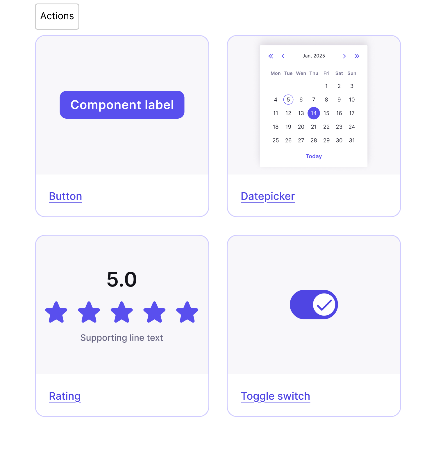
Component libraries are the functional building blocks of your design system. Reusable elements like buttons, modals, and navigation bars keep the visual consistency intact. Teams using Silk cut their setup time by 50% and finished prototyping twice as fast. Users adapted its components to match their brand needs 80% of the time without affecting design quality.Phosphor icon libraries help create complete visual harmony with 9,072 icons in different weights and styles. Designers can keep consistency while adapting to what each project needs.
Your Figma design system template becomes a unified visual language when you create a clear visual hierarchy through contrast, proper spacing, and alignment.
Documenting and Scaling with Figma Design System Templates
Good documentation acts as a foundation for flexible design systems that turn standalone components into unified experiences. This helps teams grasp implementation details, make consistent decisions, bring new members up to speed, and improve designer-developer communication.
Your design system template components should include usage guidelines, design specs, ground examples, code snippets, and interactive prototypes. The documentation must cover visual style choices like color palettes, typography systems, and icon libraries.Version control tracks changes and helps teams communicate updates. Using semantic versioning (MAJOR.MINOR.PATCH) shows what kind of updates you've made. A well-laid-out changelog records every addition, change, or removal in your system.
This prevents teams from getting confused.Silk shows these principles through its complete interface system. The foundations use a structured token system for colors, typography, spacing, and layout that supports accessibility and brand customization. You'll find reusable elements for common UI features in its core components.
These come as open-source Figma design system templates with built-in icons and documentation. Your system needs usage notes for components right inside Figma to stay flexible. Teams should know the reasoning behind decisions. A clear governance structure through RACI matrices helps manage responsibilities. Regular maintenance cycles keep your design system ahead of changes instead of just reacting to them.
Conclusion
A well-designed system template changes UI creation from repetitive work into an optimized, consistent process. This piece shows how solid foundations build the framework of your system. Accessibility requirements and design tokens create a shared language between designers and developers.Visual language, without doubt, plays a vital role in design systems that work. A well-laid-out typography and color palettes based on design tokens create visual harmony. They ensure accessibility at every touchpoint. Components like buttons, modals, and navigation bars keep this consistency while adapting to brand needs.
Documentation is a vital element that turns standalone components into unified experiences. Teams understand implementation details better with proper design system documentation. It helps them make consistent decisions and closes communication gaps between designers and developers.
The Silk design system demonstrates these principles perfectly. This complete interface system provides foundations through a structured token system. It defines colors, typography, spacing, and layout while supporting accessibility and brand customization. The system offers reusable elements for common UI features. Open-source Figma files for mobile and responsive web come with integrated Phosphor Icons and in-file documentation.
Teams have achieved remarkable results with Silk. Their setup time dropped by 50%, and they completed prototyping twice as fast. The system proved flexible too - 80% of users adapted its components to match their brand needs while keeping design integrity intact.Time invested in creating a resilient design system template brings rewards. It speeds up design processes, removes inconsistencies, and cuts design debt. Your team can solve unique design challenges instead of rebuilding UI elements from scratch. This approach maintains a consistent visual language throughout your organization.


