
%20(2).png?width=2880&height=1620&name=Thumbnail%20(right%20click%20here%20and%20choose%20_Set%20as%20thumbnail_)%20(2).png)


Silk Design System
Free, evolving commerce design system by Netguru, built to help teams design and ship faster
What is Silk?
Silk is a free design system created by Netguru for teams who don’t want to spend months reinventing buttons, spacing, and tokens—yet still need something they can fully adapt to their brand.
After years of delivering commerce products, we kept running into the same challenge: too much time was spent setting up UI foundations before teams could focus on solving real product problems.
That’s why we created Silk—to help teams assemble consistent interfaces faster using ready-made components and patterns, and move through iterations with confidence.
Built for mobile and responsive web, Silk supports modern product teams with accessibility-first foundations, flexibility, and ease of use.

Why Silk?
Stop wasting months on UI basics. Silk is a lightweight, variable-based system designed to help you ship commerce interfaces immediately—deeper than a UI kit, but without the enterprise bloat.
- Commerce-Ready: Optimized patterns for search, lists, and checkout.
- Mobile-First: Tailored for responsive web with a native-platform feel.
- Accessibility: Built to support WCAG 2.2 AA standards by default.
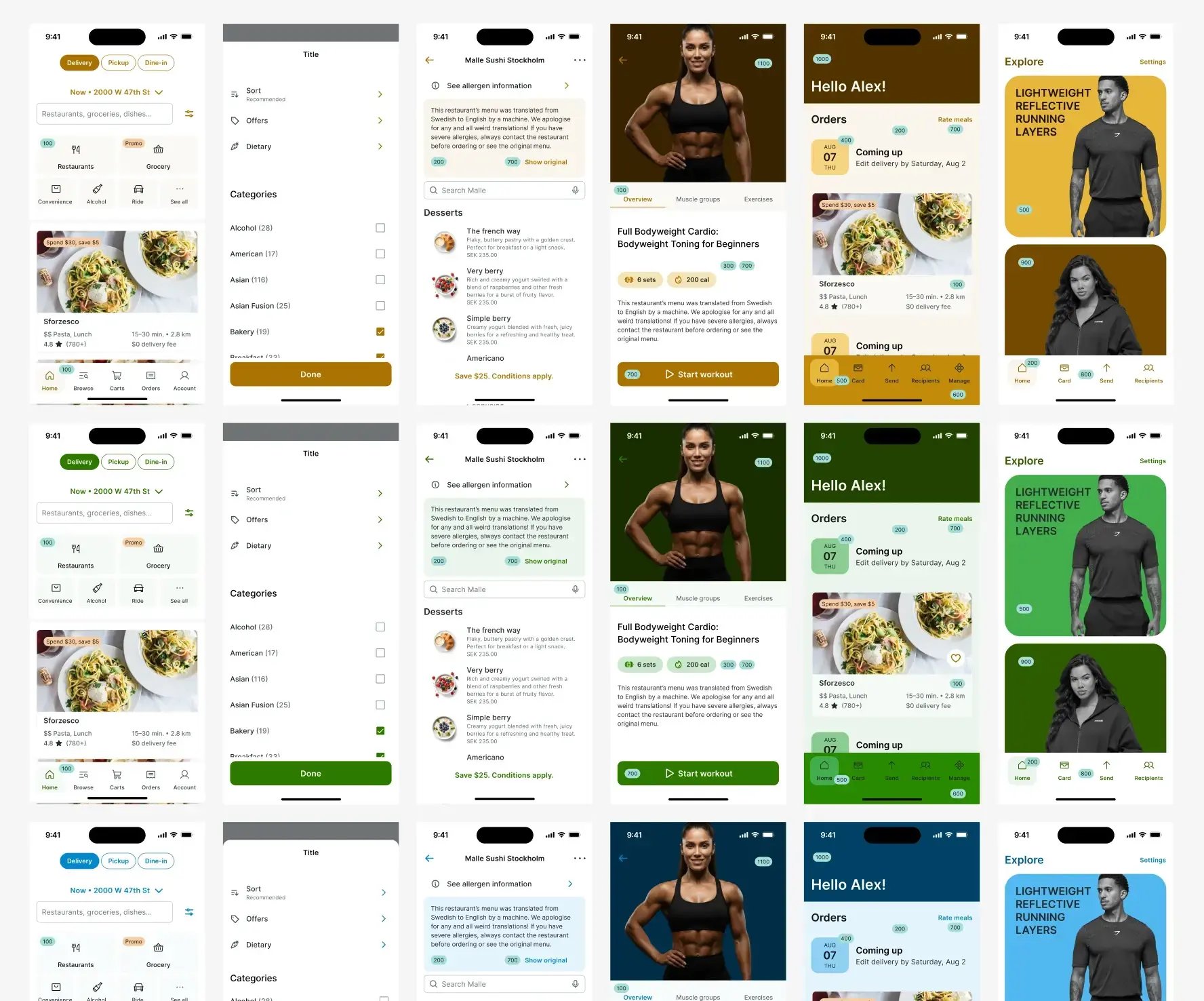
All-in-one toolkit for your brand
Contents
Foundations
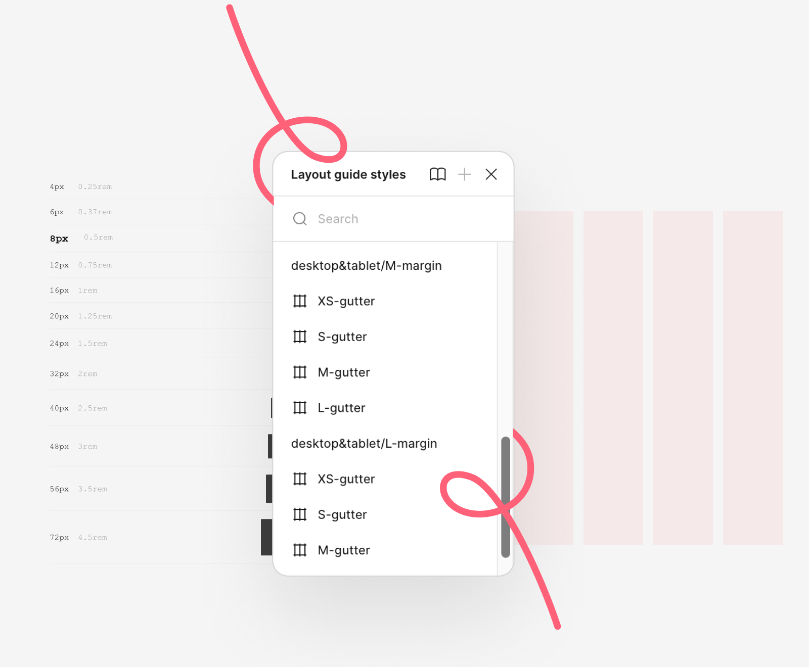
Silk includes 500+ predefined tokens for color, typography, spacing, grids, and layout. Everything is structured and ready to use—so you can start designing without setting up core styles from scratch.

Components
Consistency, accessibility, and freedom—these are the underlying principles at the code of Silk components. For easier navigation, we grouped them in 4 categories.
Actions & inputs

Data display & content

Feedback & messaging

Navigation & way-finding

Commerce patterns
Silk includes ready-made patterns for common commerce scenarios—such as product listings, checkout flows, and account areas—designed to support scalable, conversion-focused interfaces.

Silk documentation
Silk includes clear online documentation that helps teams quickly set up and customize the system. It shows how to get started with Silk and adapt it to your specific needs. View 👉 the Silk documentation.
Fast & Scalable Customization
Silk is built to adapt to your brand identity using a variable-based architecture that allows you to reskin the entire system in minutes.
- Automated color swaps: Adjust global palettes and functional tokens for text, surfaces, and strokes update automatically across the system.
- Global typography: Replace default fonts across the system without disrupting layout structure or component behavior.
- Shape control: Instantly toggle between sharp or rounded edges using shared radius variables.
- Total integrity: Maintain full control over your visual language without breaking the underlying system foundations.


Ship commerce products in weeks, not months
Create space to focus on experience, not setup


