
Strengthening Xolv.io’s Brand Identity with UX and UI Design Services
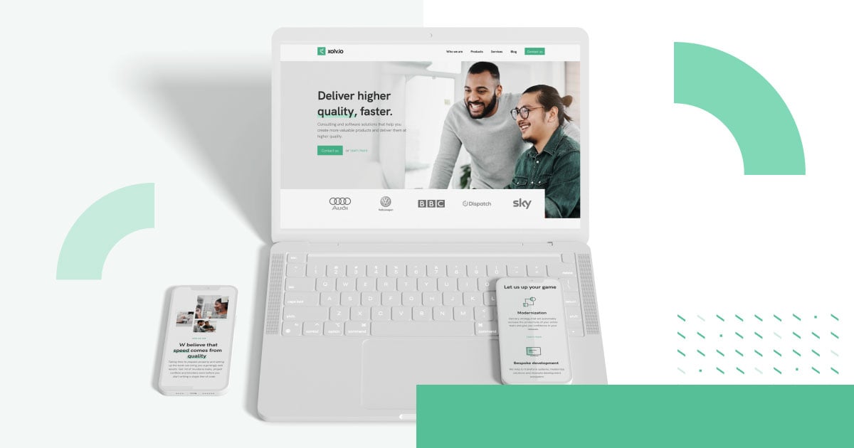
The client
Founded in 2013, Xolv.io consults on and develops software with a fully remote team, on a mission to deliver higher quality faster.
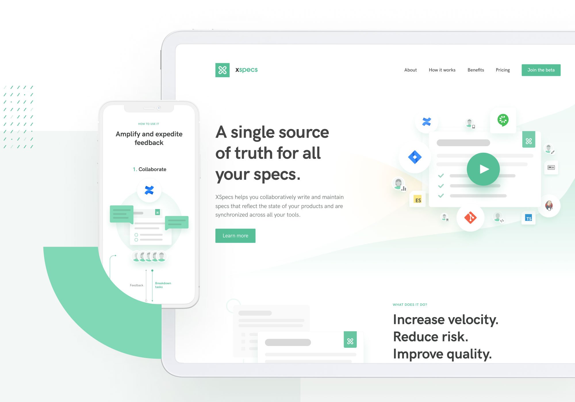
Its services run from software architecture and design through to custom development, and it also offers XSpecs — a toolkit for writing and maintaining specs collaboratively — and a knowledge-sharing initiative called Quality Faster.
The challengeWhat the teams actually needed
The website revamp had to strengthen the Xolv.io brand and tighten the visual connection between the brand and the products under it.
Challenge 01Carrying prior work forward
Ideas from the brand manual and the outcomes of earlier collaboration had to be transformed rather than discarded.
Challenge 02New architecture, new content
The information architecture needed reworking and the company needed help producing new content for both the Xolv.io and XSpecs sites, without the visual ecosystem coming apart.
Challenge 03Complex processes, made legible
Visualising complicated processes while keeping the design responsive and easy to navigate was its own problem.
What we did
One brand, two products, a single visual ecosystem
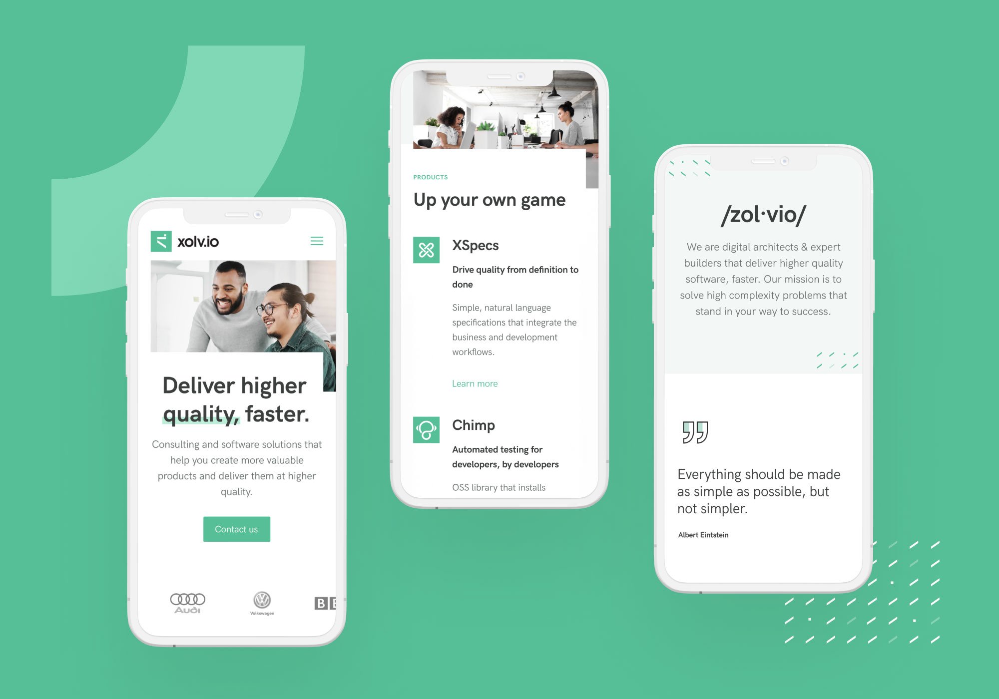
The work split into discovery, design and asset creation: competitor research, moodboards, wireframing, then UI designs and branding assets for Xolv.io, XSpecs and Quality Faster.
Tone of voice, established
Competitors were analysed from the standpoint of brand and communication, which set the tone of voice, with the company’s existing values as the starting point.
Icons tied to the products
New UI assets built on earlier work, with the Quality Faster illustration style shaping a unique icon set, and a new pattern derived from the main logo.
A softer relative of the parent
The product site uses the brand colours with a warmer accent and a much softer feel, and a new wireframe-like illustration style sits at the centre of the identity.
Diagrams that fold
Complex diagrams were designed to scale and fold at every screen size, and the client’s development team received an extensive handover style guide.
More like thisOther places we scaled product teams for growth.
What’s next