OK Google, It’s Time for a Change! – Google Drive’s Web App Redesign

Contents
In April 2019, G Suite, Google’s flagship set of collaboration and productivity apps for business, hit five million paid users worldwide. According to iDatalabs, it’s the market leader among office suite technologies with a 63-percent share. Yet, when it comes to its cloud sharing services, Google Drive is not the most popular choice.
Only one in five business customers use the Google Drive cloud storage option at least once a month. Next to security and reliability, ease of use is one of the most important factors when evaluating cloud storage services. Our team decided to find ways to improve Google Drive’s overall experience for a business user.
Our experience with Google Drive
In Netguru, Google Drive is our tool of choice. Since we’re a remote-first company, our team members are scattered across different locations. We need a cloud based solution for smooth cooperation. Google Drive was an easy choice, as it offers many advantages:
- storing many files,
- working on documents in real time with other team members,
- organizing files and sharing them.
Although Google Drive is one of the most popular cloud-based file storage solutions, users say that it’s difficult to find their way through all the documents, especially those they didn’t create themselves. In Netguru, 600 people work either remotely or from one of the seven offices. We work in different departments and on hundreds of different projects – each team produces and store many files, scattered throughout thousands of folders. This makes Netguru employees the perfect audience on which we could study some potential improvements to Google Drive.
Research goals
The goal of the study was to identify the main pain points and understand how Google Drive is used in daily work. We didn’t consider different contexts, but we understand that this tool is used in different settings and environments, and by different people with different needs. We wanted to approach the Google Drive redesign and reconsider features from the standpoint of a typical user working in a medium-sized or a large company, with a lot of collaboration involved.
Step I: Selecting the features
The first question we asked ourselves was “What exactly do we want to redesign?” It was obvious that we didn’t want to compete with the Google Drive Team, which works on new features, testing, and talking to end-users. This kind of work just can’t be replicated.
Google Drive offers a host of features:
- safe storage for different types of files,
- sharing files with whole teams and individually,
- searching for files and organizing them in folders,
- compatibility with such Google apps as Docs, Slides, Sheets, or Forms,
- scanning different documents and converting them to PDFs (only for Android),
- working offline and checking a document’s history,
- new intelligent file suggestions and organization with Priority and Workspaces.
Depending on the use case, those features will be used with different frequency. For example, students might not use sharing options that often, because they write their papers and homework for themselves. In a company which heavily relies on collaboration, people share files on a daily basis with whole teams, selected people, and even people outside the company.
We wanted to learn how people use Google Drive in Netguru. In order to do that, we came up with two research questions:
- What Google Drive features do people use in their daily work?
- Which activities or features make the experience daunting and painful?
The answers to these questions would clearly indicate the directions that we need to follow to create a meaningful redesign concept.
Research findings
To be sure whether people struggle with the activities mentioned above, we sent out a short survey to our colleagues. The representation of people from different teams was distributed quite evenly, with a small ascendancy from the product design team.

Most respondents (90%) use Google Drive on a daily basis or a few times a week. We wanted to focus on problems that occur to users who work with Google Drive frequently, so we decided not to take into account the respondents who selected “rarely than a few times a month” option.

In the next question, we wanted to learn with which Google Drive version our colleagues struggle with. Just as we suspected, almost 90% of respondents used mostly the web version of GDrive. This made us confident that in a business environment, the web version is the most popular way of handling and sharing files.

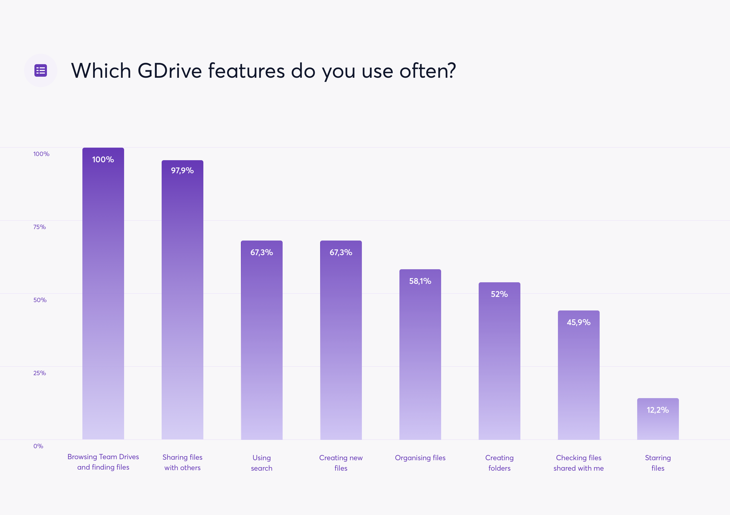
When it comes to the most popular features, the results were also not surprising. In Netguru, people mostly:
- go through Team Drives and find files (100%),
- share files with others (97.9%),
- use search (67.3%%),
- create new files (67.3%),
- organize files (58.1%).
The second question related to specific features was about the pains that our colleagues experience when using Google Drive. The aim was to understand the everyday struggles and gain some insights into the most important parts of the interface which would benefit from a redesign. When asked about the features that were not satisfying, the most popular answers were:
- using search (61.2%),
- going though Team Drives and finding files (61.2%),
- sharing files with others (45.9%),
- organizing files (36.7%),
- checking files that were shared with me (21.4%).
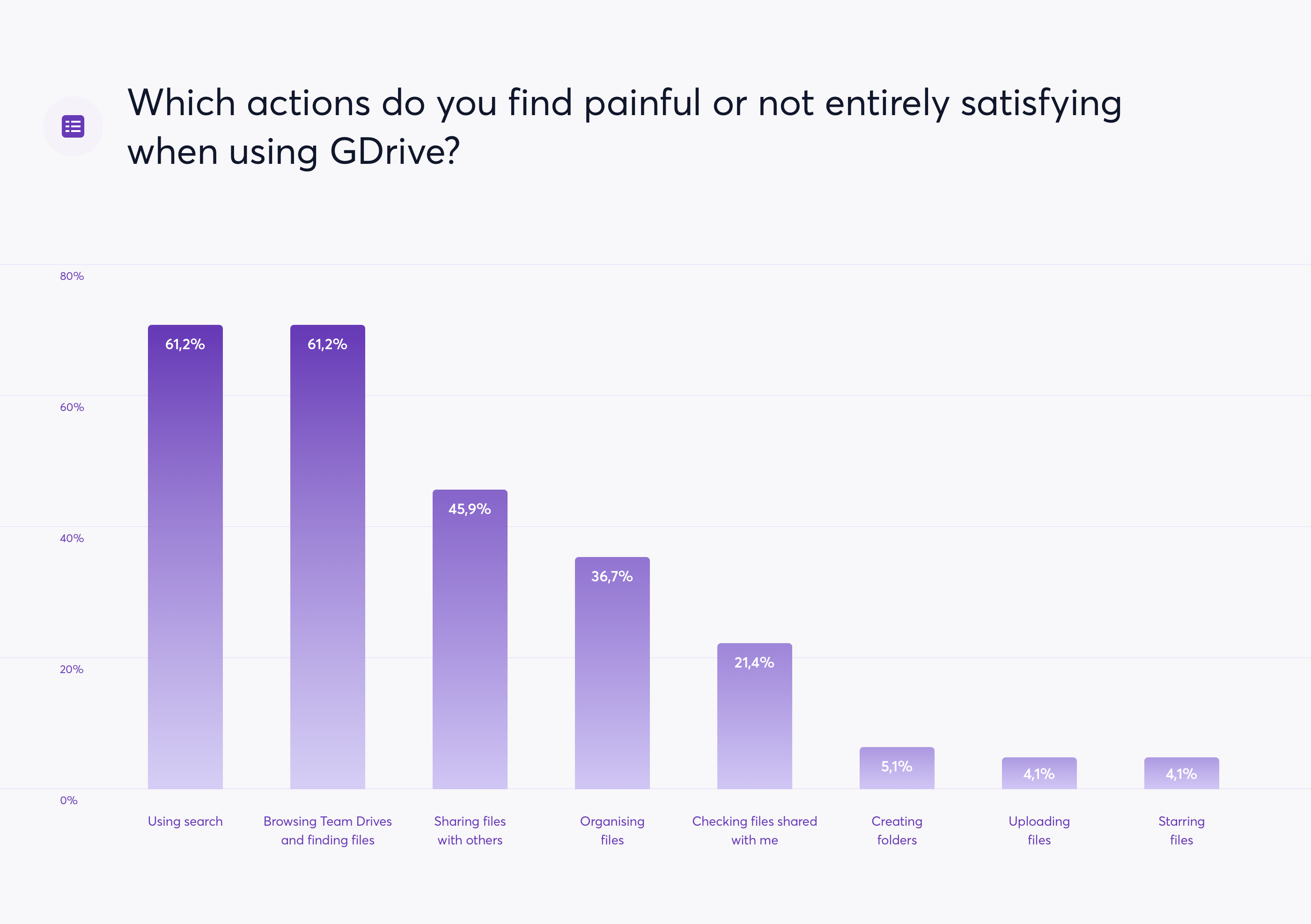
It gave us a clear vision of what we should tackle first – efficient search was essential for quick file access and making work much more efficient. People struggled with finding files due to misleading search results and various naming patterns that others use when creating new files and folders.
When it comes to the argumentation and explanation of why those features were painful, we gathered insights from an open-ended question – our colleagues were free to complain and describe the most painful situations when using GDrive interface. The question that enabled us to understand the recurring frustration with using Google Drive, was: “Could you explain why you find those features painful?”. The raw data was analyzed and grouped together in order to identify popular difficulties.

Raw data
The recurring troubles that our colleagues experienced were:
1. Using search
- Showing only files, not folders or directories
- Problems with limiting search results to folders or team drives
- Showing a lot of irrelevant files
- The root folder is not displayed clearly; it is difficult to find the location of a file
2. Going though Team Drives and finding files
- Difficulties with managing Team Drives sharing settings
- Team Drives are not well-thought out; sharing one folder in team drive is impossible and not intuitive
- No quick access to popular folders or drives
- Giving results from folders that are not in use
3. Sharing files with others
- Sharing outside the company – requires many steps and actions, which is frustrating when users want to do it quickly
- Too many options when it comes to sharing
- Complicated “Advanced” sharing options
- Not being able to share a Team Folder (only file)
- Sharing files/directories in bulk is not easy
4. Organizing files
- It's difficult to transfer files between drives – you have to download everything and upload it again to the other drive
- Difficulties in transferring files between folders – if you don’t know the exact directory it’s very hard
- Huge miniatures which make bigger folders hard to read
- No self-organization / self-cleaning or suggestions which files might be outdated
- Not knowing the exact directory (which drive it is – private or public
- Only one folder visible at a time
5. Checking files that were shared with me
We were also aware that Google has introduced new ways of organizing files recently, including a Priority tab and Workspaces. The last question of the survey was related to those features. Unfortunately, none of the participants used it, because they’d never heard of them or saw them when using Google Drive. It’s very interesting why Google didn’t advertise those features a bit more, for example, by showing a quick overview or tutorial. Still, we wanted to focus on the problems stated directly by participants, so we decided not to dig deeper for the time being.
The redesign
After some solid benchmarking, gaining inspiration, and analyzing current solutions, we had a basic understanding of what we wanted to explore and which ideas to push forward when it comes to searching and organizing files. Creating a moodboard and sketching out the ideas helped us visualize and discuss the general direction and specific use cases.

Inspiration moodboard
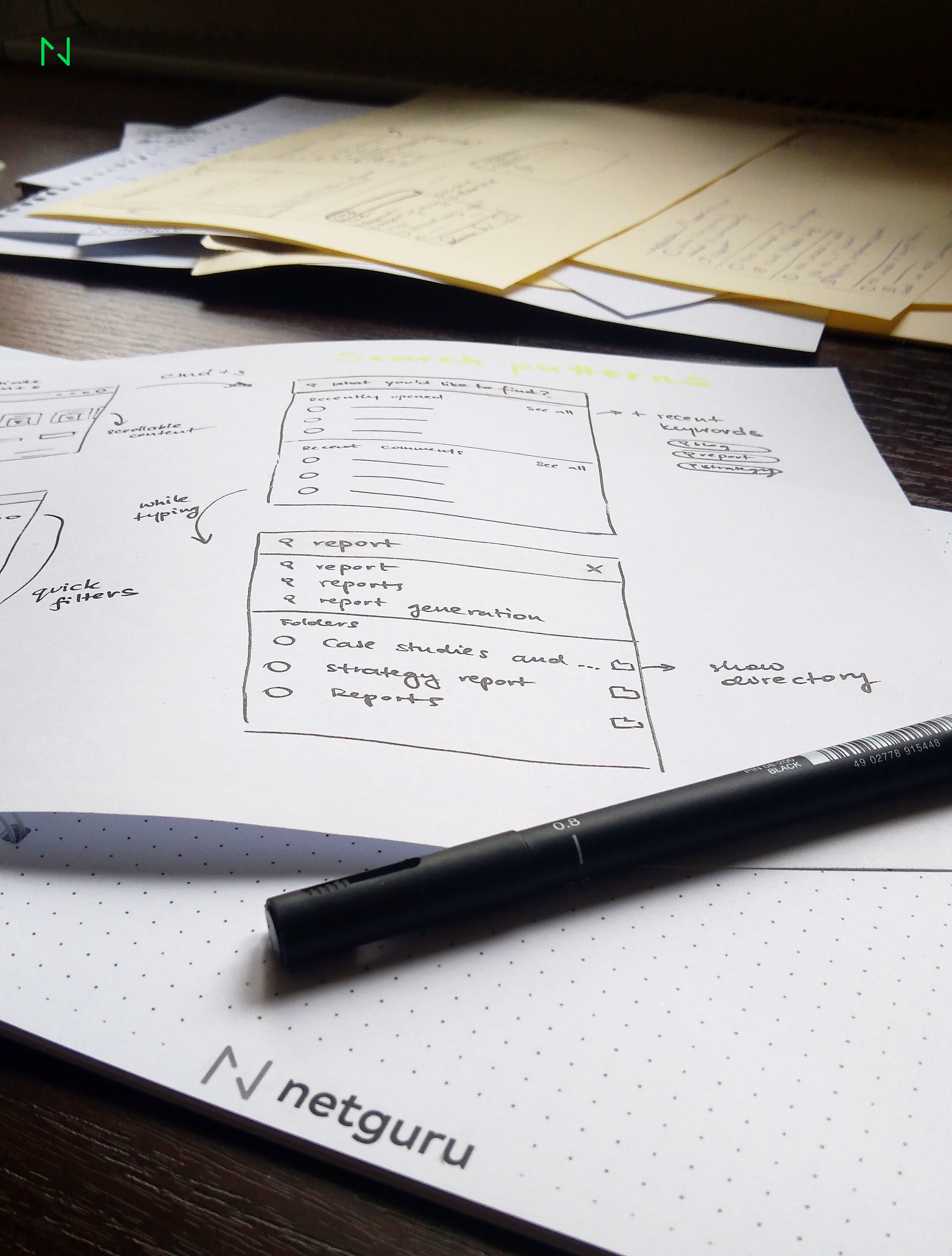
Sketching works great for a quick visualization of initial ideas and flows.
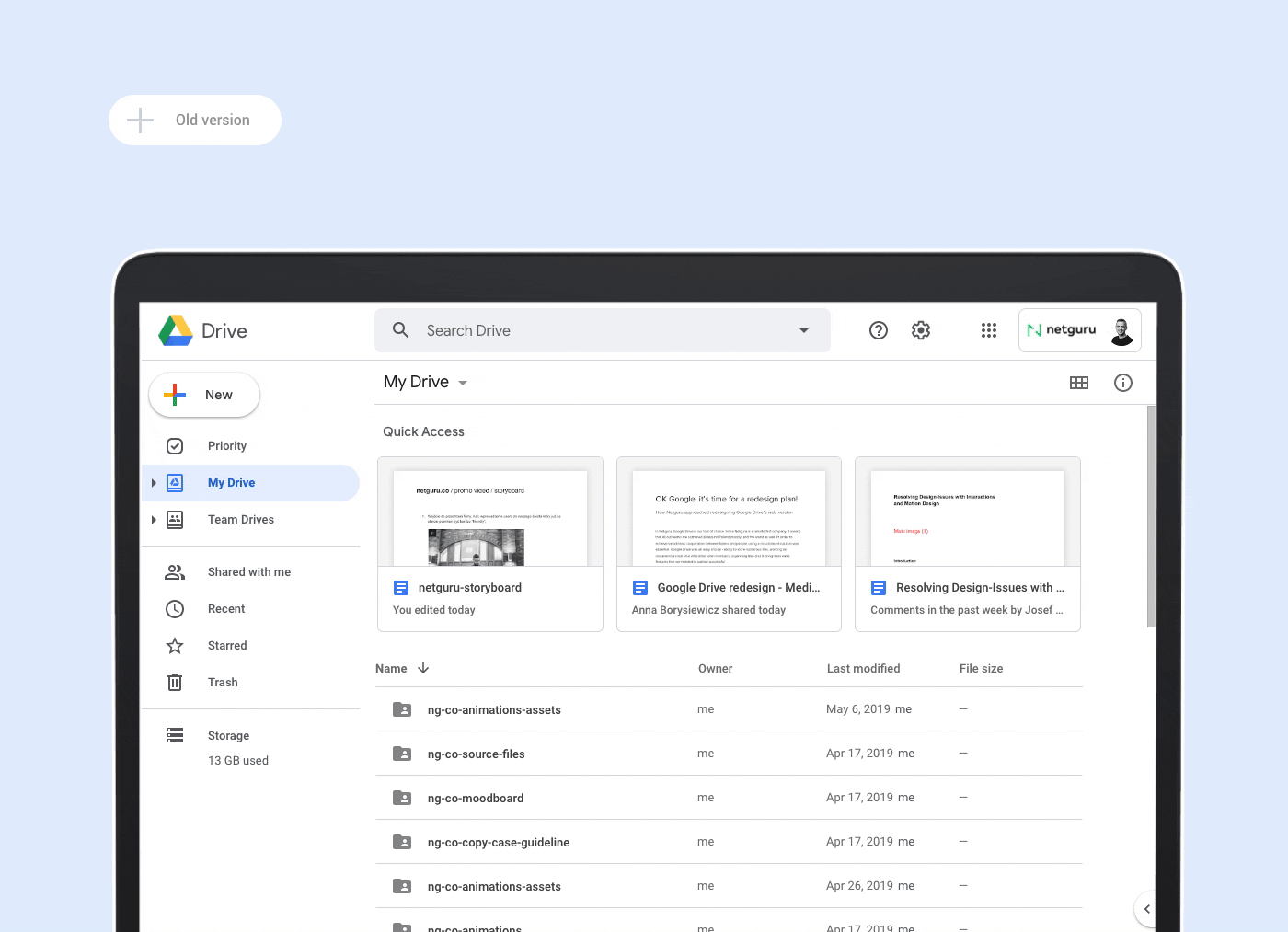
A refreshed look
First, we wanted to tackle the visual part of the interface, since it was a perfect opportunity to introduce UI tweaks and improvements. When we added more contrast to the background, it became easier to differentiate main content from navigation and focus on particular elements. Subtle changes in the “+” inside the main CTA button and consistent icons created a more cohesive experience. Since there is no hover state in Google Drive’s current version, we decided to add this state so that users could easily locate the elements they are currently analyzing.
Using search
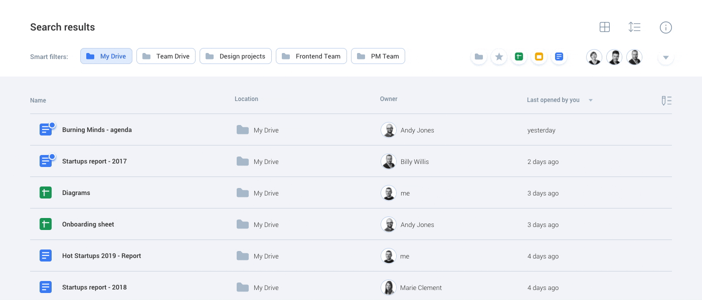
The first key issue that transpired in the research phase was the search feature. It seems that people struggle with this feature very often. It’s difficult to find files quickly, there is no option to find a specific folder, no filtering by Team Drive or other directories, and the root folder is not visible, which makes it harder to identify the file itself.
Our respondents did not realize that the filters feature was available directly by clicking the chevron in the search bar. In our redesign, filters are shown directly above the search results. Users can now locate files and folders quickly by browsing documents according to different Team Drives, types of files, owners, etc. No more complicated search patterns – the elements are filtered instantly!
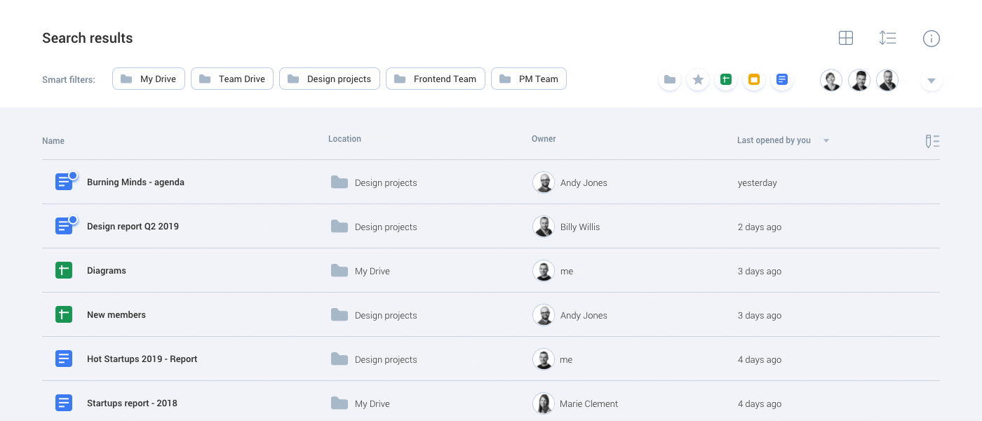
Additionally, since search was very popular among our survey participants, we created a shortcut (CMD+S on Apple devices) that launches the feature. Upon opening the search bar, users can see recent keywords, recently opened documents, and recent comments, replies and suggestions. This is helpful especially to users who use documents mostly for collaborating and talking with other teammates.
When a user starts typing, not only files and folders become visible, but the file path and the owner as well. Users can now match the file with a specific location or a colleague, which makes it easier to find the file.
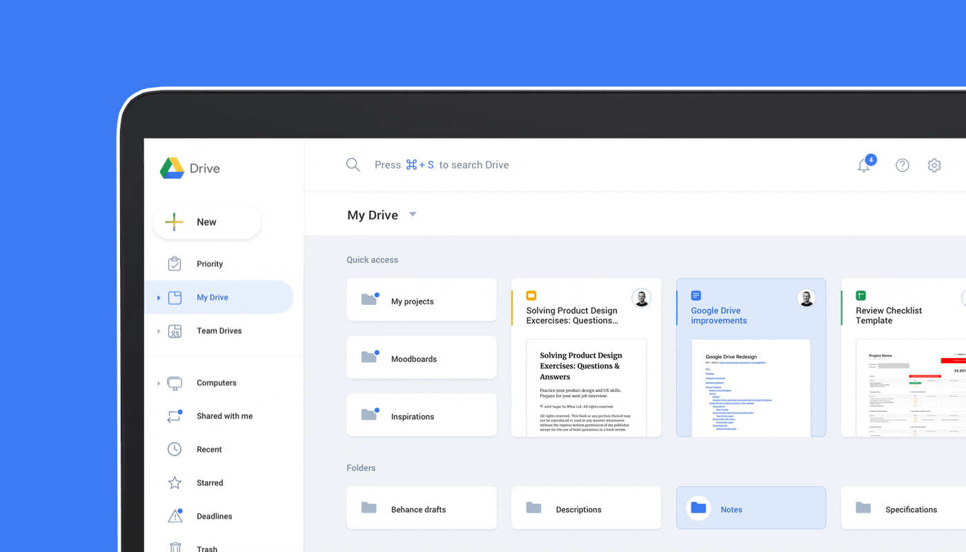
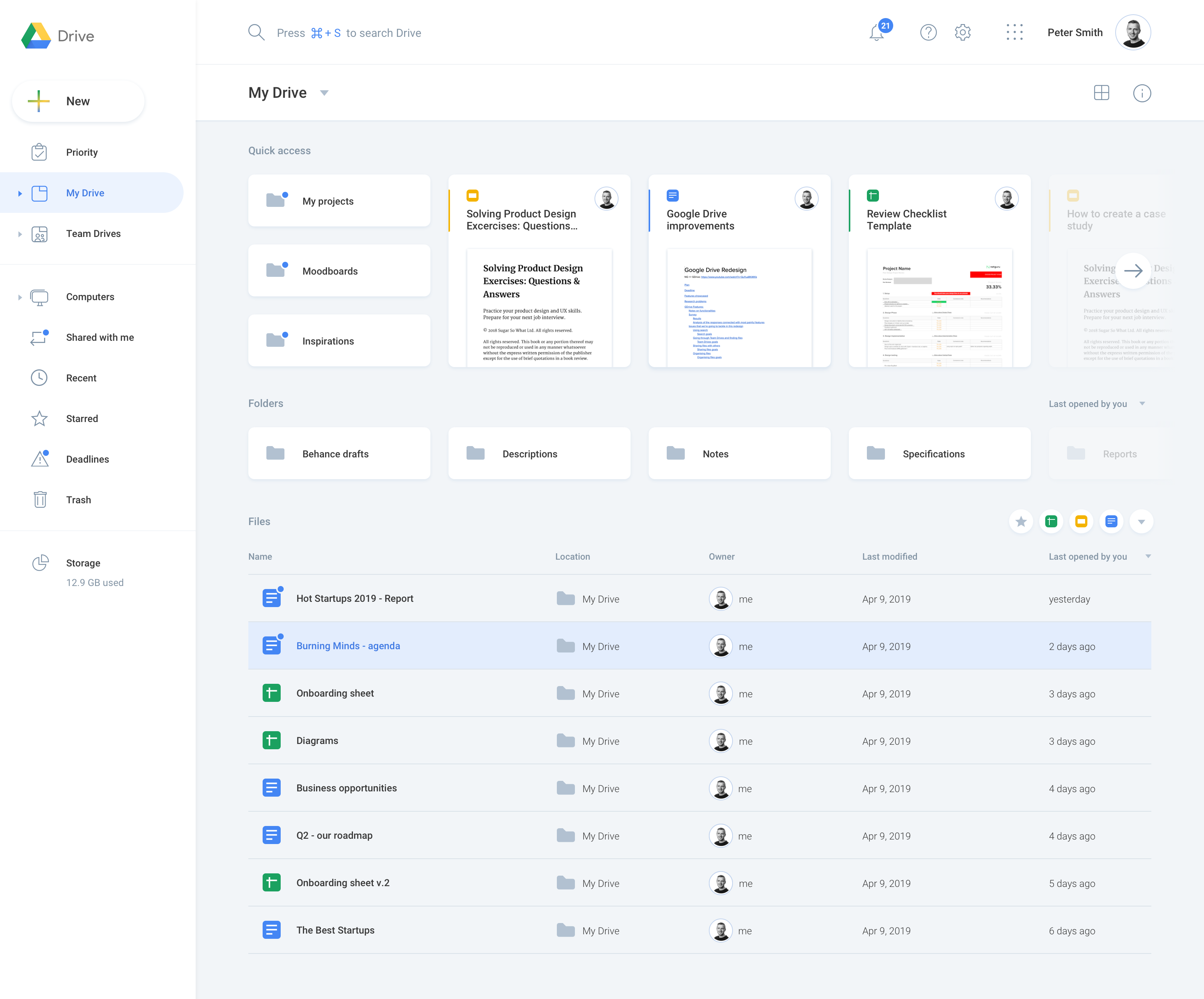
Adjustable dashboard
The current Google Drive default view consists of Quick Access, which shows recent elements and a list with My Drive files. Since Quick Access can be a very useful element – especially for quickly finding frequently opened files – we added a feature that enables users to drag and drop files and folders and personalize the dashboard in the way they want. Since it wasn’t clear why some files appeared Quick Access, we gave users the option to adjust the view however they want. With a simple drag & drop, they can move a file to Quick Access section to make them accessible with one click.

Another improvement we introduced concerns filtering My Drive files. When we added an option to filter out files by type, browsing through personal files became a lot easier.
Personalization features
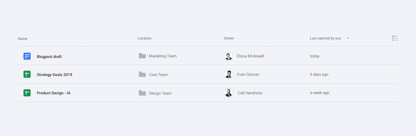
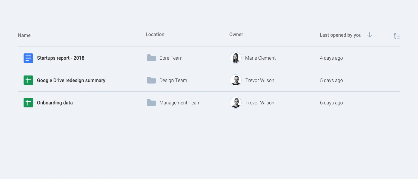
It seems that each user searches for files differently – for instance, by triggering the search bar, using filters, or digging through different folders manually. The same logic applies to analyzing a document’s details – some people could find the “Owner” column more helpful than the “Last modified” indicator. That’s why we introduced an option to personalize search results. By turning columns on and off, users can decide which information will appear on the list.
Another functionality from our redesign that helps scan lots of files is “Table density”. By adjusting row height, the user can squeeze in more content in search results.
Small tweaks that make a massive difference
Our respondents said that finding files is a daunting task. One of the reasons for this is that Google Drive doesn’t show the folder a file is located in. We added hover states that highlight the currently inspected document; we also introduced a small popup that shows the location of the file. When a user hovers over the folder, they can see the file path, and they can click on any folder they wish. This makes navigation a lot easier.
Our colleagues often receive notifications via Slack or email about new replies, comments, and suggestions on Google Drive. We thought it would be great to see this information directly in Google Drive as well. A user could just hover over and check new notifications without the need for opening the document at all!

Notifications & Deadlines
Since we’re talking about notifications, we thought it would be awesome to have every new update accessible directly in Google Drive. You could see information about new comments, replies, suggestions, new files in starred folders, or information about newly shared file, to name a few.
Last but not least, we would love to test out an idea that we called “Deadlines”. Very often in bigger organizations, people rely on collaborative documents to share ideas. People are given some amount of time to think about a topic and are asked to provide their opinion inside the document.

Since people do a lot of multitasking, they often forget that they were supposed to submit some opinion before a deadline. If a user could add a deadline to a document and link it with a smart notification, it would improve the general workflow and save a lot of time. How many times have you been pinged to take a look at a file and add some comments?
To sum up, with our redesign, we improved a few elements of Google Drive’s interface. We enhanced the visual part by adding more contrast to the background and tweaking the UI with features like hover states. The search experience is now easier because users can launch a search with a keyboard shortcut. The search also shows relevant suggestions while a user is typing. We added smart filters that adjust according to search results. The search is also more personalized now – users can add or delete columns in search results and adjust the table density.
When it comes to the dashboard, it now offers an option to drag & drop elements to Quick Access. Upon hovering over a document, users can now see the document’s location and recent comments and suggestions added in the document. Notifications are now embedded in Google Drive, and they will notify users about newly shared documents and replies to their comments. Finally, we created a Deadlines tab that sorts documents by a deadline and shows which ones should be worked on first.
Wrap up
We had a lot of fun exploring Google Drive’s interface, talking to our colleagues, analyzing their responses, and brainstorming solutions. We believe that introducing even small improvements can have a large impact on the general experience. If those improvements make users happier, they are definitely worth implementing. As a next step, we would love to see how people react to our improvements and check whether they really make finding files faster. We’ll definitely use Google Drive to create a user testing plan! :)


