Jetpack Compose vs Flutter (With Examples)


Contents
In the competitive world of mobile app development, programmers are always looking for ways to create efficient, effective and user-friendly apps. Two popular frameworks that have gained great traction among both web and mobile app designers are Jetpack Compose and Flutter.
Jetpack Compose and Flutter are popular frameworks that have distinct design philosophies and use cases.
Flutter is likely the better choice for a developer looking to create a high-performance, cross-platform mobile development with smooth animations and custom UI code. Flutter makes creating complex, custom UIs easier than the old Android XML system.
However, if a developer wants to create a native Android app with a modern user interface and an easy-to-use programming model, Jetpack Compose is the better choice. Google invested in this toolkit to improve the native Android experience and allow developers to develop and create native apps as quickly as they would have on Flutter.
In UI Development, Flutter is an established star, with over 68% of developers picking Flutter as their favorite framework – but Jetpack Compose is hot on its heels with a growing fanbase fixated on building better, cleaner Android-native apps. That is not to say that Compose is limited only to Android, however. We compare the two toolkits to see how they stack against each other in app styling, navigation, and animations.
Flutter
Flutter is Google’s UI SDK for crafting cross-platform mobile, web, and desktop applications. Whether it's for Android or iOS, the SDK natively compiled apps and programs to allow businesses and developers to build responsive, user-friendly, and intuitive applications through widgets and frameworks.
Flutter is often used for its capabilities in coupling UI and business logic, which is why many people would say that Flutter is a frontend SDK.
Note that Flutter is written using Dart, which may be an issue for dev teams not familiar with the language.
|
Pros |
Cons |
|
|
|
|
|
Jetpack Compose
Jetpack Compose is a production-ready kit with growing community support and fully featured components compatible with existing views.
It’s fully declarative and comprises a reactive programming model accessed through the Kotlin programming language. Jetpack Compose simplifies UI development through APIs, predefined functions, and a monolinguistic model as a Jetpack Compose-written application uses Kotlin 100%.
|
Pros |
Cons |
|
|
|
|
|
Flutter
As a developer who has used Jetpack Compose, I can unequivocally say that it is a joy to use. Jetpack Compose makes it easy to create beautiful user interfaces.
Jetpack Compose makes it easy to create beautiful user interfaces. However, when compared to Flutter, there are certain areas where Compose needs to be improved. For one thing, the hot reload feature in Flutter is essential when prototyping an app idea quickly.
Although Jetpack Compose has made significant progress in recent months, its tooling is still not as good as Flutter's, which Google will need to address if Jetpack Compose is to succeed truly.
Take note of these differences when working on a Flutter or Compose app.
App navigation
To achieve an improved experience in mobile apps, Flutter, as well as Jetpack Compose, offers a powerful way of navigation, which helps the app's content and provides a clear structure to find information the user needs. That is what improves overall user experience by making apps intuitive and easy to use.
Navigator, Flutter's navigation system, is a widget that manages a stack of devices. Essentially, when you navigate to a new page, a new widget is added to the top of the stack, and when you return, the top widget is removed.
The Navigator widget also allows you to manage your navigation history and navigate animations. It is simple, straightforward, and capable of handling basic navigation scenarios.
Jetpack Compose's navigation system, on the other hand, is more flexible and can handle more complex navigation scenarios because it is based on the Android Jetpack Navigation library.
It has a graph-based structure, with each destination represented by a fragment and the navigation paths between them defined by edges. It also handles deep linking, navigation with safe args, back stack, up navigation, and many other things. Jetpack Compose's navigation component is more powerful; it includes a NavController, NavHost, and NavBackStack to aid in more complex navigation.
App navigation in Flutter
In Flutter, the screens and pages are routes, and to navigate between routes, Flutter uses a widget called Navigator. To navigate between different routes, Flutter uses the push() method, making it easier to navigate to the next route (page) in the app. But how does the app know where to navigate? In combination with the MaterialPageRoute class, the Navigator Widget makes navigation between different routes possible.
It’s also responsible for creating new routes and pushing the route back to the navigation stack. To navigate back to the previous screen, the Navigator then uses the Navigator.pop() method.
Here’s an example of what that would look like in Flutter.
class MyHomePage extends StatelessWidget {
  @override
  Widget build(BuildContext context) {
    return Scaffold(
      appBar: AppBar(
        title: Text('Home'),
      ),
      body: Center(
        child: RaisedButton(
          child: Text('Go to next page'),
          onPressed: () {
            Navigator.push(
              context,
              MaterialPageRoute(builder: (context) => NextPage()),
            );
          },
        ),
      ),
    );
  }
}

class NextPage extends StatelessWidget {
  @override
  Widget build(BuildContext context) {
    return Scaffold(
      appBar: AppBar(
        title: Text('Next Page'),
      ),
      body: Center(
        child: RaisedButton(
          child: Text('Go back'),
          onPressed: () {
            Navigator.pop(context);
          },
        ),
      ),
    );
  }
}
Please keep in mind that this is a very basic example, and you can customize the navigation by using different routing libraries such as fluro, auto route, and get it. These libraries aid in navigation management.
Oh, and don’t forget to improve the UX/UI, you could use PageRouteBuilder to customize the animation between pages as you transition through them.
App navigation in Jetpack Compose
In Jetpack Compose, Jetpack navigation is different as it doesn’t have the concept of Widgets. The screens of pages to navigate are known as destination. Jetpack uses the NavController class, which manages the navigation between different destinations.
It works in conjunction with the NavHost composable, which contains different destinations in the navigation structure. Here,the NavController is responsible for managing the stack of destinations and provides methods for navigation such as navigate(), popBackStack() and popTo().
Here is an example of App Navigation in Jetpack Compose.
val navController = rememberNavController()

@Composable
fun App() {
    NavHost(navController = navController) {
        composable("Home") { HomeScreen() }
        composable("Settings") { SettingsScreen() }
    }
}

@Composable
fun HomeScreen() {
    Column {
        Text("Welcome to the home screen!")
        Button(onClick = { navController.navigate("Settings") }) {
            Text("Go to settings")
        }
    }
}

@Composable
fun SettingsScreen() {
    Column {
        Text("Welcome to the settings screen!")
        Button(onClick = { navController.navigate("Home") }) {
            Text("Go back to home")
        }
    }
}
We use the NavHost composable to define our navigation structure and set two destinations: "Home" and "Settings". In the example, we also also used the rememberNavController() function to create a NavController, which serves as the central Navigation component for our application. Remember to create your NavController in a place where other composables will have access to reference it.
Hot reload
In Flutter, the hot reload feature allows you to see code changes immediately on an emulator or real device without restarting the app. The entire app can even be started in hot mode, where every time code changes are saved, the app automatically refreshes.
Unfortunately, Compose does not share the same hot reload feature. To see changes on an emulator or real device, the entire application must be restarted. In lieu of hot reloading, Google has provided a Preview mechanism in the Android Studio IDE, which allows you to display a specific UI component directly in the IDE and see changes in real-time through the Preview annotation. For this to work, make sure you add this annotation before the composable function.
What it lacks in speed, it makes up for in awesome feature sets that make editing previews easier. The Android Studio IDE has a Preview Editing tool that unlocks all the available UI code configurations in a digestible, customizable parameter menu.
It looks like this:

Image courtesy of Jetpack Compose
Styling
Modern mobile applications need outstanding user experience to attract and retain customer loyalty. In a bid for greater market share, designers look to prepare customized, specific, and original UI elements ready for mobile development. As a result, developers would need better, more convenient tools to be able to implement ever-improving UI into real-world products.
Flutter is one such tool. Known for being a top-class solution for building customized beautiful interfaces, Google’s SDK offers much more power, speed, and flexibility for building customized UIs than those offered in standard Android XML layouts.
Its market dominance may not last long, however, as Jetpack Compose has proven itself a good competitor for Flutter in situations where customizability and intuitive interactions is key for mass product adoption.
Jumping to the code, we can see that both Flutter and Compose use the Theme concept to build a consistently stylized application without having to manually edit each image or text.
MaterialApp(
  title: appName,
  theme: ThemeData(
    // Define the default brightness and colors.
    brightness: Brightness.dark,
    primaryColor: Colors.lightBlue[800],

    // Define the default font family.
    fontFamily: 'Georgia',

    // Define the default `TextTheme`. Use this to specify the default
    // text styling for headlines, titles, bodies of text, and more.
    textTheme: const TextTheme(
      headline1: TextStyle(fontSize: 72.0, fontWeight: FontWeight.bold),
      headline6: TextStyle(fontSize: 36.0, fontStyle: FontStyle.italic),
      bodyText2: TextStyle(fontSize: 14.0, fontFamily: 'Hind'),
    ),
  ),
  home: const MyHomePage(
    title: appName,
  ),
);


val theme = MaterialTheme(
                colors = lightColors(
                    primary = Purple200,
                    primaryVariant = Purple700,
                    secondary = Teal200
                ),
                typography = Typography(
                    body1 = TextStyle(
                        fontFamily = FontFamily.Default,
                        fontWeight = FontWeight.Normal,
                        fontSize = 16.sp,
                    ),
                    button = TextStyle(
                        fontFamily = FontFamily.Default,
                        fontWeight = FontWeight.W500,
                        fontSize = 14.sp
                    ),
                    caption = TextStyle(
                        fontFamily = FontFamily.Default,
                        fontWeight = FontWeight.Normal,
                        fontSize = 12.sp
                    )
                ),
                shapes = Shapes(
                    small = RoundedCornerShape(4.dp),
                    medium = RoundedCornerShape(4.dp),
                    large = RoundedCornerShape(0.dp)
                )
            ) {
            }
Customizing UI code
At first glance, the two toolkits appear very similar. We can specify global data like typography or color schemes and we could change stylistic formats for specific sections.
But great customer experience is more than just custom fonts and a slight variety of colors.Designers often want to change shapes, sizes, elevations, and the structure of specific UI components like buttons, text fields, toolbars, etc.
Let’s pick a custom button as an example. On the left, you can see how the default Material button looks in the Android application. By default, it seems the same in both Flutter and Compose. On the right is a custom button that our designers want to have in the app. It has four significant differences compared to the default one:
- It has a different color
- Corners are rounded
- There is no elevation applied / no shadow under the button
- Button is taller than the default one / has bigger height
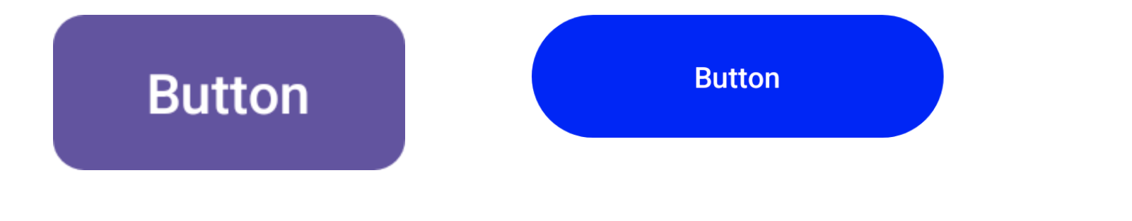
While color can be customized by changing the global colors scheme, the latter three characteristics are not so easy to achieve. Here comes an important difference between Flutter and Compose.
Customizing UI components in Flutter
In order to customize specific UI components in Flutter, we can use the same Theme object which we used for specifying typography and color scheme. Flutter’s Theme offers specific attributes for many different types of Widgets.
MaterialApp(
  theme: ThemeData.from(colorScheme: ColorScheme.light()).copyWith(
    elevatedButtonTheme: ElevatedButtonThemeData(
      // set color
      // set rounded corners
      // set elevation
      // set height
    )
  )
)
By setting a styling here we can globally change the look of all the Widgets of this type. Now you can use an ElevatedButtonWidget on your screen and these buttons will be properly styled according to your product needs.An added benefit is that if we want to someday update the styling, we have to modify only a global Theme.
Customizing UI components in Compose
The same situation is very different when we want to achieve the same in Compose. The Compose Theme allows us to specify only simple global attributes like color scheme, typography or shapes. There is no option to specify a global styling for a given component type like Button.
This comes at no surprise as Google, with the introduction of Compose, wanted to abandon the concept of global styling, which was previously present with the XML layouts.
Right now, our current solution is to build custom UI components which wrap default ones and apply proper styling to them.
@Composable
fun MyButton(text: String, onClick: () -> Unit) {
  Button(
    text = { Text(text) },
    colors = // set color,
    elevation = // set elevation,
    shape = // set rounded corners,
    modifier = Modifier.height(/* set height */)
  )
}
Unlike Flutter, we have to use this custom component on our screen instead of a default one. This way, each button on all screens will be styled similarly. If we want to update the design, we’ll only have to modify this single custom MyButton component.
Animations
Flutter has built-in animation support, including a rich set of customisable widgets for creating smooth and complex animations. Jetpack Animations is part of the Jetpack library, providing a collection of classes for creating and manipulating animations in Android apps.
Both Flutter and Jetpack Animations can be used to create animations in mobile apps, but they differ in implementation and the set of features they provide.
Animations in Flutter
To create the animations, Flutter uses the AnimationController and Animations classes. Flutter employs the AnimatedBuilder widgets to trigger animations in response to user interactions or events. It also uses the Tween class to interpolate between the values. AnimationStatus is used in Flutter in order to determine if the animation is running, stopped or completed. Flutter also give pre-build animations and effects like Hero animations and Shared axis transitions.
Here is an example animation that scales a Flutter logo from a scale of 0 to 1 over a duration of 2 seconds.
class MyAnimations extends StatefulWidget {
  @override
  _MyAnimationsState createState() => _MyAnimationsState();
}

class _MyAnimationsState extends State
    with SingleTickerProviderStateMixin {
  AnimationController animationController;
  Animation animation;

  @override
  void initState() {
    super.initState();
    animationController = AnimationController(
      vsync: this,
      duration: Duration(seconds: 2),
    );
    animation = Tween(begin: 0, end: 1).animate(animationController);
  }

  @override
  Widget build(BuildContext context) {
    return Scaffold(
      body: Center(
        child: Column(
          mainAxisAlignment: MainAxisAlignment.center,
          children: [
            AnimatedBuilder(
              animation: animation,
              builder: (context, child) {
                return Transform.scale(
                  scale: animation.value,
                  child: child,
                );
              },
              child: FlutterLogo(size: 200),
            ),
            SizedBox(height: 50),
            RaisedButton(
              onPressed: () {
                animationController.forward();
              },
              child: Text('Start Animation'),
            ),
          ],
        ),
      ),
    );
  }
}
The animation is controlled by the AnimationController and defined by the Animation. The AnimatedBuilder widget is used to rebuild the Flutter logo with the new scale value during the animation. The animationController.forward() method is called when the user presses the "Start Animation" button to start the animation. These animations also work on iOS.
Animations in Jetpack Compose
Jetpack Compose animations are not like Flutter’s. Instead of AnimatedBuilder widgets, it uses the animate and transitions composable functions. This function takes an animation definition, such as a LinearEasing or a Spring. It returns a value that can be used to update the state of the animation in other composables.
You can start and stop the animation using the start and stop functions. The seek function, which allows you to set the position of the animation at a specific point in time, can also be used to control the animation.
Furthermore, the onAnimationEnd callback can execute a function when the animation completes. To interpolate between values, Compose uses the lerp function. Jetpack Compose has an animation-based navigation feature that allows you to use the navigateWithTransition function to navigate between different screens with animations.
Here is an example of how to create a simple animation in Jetpack Compose using the animation composable:
@Composable
fun AnimatedBox() {
    val animatedValue = remember { animatedFloat(0f) }
onCommit(animatedValue.targetValue) {
    animatedValue.animateTo(
        targetValue = 1f,
        anim = spring(
            stiffness = Spring.StiffnessLow,
            dampingRatio = Spring.DampingRatioNoBouncy
        ),
        onEnd = { reason, endValue, _ ->
            if (reason == AnimationEndReason.Interrupted) {
                animatedValue.snapTo(endValue)
            }
        }
    )
}
Box(modifier = Modifier.fillMaxWidth().padding(24.dp),
  backgroundColor = animatedValue.value.interpolate(
  colors = listOf(Color.Red,Color.Yellow)) )
}
This code creates an animation that changes the background color of a box from red to yellow. The animation is defined by the animatedValue variable using the animatedFloat composable that holds the current value of the animation. The onCommit function triggers the animation using the animateTo function. The spring function is used to define the animation curve. The interpolate function is used to interpolate the value of the animation to a color.
You can use this composable in your UI tree like this:
Column {
    Text(text = "Animated Box", fontSize = 20.sp)
    AnimatedBox()
}
This will create a Text with the text "Animated Box" and the AnimatedBox composable.
In Flutter, you would need to create a custom animation, whereas Jetpack Compose supports animated composable visibility for this reusable, dynamic purpose.
Choosing the best framework for mobile app development project
As with all other tools we compare, choosing between Jetpack Compose or Flutter depends on your project’s requirements and determined use cases.
Here’s a quick breakdown of how we understand it.
Use Flutter when we’re looking to build a cross-platform app with smooth animations. Cross-platform means Flutter is a great option if you’re looking to build something on Android and iOS. Flutter would also be the go-to option if storage isn’t an issue.
Hot reload is also an incredibly useful (some would say indispensable) tool when you’re prototyping an idea - so that could be a deal breaker for some developers.
Use Jetpack Compose when we want to create a native Android app with composable programming models. It uses a declarative API to cut down your learning time and integrates marvelously with your already existing code. Common libraries used in Android development such as ViewModel work with Compose, so compatibility is a non-issue.
While Flutter is currently the more popular option between the two, the concept of a composable programming model is quickly gaining traction. No-code platforms have been developed to create full blown software solutions and Jetpack Compose just might be the bridge the business and developer worlds need to create reusable, well-thought applications at break-neck speeds.


