Compose Multiplatform - Adaptive UI


Contents
It’s important to save development time as much as possible when working on a multiplatform project. Developers usually don’t want to build a separate UI for different platforms or device types (e.g. small smartphone, medium tablet, or Chromebook).
The purpose of this article is to provide you with some basic concepts and solutions that helped me and my team in implementing such an adaptive UI.
General approach
Compose Multiplatform supports Desktop (Windows, MacOS, Linux) and Android (as of writing). In most cases, developers can build UI for both platforms using the same codebase. When doing so, there are a few important things to keep in mind.
Compose Multiplatform also supports web apps, but Web Compose API is quite distinct. Web apps often need a different approach, and so trying to use common UI code for them can prove to be problematic.
Desktop screen sizes are much wider than in most Android devices. You always want to maximize the full potential of your screen in displaying relevant information while keeping it elegant on the screen of a small smartphone. Hence, adaptive UI should be a priority when developing a multiplatform app.

The question now is: How do you achieve it? At the top of the UI tree, you can get information about screen width and then send it to the children UI components that need to be adaptive. However, this seems like sending one parameter through a lot of composable functions doesn’t it? Well, we can take some inspiration from the way theming works in Jetpack Compose.
Theming and CompositionLocal
The default solution for theming in Jetpack Compose is MaterialTheme, which is convenient but limiting if you need more of a custom design. Instead, you can replace it with your CustomTheme.
Here’s the default MaterialTheme solution:
@Composable
fun MyApp() {
  MaterialTheme(
      colors = …,
      typography = …,
      shapes = …
  ) {
      // app content
  }
}
On the other hand, here’s the CustomTheme solution:
@Composable
fun MyApp(
  windowSize: WindowSize // Info about screen width
) {
  CustomTheme(windowSize) {
    // App content
  }
}

@Composable
fun CustomTheme(
    windowSize: WindowSize,
    darkTheme: Boolean = isSystemInDarkTheme(), // Get current theme from system settings
    content: @Composable () -> Unit,
) {
  CompositionLocalProvider(
    LocalCustomColors provides if (darkTheme) darkColors else lightColors,
    LocalWindowSize provides windowSize
  ) {
    content()
  }
}

// We provide default unset values
val LocalCustomColors = staticCompositionLocalOf {
    CustomColors(primaryText = Color.Unspecified, borders = Color.Unspecified, ...)
}
val LocalWindowSize = compositionLocalOf { WindowSize.COMPACT }

// The class used for our custom theme colors
@Immutable
data class CustomColors(
  val primaryText: Color,
  val borders: Color,
  ...
)
windowSize pertains to the information about screen width, which I’ll get back to later. For now, focus on CompositionLocalProvider {} which enables you to set some values that will be accessible anywhere in the child UI components and it won’t be necessary to pass these values as function parameters.
In effect, instead of this:
@Composable
fun AppContent(primaryTextColor: Color) {
  Text(“Hello world!“, color = primaryTextColor)
}
We can do the following:
@Composable
fun AppContent() {
  Text(“Hello world!“, color = LocalCustomColors.current.primaryText)
}
To use it in similar manner to MaterialTheme, you can introduce a CustomTheme object:
object CustomTheme {
    val colors: CustomColors
        @ReadOnlyComposable
        @Composable
        get() = LocalCustomColors.current
}
And use it like so:
@Composable
fun App() {
  Text(“Hello world!“, color = CustomTheme.colors.primaryTextColor)
}
This solution is called CompositionLocal. It’s a handy tool to use when you have global information that needs to be accessed by many UI components but you don’t want to send it through many nested composables. It’s the perfect solution for theming and achieving adaptive UI.
You may have noticed that colors are set up using staticCompositionLocalOf and window size information is set up using compositionLocalOf. That’s because window size changes more often than colors. You can read about the exact difference between them in the official documentation.
Storing information about window size
So the question remains: how do you get and store information about screen size? There are a couple of ways to approach this. There’s a video from youtuber Philipp Lackner that showcases one possible solution (I highly recommend his content). But you can still make it simpler! Using his solution, you can access window width and height anywhere in the app, but the information about the width should be more than enough for most of the cases.
So let’s create the enum class representing the information about app window size:
enum class WindowSize {
  COMPACT,
  MEDIUM,
  EXPANDED;

  // Factory method that creates an instance of the class based on window width
    companion object {
        fun basedOnWidth(windowWidth: Dp): WindowSize {
            return when {
                windowWidth < 600.dp -> COMPACT
                windowWidth < 840.dp -> MEDIUM
                else -> EXPANDED
            }
        }
    }
}
The three breakpoints — COMPACT, MEDIUM and EXPANDED — are based on official Google recommendations. You shouldn’t reference window width in dp directly in the app, but rather reference whether your window is COMPACT, MEDIUM or EXPANDED.
Thanks to this, you can change the breakpoints' dp values later and they’ll be applied universally across the app. During development, for example, you can decide that the medium breakpoint is too low for your case and increase its value from 840.dp to 1000.dp.
Now that you’ve decided how to store information about the window width, how do you actually get it? You need to support both Android and desktop platforms but their APIs for getting the window size information are different.
On Android:
class MainActivity : AppCompatActivity() {

    override fun onCreate(savedInstanceState: Bundle?) {
        super.onCreate(savedInstanceState)
        setContent {
            MyApp(windowSize = rememberWindowSize())
        }
    }
}

@Composable
private fun Activity.rememberWindowSize(): WindowSize {
    val configuration = LocalConfiguration.current
    val windowMetrics = remember(configuration) {
        WindowMetricsCalculator.getOrCreate()
            .computeCurrentWindowMetrics(this)
    }
    val windowDpSize = with(LocalDensity.current) {
        windowMetrics.bounds.toComposeRect().size.toDpSize()
    }
    return WindowSize.basedOnWidth(windowDpSize.width)
}
On desktop:
fun main() = application {

    // You can define default window size on desktop here
    val windowState = rememberWindowState(size = DpSize(850.dp, 650.dp))

    Window(
        onCloseRequest = ::exitApplication,
        state = windowState
    ) {
        Application(windowSize = WindowSize.basedOnWidth(windowState.size.width))
    }
}
If you provide windowSize as CompositionLocal in the common UI code, you can decide how to display content based on this information:
@Composable
fun AppContent() {
    if (LocalWindowSize.current == WindowSize.COMPACT) {
        Column { /* content */ }
    } else {
        Row { /* content */ }
    }
}
Pre-made WindowSize classes are now available in a new library (material3-window-size-class; still in alpha stage as of May 2022) as part of the Material 3 set of libraries. You can read more about size classes and take a look at a sample implementation in Crane. You need to verify whether it works on KMM though.
Adaptive padding
To improve UI adaptiveness to different screen sizes, you could opt for modifying font sizes depending on app window size. Another approach is to use variable spacing or padding values instead. Take the spacing between password input and buttons below, for example:
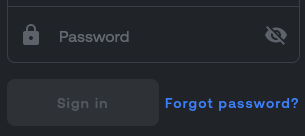 On
On COMPACT (narrow) screens
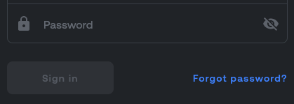
On EXPANDED (wide) screens
Let’s take a peek at the code:
PasswordInput()
Spacer(modifier = Modifier.height(CustomTheme.dimens.grid_2_5))
LoginButtons()
This CustomTheme.dimens.grid_2_5 value is different depending on the current window size. Thanks to that, you can save some space on small screens and you don’t have to put if statements everywhere in the process. Here’s how you can achieve this:
class CustomDimens(
    val grid_0_25: Dp,
    val grid_0_5: Dp,
    val grid_1: Dp,
    val grid_1_5: Dp,
    val grid_2: Dp,
    val grid_2_5: Dp,
    val grid_3: Dp,
    val grid_3_5: Dp,
    val grid_4: Dp,
    val grid_4_5: Dp,
    val grid_5: Dp,
    val grid_5_5: Dp,
    val grid_6: Dp,
    val borders_thickness: Dp,
)

val compactDimens = CustomDimens(
    grid_0_25 = 1.5f.dp,
    grid_0_5 = 3.dp,
    grid_1 = 6.dp,
    grid_1_5 = 9.dp,
    grid_2 = 12.dp,
    ...
)

val mediumDimens = CustomDimens(
    grid_0_25 = 2.dp,
    grid_0_5 = 4.dp,
    grid_1 = 8.dp,
    grid_1_5 = 12.dp,
    grid_2 = 16.dp,
    ...
)

val expandedDimens = CustomDimens(
    grid_0_25 = 2.5f.dp,
    grid_0_5 = 5.dp,
    grid_1 = 10.dp,
    grid_1_5 = 15.dp,
    grid_2 = 20.dp,
    ...
)
Then in the custom theme, you need to add the following:
@Composable
fun CustomTheme(
    windowSize: WindowSize,
    darkTheme: Boolean = isSystemInDarkTheme(), // Get current theme from system settings
    content: @Composable () -> Unit,
) {
    // Get appropriate dimens values depending on windowSize
    val dimens = when(windowSize) {
        WindowSize.COMPACT -> smallDimens
        WindowSize.MEDIUM -> mediumDimens
        WindowSize.EXPANDED -> expandedDimens
    }
    CompositionLocalProvider(
        LocalCustomColors provides if (darkTheme) darkColors else lightColors,
        LocalWindowSize provides windowSize
        LocalCustomDimens provides dimens // provide the chosen dimens as composition local
  ) {
    content()
  }
}

// Provide default unset value for composition local
val LocalCustomDimens = staticCompositionLocalOf { smallDimens }

// You can add you LocalCustomDimens to your utility CustomTheme object for convenience
object CustomTheme {
    ...

    val dimens: CustomDimens
        @ReadOnlyComposable
        @Composable
        get() = LocalCustomDimens.current
}
And you’re all set! You can use it like so:
@Composable
fun AppContent() {
    Row {
        Text(“Hello”)

        // On smallest screens this spacer is 6.dp wide and largest screens it’s 10.dp
        Spacer(Modifier.width(CustomTheme.dimens.grid_1))

        Text(“world”)
    }
}
Navigation drawer
In most applications, you want to create a side navigation drawer for users to easily explore the content. Thankfully, in Compose Multiplatform, you can use a Scaffold composable to add such a drawer.
val scaffoldState = rememberScaffoldState()
Scaffold(
    scaffoldState = scaffoldState,
    drawerContent = { /* drawer content */ },
    drawerGesturesEnabled = true,
    topBar = { ToggleDrawerButton(scaffoldState.drawerState) }
) {
    // app content
}

@Composable
fun ToggleDrawerButton(drawerState: DrawerState) {
    val coroutineScope = rememberCoroutineScope()
    Button(
        onClick = {
            coroutineScope.launch {
                if (drawerState.isOpen) {
                    drawerState.open()
                } else {
                    drawerState.close()
                }
            }
        }
    ) {
        Text("DRAWER")
    }
}
Now, you can open the drawer using gestures (e.g. swiping right on the device) or the ToggleDrawerButton in the top bar of your app. This solution works great for devices with narrow screens, such as smartphones. However, some issues arise on tablets and desktops, which have wider screens.
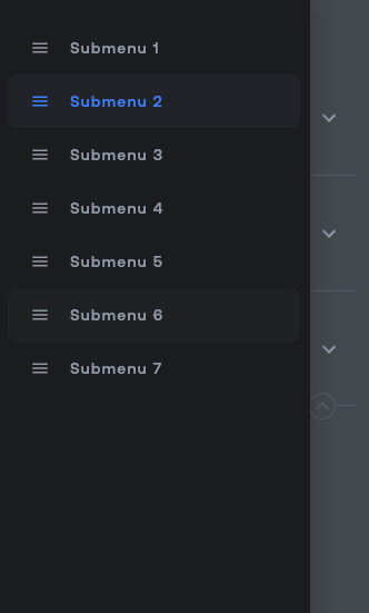
First, the navigation drawer can get too wide.
 On small screens looks neat
 But this is ridiculous
While there’s no direct way to control the drawer’s width, you can set a custom shape to limit width scaling.
const val DrawerMaxWidth = 250f
class MyDrawerShape : Shape {
    override fun createOutline(
        size: Size,
        layoutDirection: LayoutDirection,
        density: Density
    ): Outline {
        return Outline.Rectangle(
            Rect(
                offset = Offset.Zero,
                size = Size(
                    width = min(size.width, DrawerMaxWidth * density.density),
                    height = size.height
                )
            )
        )
    }
}
Then, add it as a Scaffold parameter.
Scaffold(
    ...,
    drawerShape = HomeDrawerShape(),
) {
And voila:
 When it comes to the widest screens, it may be preferable for the navigation drawer to be always present on the side of the app. You can achieve this using the following code:
@Composable
fun AppContent() {
    val isScreenExpanded = LocalWindowSize.current == WindowSize.EXPANDED
    Scaffold(
        scaffoldState = rememberSizeAwareScaffoldState(),
        drawerContent = { if (!isScreenExpanded) { MyDrawerContent() } }, // Modal drawer is available only on smaller and medium screens
        drawerGesturesEnabled = !isScreenExpanded // Gestures are enabled only on smaller and medium screens
        ...
    ) {
        Row(Modifier.fillMaxSize()) {
            if (isScreenExpanded) { MyDrawerContent() } // Show permanent drawer only for large screens
            // app content
        }
    }
}

@Composable
private fun rememberSizeAwareScaffoldState(): ScaffoldState {
    val commonSnackbarHostState = remember { SnackbarHostState() }
    val compactScaffoldState = rememberScaffoldState(
        drawerState = rememberDrawerState(DrawerValue.Closed),
        snackbarHostState = commonSnackbarHostState
    )
    val expandedScaffoldState = rememberScaffoldState(
        drawerState = DrawerState(DrawerValue.Closed),
        snackbarHostState = commonSnackbarHostState
    )
    val isScreenExpanded = LocalWindowSize.current == WindowSize.EXPANDED
    return if (isScreenExpanded) {
        expandedScaffoldState
    } else {
        compactScaffoldState
    }
}
This rememberSizeAwareScaffoldState() remembers the information about the modal navigation drawer. The thing is: on larger screens, the modal navigation drawer is always going to be closed (because the permanent navigation drawer is always open). Hence, you need to return DrawerValue.Closed every time if the screen is wide enough to display a permanent navigation drawer.
This solution is partly inspired by the official JetNews sample, where they toggle between navigation drawer and navigation rail depending on screen width.
Lately, a new official composable has been added: PermanentNavigationDrawer. Together with ModalNavigationDrawer, you can possibly achieve something similar in a cleaner way.
Responsive grid
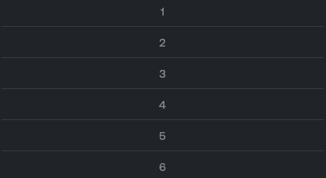
It’s often the case that you need to use a grid for laying out sections of the page. It should be possible for some sections to be larger than others but you need to keep the grid borders properly aligned at all times. On small screens, all sections should be laid out one under another because there’s not enough space on the device to display such a wide content.
 On larger screens
 On smaller screens
You might be tempted to go for a LazyVerticalGrid but it’s not really useful in this case. Instead, you should create a custom solution. A code for this “1,2,3,4,5,6” sample could look like the following:
Column {
    ResponsiveRow {
        GridCell { SectionText("1") }
    }
    HorizontalDivider()
    ResponsiveRow {
        GridCell { SectionText("2") }
        GridDivider()
        GridCell { SectionText("3") }
        GridDivider()
        GridCell { SectionText("4") }
    }
    HorizontalDivider()
    ResponsiveRow {
        GridCell { SectionText("5") }
        GridDivider()
        GridCell(weight = 2f) { SectionText("6") }
    }
}

@Composable
fun SectionText(text: String) {
    Text(text, Modifier.fillMaxSize(), textAlign = TextAlign.Center)
}
The grid could be implemented like this:
@Composable
fun ResponsiveRow(content: @Composable ResponsiveRowScope.() -> Unit) {
    val isCompact = LocalWindowSize.current == WindowSize.COMPACT
    if (isCompact) {
        Column {
            content(ActualColumnScope(this))
        }
    } else {
        Row(modifier = Modifier.height(IntrinsicSize.Min)) {
            content(ActualRowScope(this))
        }
    }
}

interface ResponsiveRowScope

internal class ActualRowScope(rowScope: RowScope) : ResponsiveRowScope, RowScope by rowScope

internal class ActualColumnScope(columnScope: ColumnScope) :
    ResponsiveRowScope,
    ColumnScope by columnScope

@Composable
fun ResponsiveRowScope.GridCell(
    paddingValues: PaddingValues = PaddingValues(CustomTheme.dimens.grid_2),
    weight: Float = 1f,
    content: @Composable () -> Unit
) {
    if (this is RowScope) {
        Box(
            modifier = Modifier
                .weight(weight)
                .fillMaxHeight()
                .padding(paddingValues)
        ) {
            content()
        }
    } else {
        Box(
            modifier = Modifier
                .fillMaxWidth()
                .padding(paddingValues)
        ) {
            content()
        }
    }
}

@Composable
fun ResponsiveRowScope.GridDivider() {
    if (this is RowScope) {
        VerticalDivider()
    } else {
        HorizontalDivider()
    }
}

@Composable
fun VerticalDivider() {
    Divider(
        modifier = Modifier
            .width(CustomTheme.dimens.borders_thickness)
            .fillMaxHeight(),
        color = CustomTheme.colors.borders
    )
}

@Composable
fun HorizontalDivider(modifier: Modifier = Modifier) {
    Divider(
        modifier = modifier
            .height(CustomTheme.dimens.borders_thickness)
            .fillMaxWidth(),
        color = CustomTheme.colors.borders
    )
}
The bread and butter of this implementation is ResponsiveRow, which is usually a Row but becomes a Column on small screens (when LocalWindowSize.current == WindowSize.COMPACT). Also, the ResponsiveRowScope.GridDivider() can be a HorizontalDivider or VerticalDivider depending on the screen size. Therefore, when screen shrinks and ResponsiveRow becomes a Column, GridDividers used inside it will change from vertical to horizontal ones.
If you need more custom behavior for your responsive grid, it might be a good idea to turn to your own Compose Custom Layout implementation.
Conclusion
Hopefully, these tips can help speed up development time for your multiplatform projects. Compose Multiplatform is a reliable, robust, and scalable framework to achieve adaptive user interfaces across various devices and platforms.


