SafeTrip – a Travel App That Will Allow You to Feel Confident Abroad – UX Case Study

Contents
As a traveller and a hothead, I use plenty of travel apps that help me move around, find inspiration and tips, or buy tickets and book accommodation online.
Traveling is my passion, however oftentimes I feel insecure when I’m in a foreign country. I always ended up writing down the emergency contact information on paper and printing the government information about the country or region I was visiting.
Because of these reasons, I was glad to take the challenge that I found on the UX challenge site:
It’s one thing to know what the weather is like in your travel destination, and it’s quite another thing to be totally prepared for temperature or altitude changes so that you stay fit and healthy during the trip. How can you design a product that helps travelers prepare and acclimatize fast for their trip so they don't miss a minute of fun?
Let me guide you through the design process. Let’s start!
Case study limitations
The goal of the challenge was to focus on the design phase. Due to these reasons, the design process does not include the user research phase.
I substituted my personal opinions for user research. What is more, at the end of the case study you can get to know about the further development of the app post MVP and the marketing plan.
Design process
Brainstorming
At first, I started with brainstorming. This phase helps me to gather all thoughts in one place. Thanks to this kind of visual representation it was easier to decode the content.
Based on the brainstorming session, I moved to the first phase of product development, which was market research.
Market research
“No man is an island”, wrote the English author John Donne, which means that no one is self-sufficient and everyone relies on others. The same is true for products or services.
By making this assumption, we increase our ability to perceive our product as a thing that exists in a given ecosystem, affects it, and depends on it.
Thanks to such a holistic view, we will better understand that without knowing the market we risk making products that not only won't stand out from others but also will not provide the unique value that will make it desirable to users in the long term.
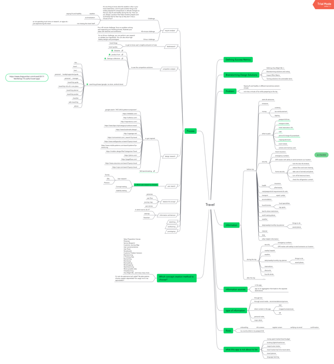
Competitor analysis matrix
For UX designers, a competitor analysis includes studying other organisations and companies that are in direct and indirect competition with the product they’re designing. It means looking at the products or services that solve the same problem as ours, but also ones that only partially product overlap.
After gathering information about the market, I ran the analysis of the selected competitors. To run that analysis I needed to decide what key factors I wanted to analyze. I included both direct and indirect competitors and key factors in the matrix that I used to compare the information.

This analysis led me to a clearer vision of what are the common features across the existing solutions, what are my competitor's unique values, and if there is a niche that I could fit into.
Based on that, I assumed that my value proposition would be an app, whose core function is providing information about safety in the user’s destination as well as giving the user an instant possibility to contact the emergency number.
Market & cultural research questions
That I was able to answer after running competitor analysis

As it is just a concept for an application I skipped the testing stage, but otherwise I would have verified all of these assumptions with real users, starting from creating a proto-persona that fits the objectives, behaviours, needs, obstacles, and jobs of the real end user.
Based on that I would create the user personas. Then I would start to get to know the users better by running user research using selected methods. I would also like to get to know what they think about the value proposition. I would do this using the concept testing user research method.
Verified information would reveal if my value proposition is what users really need and desire. I would have solid, verified data thanks to which I could move to the process of creating a product.
Design research
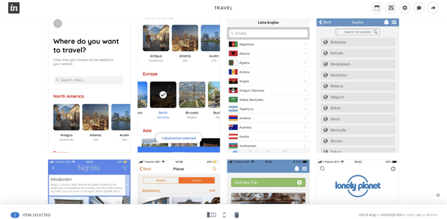
In the next phase I gathered inspirations, best practices, and competitors’ solutions to certain problems in one place. With visuals I created a base of design inspirations that is easy to look through in an InVision moodboard.
This design research or benchmarking let me get more familiar with solutions to problems that are similar to mine so that I do not have to reinvent the wheel. I am also up to date with the standards and trends.
Ideation & Concepts
The ideation with the resulting concept is a visual and verbal conclusion of the findings of the whole strategy and research process. At this stage of the design process, I do a synthesis of everything that I have found earlier about the project: the competition, business goals, users, etc.
It is only natural to make sure I have gathered all the resources from the previous steps and I am ready to mix them up in order to come up with the best ideas on how to execute the vision of the product.
Here, I can use a range of tools.
It all depends on the specific case, context, and what I currently need. Not only is the list of tools long, but I can also create my own tools, or make some modifications to existing ones. There are a lot of tools and methods helpful in the ideation and concept stage.
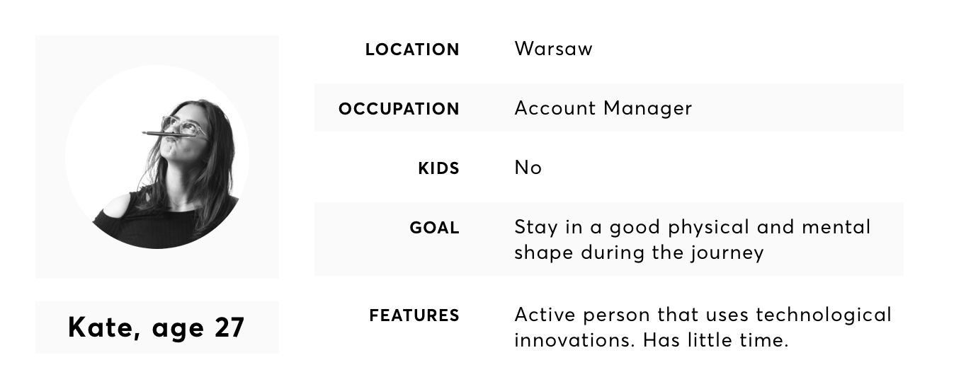
User profile
I started by creating a simple proto-persona to raise my empathy and try to walk, even a little bit, in the user’s shoes.
User Persona
User stories
Thanks to the proto-persona, I could identify with the user’s needs while travelling abroad. This led me to write user stories.

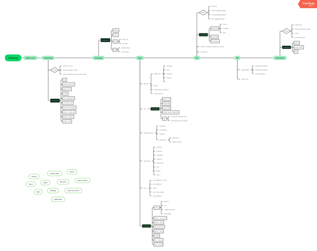
Sitemap
Based on the user stories, prioritizing them and deciding what I can do as an MVP, I created the sitemap of my application.
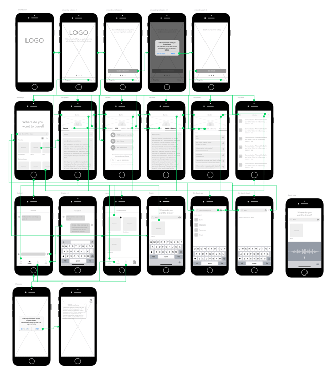
Wireframes & User flow
The next step I took was to transform my sitemap into designs. Based on the gathered design inspirations, prepared user stories, and visualized sitemap, I started to create wireframes on paper.
Later on, when the vision was more clear, I moved my ideas into Sketch. I used Overflow to visualize the connections between screens and understand the user flow.
Post MVP
Assuming that I could work on the further development of this app, I would enrich the application with additional functionalities that I found innovative and valuable to the user:
Ticket aggregator:- allowing a user to add all tickets they bought during his/her journey (flight tickets, museum tickets, bus tickets etc) and/or taking data from the apps they are already using (like Apple Wallet, e-books etc) or from emails.
-
- Addresses aggregator: similar to the functionality of the ticket, but in this case the app could take data from accommodation booking apps.
- Life, health & travel insurance aggregator: functionality which allows a user to upload a file with their insurance policies as well as type in the basic information about each of them. This to keep information that is important in case of an emergency in one place.
- Packlist: functionality that will provide a list of general stuff that needs to be packed for every kind of trip as well as a list of stuff specific to the destination.
- Checklist: functionality that informs the user what they have to do before going to a place in terms of crossing the border, health, and safety.
I would also prepare wireframes for the currently uncovered flows that were only mentioned in the sitemap:
- Tutorial (if it turned out that users are not that good with technology)
- 404 error states
- Help center
- Loading states
- Terms of service
- Pull to refresh states
Recommended enhancements
This challenge helped me to develop my skills in terms of running market research, collecting and analysing data, planning the logical structure of an app, and design. In the future, if I have more available time, I will run through the design process once again starting from verifying my assumptions with real users. Apart from user research I would also:
- Run Desk research
- Take into consideration the context of use and cultural aspects
- Take into consideration different devices and operating systems
- Take into consideration pointing devices
- Take a closer look at market research
- Follow the recommendations of marketing for mobile apps as well as the 6 stages of app discoverability.


