
Co-Branded Payment Design for MagicPay's Banking Partners

The client
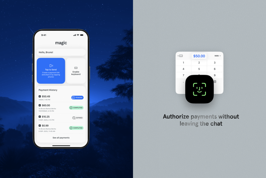
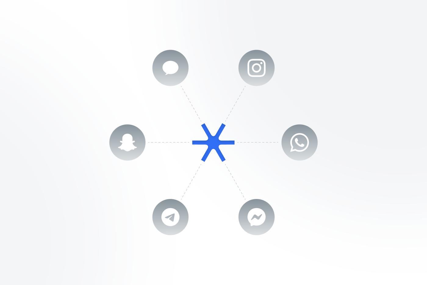
MagicPay is a fintech startup whose white-label SDK lets a bank’s or a fintech’s customers send money straight from any messaging app with a keyboard. Every partner bank gets its own co-branded version, and the company’s market operations sit in Mexico and Spain.
The challengeWhat the teams actually needed
Pitch a payment layer to a bank and it has to look bank-grade in the first demo. Partner demos and rollout talks were already running.
Challenge 01Call-to-actions that did not stand out
Weak visual hierarchy risked confusing people across the sending and receiving flows.
Challenge 02Co-branding with no system behind it
Without one, MagicPay’s identity would fragment as it rolled out across multiple banks.
Challenge 03Three surfaces, one product
Three surfaces — the keyboard extension running natively, the hub inside the app, and a claim journey for someone with no account and no app of their own — all had to read as one product.
What we did
A brand system banks can carry, and flows built on top of it
The work split into two connected tracks: an identity MagicPay could hand to partner banks, and UX/UI for the sender and recipient journeys built on it.
A design system, not a skin
Colour architecture, typography and logo rules were documented as a system, so partner banks can apply the identity correctly without MagicPay in the room.
A mark that survives someone else’s app
On iOS and Android alike the SDK renders inside a mobile UI and a keyboard extension, so the mark had to survive small sizes and another company’s navigation around it.
The hardest flow: the person with nothing
The person receiving money has no account, no app and nothing linking them to the sending bank — only a link and their own bank details. The claim journey was built around one input, stored after first use so later payments close in a single click.
Mapped end to end
The keyboard extension’s way in, its authentication and its success and failure states were redesigned, along with the in-app Payment Hub. Each flow ran from a Figma journey through wireframes to finished UI, so development had one source to build from rather than shifting mockups.
Client testimonial
The problem with payments today isn't a lack of infrastructure, it's the lack of a great experience (a magical one). Netguru helped us build it, so sending money feels as easy and intuitive as sending an emoji or a single tap from your keyboard.
More like thisOther places we scaled product teams for growth.
What’s next