Deliveroo UX Redesign Concept – Case Study

%20(1).jpg?width=2880&height=1000&name=1440%20delivero%20header%20(1)%20(1).jpg)
Contents
With a fresh influx of investment from Amazon, Deliveroo is gearing up to enhance user experience and expand its reach, challenging giants like Uber Eats and Grubhub.
Deliveroo is a London-based online food delivery company serving people in hundreds of cities in 14 countries on 3 continents. As with its main rivals, such as Uber Eats and Grubhub, Deliveroo works as an intermediary between customers and restaurants. Customers order food from restaurants using Deliveroo’s apps or its website, and the company facilitates delivery from the eatery to the home or workplace through their network of self-employed couriers.
Netguru’s Analysis into the Deliveroo App
With Amazon’s generous inflow of capital, there are myriad ways for Deliveroo to spend it to their advantage, including expanding into more cities and improving their low user ratings. The UX design team analyzed their current app to find a few quick-win user experience changes to increase usability, convenience, and return visits.
Deliveroo allows users to utilize their website for placing food delivery orders, as well as two mobile apps, one for iOS and one for Android, in addition to custom mobile apps for their couriers. In this study, we take a look at the customer-oriented iOS app to find its strengths and weaknesses.
While the Deliveroo mobile app has been effective at allowing the company to grow at over 650% year over year, there is still room for improvement, especially if they are to take on the sector’s heavyweights. Today, we’ll dive into the following 4 user-flow areas of Deliveroo’s iOS app to see if there are some improvements to be made in their food-ordering process:
- Location selection;
- Restaurant lookup using the search functionality;
- Restaurant lookup by browsing; and
- Meal selection.
Several methodologies of user experience design reviews exist, all aimed at identifying usability issues which could be improved. In this case study, we went with an expert review, as our in-house UX team members performed the research and proposed changes.
What We Found: The Outcome of Our Analysis
Our review process identified 5 areas of the food-ordering process at Deliveroo which warrant changes. We classify these changes into 3 levels of urgency: critical, major, and minor.
Here are 5 areas of the Deliveroo iOS app deserving attention and redesign:
1. Location Selection
In the location selection section, we found two issues we deemed major:
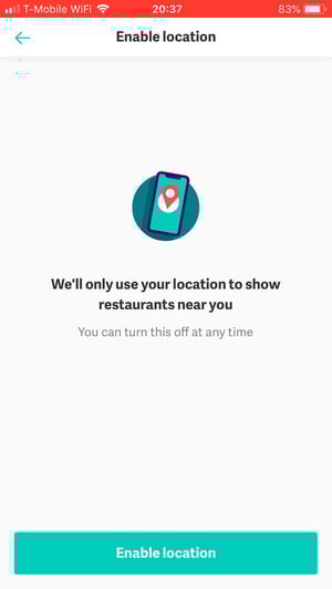
Issue #1: On the screen for enabling location, the users are not given any choice. They are given only one option, which is to enable location sharing. Not doing so means the user is unable to complete the app’s initiation process.
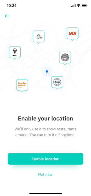
Solution: A simple fix is to add a second option, which we have done here with the “not now” link below the more-prominent “enable location” button. Giving users the ability to complete this process at a later time is more user-friendly and convenient, and will ensure they won’t delete the app before placing their first order.
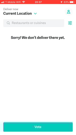
Issue #2: Our second location screen is for users who aren’t in an area which Deliveroo currently serves. On this screen, we noticed one unnecessary set of functionalities, including the delivery time choice, the location selection, and the filtering options. On top of that, the “we don’t deliver there yet” message is vague and should be clarified.
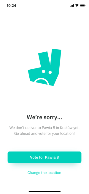
Solution: Since this screen is shown to users who aren’t in the delivery area, there is no reason to allow them to choose a delivery time window or show filtering and restaurant selection options. We removed these to avoid confusion.
Also, where is “there,” exactly? Our fix replaces that word with the actual address, because the user may not remember which address they have set up as their default delivery address. Finally, we added a button below the voting button which easily allows the user to change their delivery location without having to go through multiple clicks to get to the location settings.
2. Search Filters
Within the search filters menu, we identified one critical issue:
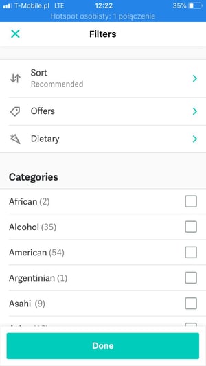
Issue: Common filtering options are not available to users, including price, estimated time for delivery, and narrowing down based on restaurant ratings.
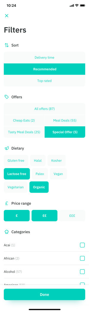
Solution: The missing filtering options are necessary, so our solution is to add them for an increase in user functionality. We added a separate pricing choice sub-filter rather than lumping it in with the initial sorting options, as cost is a primary concern for most customers. On top of that, we reorganized the submenus into clickable buttons, which allows users to stay on the same page for better UX.
3. Deliveroo App Homepage
On the app’s homepage, we found a set of issues we marked as critical, all essentially making any customer choices more confusing than necessary:
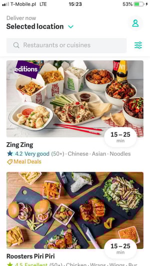
Issue #1: The first issue we noticed here was that the homepage restaurants are separated into categories such as “top rated,” “fast delivery,” and “featured.” However, these category headings are about the same size as each restaurant’s name and not distinctive enough to stand out.
Issue #2: A second issue closely related to the first is that the headings with the arrow next to them may cause a user to not associate the restaurants below with that category.
Issue #3: There isn’t any way for a customer to understand how expensive the restaurant is at first glance.
Issue #4: At the top, the user is shown the delivery address marked as “selected location.” This causes unnecessary confusion and extra clicks for a user to both open the drop-down menu to ensure the selected location is accurate and then to close the drop-down menu.
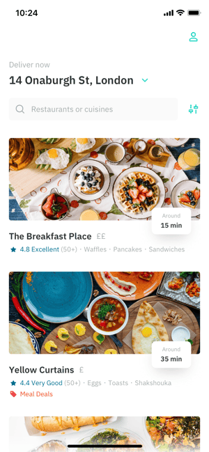
Solution #1: Increase the font size for the various headings, or remove it altogether. Moving the categorization to the filtering options, for example, eliminates the risk of having important headlines go unnoticed. This option also has the added benefit of allowing all restaurants to be listed one atop the other, removing the disarray of multiple restaurant carousels.
Solution #2: If categories such as “top rated” are to remain on the homepage, ensure that the user is able to immediately associate the restaurants below with the particular category.
Solution #3: We simply added one, two, or three currency symbols next to each restaurant’s name to alert the user that a restaurant is cheap, average, or expensive, relatively speaking.
Solution #4: Replace the “selected location” wording with the actual address, so the restaurants shown are indeed valid.
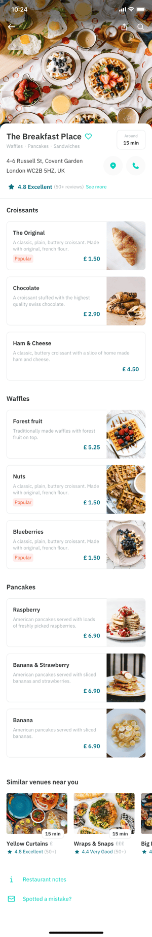
4. Individual Restaurant Menu Selection Page
When we made it to the actual menu selection page, we were confronted with the majority, a half-dozen, of our user experience issues.
Three of the UX issues were deemed by us to be critical: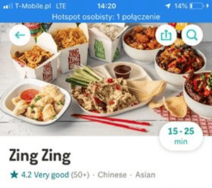
Issue #1: A map, phone number, or a “call restaurant” button aren’t available.
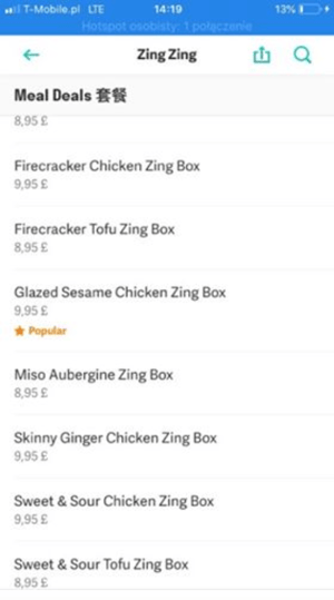
Issue #2: Navigation between food categories takes place in one seemingly endless top-down list, forcing a customer to scroll through its entirety to find what they’re looking for.
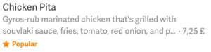 Issue #3: In this menu item example, we noticed two things: the pricing is hard to discern, and the icon for a “popular” food item is the same as the one used for a restaurant’s rating.
One issue is categorized by us as major:

Issue #4: Sentences like this one in the restaurant’s description don’t tell the user anything at all. Phrases such as “we use the finest ingredients” can be used by any restaurant, and users know to take them with a grain of salt (no food pun intended).
Solution #1: Add all of these options, or at least the “call restaurant” option. Users may need to contact the restaurant for dietary questions, for example, and forcing them to open up the restaurant’s website in another app to call causes them unnecessary inconvenience.
Solution #2: Add a secondary menu, such as a tab bar at the top, including links to each menu category.
Solution #3: First, make the price more distinguishable, either by increasing its font size, bolding the text, or moving it to its own line. For the “popular” symbol (and others), use different icons or styling to allow customers to quickly identify notices by icon alone.
Solution #4: Remove generic copy like this, and focus only on descriptive information which adds value for the customer.
Two further issues were determined to be minor in nature:
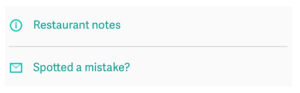
Issue #5: The divider line between the restaurant notes and feedback links is unnecessary.
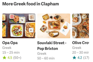
Issue #6: The heading of this “more” box already indicates the cuisine, so it is redundant to spell it out under each and every restaurant in the carousel.
Solution #5: Remove the divider for lists with only a few items, such as this one. If some kind of differentiation is needed, use a small white space instead.
Solution #6: Remove the cuisine from beneath each restaurant listing.
5. Basket / Checkout Flow
We found a few issues with the shopping cart screen which we classified as major:
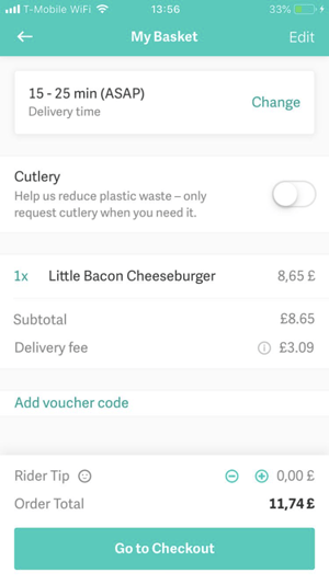
Issue #1: Button size, most noticeably (or unnoticeably, as the case may be) the delivery person tip increase/decrease button is way too small for mobile devices.
Issue #2: Dividers between various sections of the shopping basket wreak havoc on the flow rather than making things easier for the user.
Issue #3: Place of intended delivery is missing.
Issue #4: Users don’t have the option to edit line items of their order from the checkout page.
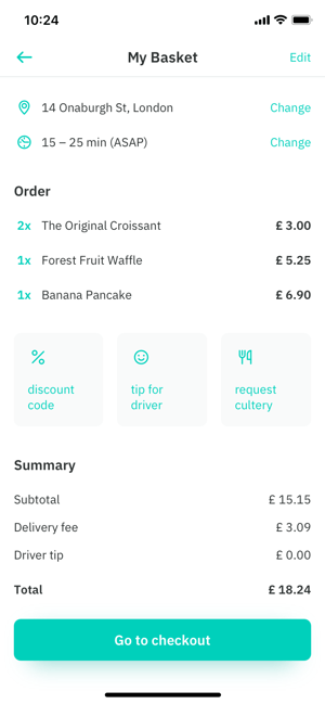
Solution #1: Enlarge the buttons to the minimum target size, or rearrange them into buttons as we did above.
Solution #2: Reorganize sections more cleanly with proper headlines, or, better yet, white space.
Solution #3: Show the exact address to assuage any worries a customer may have that the address is accurate. Also give an option to edit the address for simplicity’s sake.
Solution #4: Add a remove/edit/add feature to ease the customer’s purchasing choices.
Key Takeaways
The Deliveroo app is one many customers will return to month after month, if not weekly or even more frequently. Our proposed changes will ensure Deliveroo’s users get the best experience out of the food delivery process, leaving the onus on the restaurant to complete the encounter.

Just noticing the differences between many of the before and after images, the changes we advocate appear minimal. However, combined, and even each on its own, every tweak we made is certain to have a great impact on user experience.
The Deliveroo app already puts the customer first, for the most part, by bringing more restaurants within their reach than ever before. Now that Amazon, through their investment, has taken its slice of Deliveroo’s pie, it’s time to ease each customer’s individual purchase of pie slices. And pizza slices. And gyros. And…


