Illustrator's Eye: Interaction of Colours

It influences advertisements, storytelling, illustrations, and all other aspects of visual communication. It’s a fact that the way we perceive colours, is based on our cultural code, society, knowledge, and the environment we grew up in. Colour itself is just an action and an interaction registered in our minds.
The power of colour
We associate the colour red with danger, green with peace and nature, blue with medicine, and black depicts darkness. The story doesn’t end with these basic connections and meanings though; there is still a lot more to think about.
When choosing the colours for your brand, the ones that will represent you, your business, and the message you want to send, it is important to make the right choices. Get it wrong, and you might deliver a message that is inconsistent with your intentions. For illustrators and product designers, it is important to know what the challenges are, to enable you to achieve the best results and effectively communicate your message to your audience.
Personal experiences and cultural code
Colours have a variety of references in Western culture. Members of different cultural groups will interpret them in their own – and sometimes even opposite – way. Colours are essentially disorganized and non-universal semantic codes.
It is important to appreciate how the meaning of colours can vary in different cultures and for different potential audiences. Doing so helps you to understand the potential recipient, and avoid mistakes when picking up the colour palette. Finally, it helps your images convey the right message.
Remember everyone sees colours in their own unique way. Just think about the colour red. You imagine it with a particular hue and intensity – this is a reflection of your life experience. Your basic red may be darker and more saturated than my basic red. We don't all see it the same way. The client’s niche may be associated with medicine, but at the same time, they may be bored with blue. Find the best solution and consider not only cultural code, but also the client’s personal experiences.
You might like or dislike some combinations, and have a different opinion about single colours. If you are an illustrator, you probably have your favourite palette, your own preferences followed by aversions. Your client, even if they are not an artist, also has a favourite palette and has personal feelings about it. Try to figure out what they like, and mix it up with cultural code and the specifics of the product. That's the recipe for creating a perfect colour palette for the project.
Basics
Light side or dark side
A white or light background seems to be a safer choice than a dark one, whereas dark colours are usually associated with professionalism and technology. A bright background works well with areas like pharmaceuticals, medicine, and education – it makes us feel safe. Dark background colours are suitable when we have subjects like antivirus and security software in mind. Black also portrays leadership and authority. It’s tricky! Keep your eyes open and make your decisions wisely.
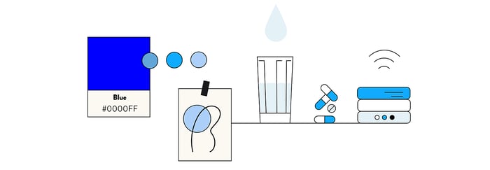
Blue
Blue conveys significance, importance, and confidence. It’s also associated with intelligence, stability, and unity. Currently, this colour is used frequently to illustrate Blockchain technology topics. You need to be careful when choosing the right tone though. Too much blue can be perceived as conservative and adds a melancholic vibe, or it might bore the audience. Different tones of blue carry different meanings, e.g. dark blue is elegant, International Klein Blue is modern, fresh and dynamic, while light blue is associated with trust, honesty, and inspiration.
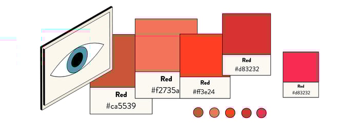
Red
Red is a highly visible and noticeable colour; it’s intense, eye-catching, and has the ability to focus attention fast. This colour represents power, courage, excitement, energy, love, and hell. Red has a huge impact on the viewer. It helps to catch attention (ever notice red buttons in movies?), it sets the mood (think Valentine’s Day illustrations), but too much red can affect the audience in an undesirable way. It can cause elevated blood pressure, increased respiratory rates, and enhanced metabolism. On the positive side, it encourages higher levels of energy and increased confidence. It is pretty rare to see a brand book where red is the dominating colour; it’s usually used as a complementary colour.
Purple
Purple combines the calm stability of blue and the fierce energy of red. Purple is associated with royalty, luxury, and ambition. It also represents extravagance, creativity, wisdom, mystery, and magic. This colour has a variety of effects on the mind and body, including uplifting spirits, calming the mind and nerves, and encouraging imagination and creativity. Different shades, tints, and hues of purple carry different meanings. Light purple hues represent feminine energy and delicacy, as well as romantic and nostalgic feelings. Dark hues evoke feelings of gloom, sadness, and frustration. Bright purple hues suggest richness and royalty.
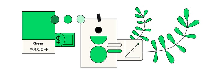
Green
Green is acknowledged as the most relaxing colour for the human eye. It dominates in nature. Green is often associated with growth, harmony, safety, and the environment. Green is also traditionally associated with money, finances, banking, ambition, greed, jealousy, and Wall Street. This colour is often used to indicate safety in the advertising of drugs and medical products. Green is directly related to nature and energy, so it is also commonly used to represent and promote "green" and bioproducts. Different shades, tints, and hues of green have different meanings. For example, dark green represents greed, ambition, and wealth, while yellow-green signifies sickness, jealousy, and cowardice. Olive green is the traditional colour of peace.
Turquoise
Turquoise is a mix of blue and green and has calming attributes. It is seen as refreshing and is associated with sophistication, energy, creativity, emotional balance, friendship, love, joy, intuition, and loyalty. It’s really fresh, but remember to avoid combining it with other "sweet" colours, like pink. Don't put it alongside light violet to avoid making everything look too candy-like. If you mix this colour with dark hues, you will achieve a very professional, modern look. Darker shades of turquoise, such as teal, have a more sophisticated feel.
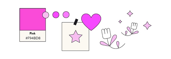
Pink
Pink is a variation of red. You already know that red evokes aggression and inspires action, however pink works differently. Both red and pink represent love. Intense pink is used to communicate playfulness, while light pink is used to communicate tenderness. Light pink is associated with nice things like romance, femininity, babies, bubble gum, and sweetness. Intense pink, like magenta, is associated with emotional balance. It contains the passion, power, and energy of red, and promotes compassion, kindness, and cooperation.
Colours in context and harmony
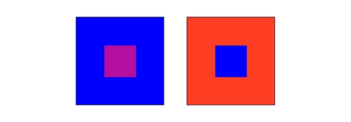
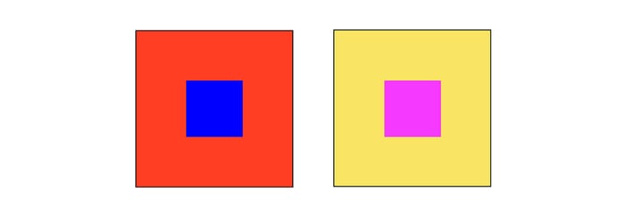
Every colour is seen in relation to another. When you see at least two colours together, each of them has a profound effect on the other. The study of colour interactions helps us to understand and predict how colours can influence their surroundings.
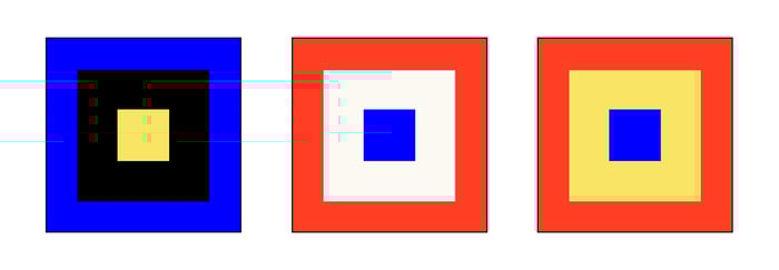
Hue contrasts
Contrast of hue happens when a colour is separated and outlined by black or white lines. White lines both weaken and soften the power and at the same time make the colours around them seem darker. A black line strengthens the colour, but also makes colours around the lines seem lighter.
Light-dark contrasts
Light-dark contrast puts together light and dark hues. The strongest expressions of light and dark are white and black.

Cold-warm contrasts
Cold colours are: blue, green, and purple. Warm colours are: red, orange, and yellow. Yellow is the lightest and violet is the darkest hue. These two hues have the strongest light-dark contrast. Hues can either be cold or warm according to the warmer or colder tones they are contrasted with.
Complementary Contrast
Complementary Contrast refers to the contrast between opposite colours. Complementary colours are those that are directly opposite each other on the colour wheel. Red-orange/blue-green is a complementary pair, as well as the extreme of cold-warm contrast. Red and green are complementary, and the two saturated colours have the same brilliance.
Harmony
Harmony can be defined as a pleasing arrangement of parts, whether it be music, poetry, colour, or even an ice cream sundae. In visual experiences, harmony is pleasing to the eye. It engages the viewer and creates an inner sense of order; a balance in the visual experience. When something is not harmonious, it's either boring or chaotic. At one end of the spectrum is a visual experience that is so bland that the viewer is not engaged. The human brain will reject under-stimulating information. At the other end, is a visual experience that is so overdone, and so chaotic that the viewer can't stand to look at it. The human brain rejects what it cannot organize or understand. Colour harmony delivers visual interest and a sense of order.
Using proper contrast and complementary colours in the right proportions enables illustrators to control the impression on the audience. How do you avoid a melancholic vibe? Use blue and then warm it up. Use green in your illustration. After adding other colours, its impact is changed. Keeping all of these tricks in mind will help you to improve your communication with your audience.
It is essential to understand how colours affect the viewer. If this topic is important to you, I highly recommend reading the following two books:
- Picture This: How Pictures Work – Molly Bang
- Interaction of Color – Josef Albers
Reference:
- Picture This: How Pictures Work – Molly Bang
- Interaction of Color – Josef Albers
Coming soon
- The Languge of Shapes in Illustrations
- Animation and Motion Graphic Basics


.jpg?width=384&height=202&name=10%20Tips%20for%20Stunning%20%20Dark%20Mode%20Design%20(1).jpg)